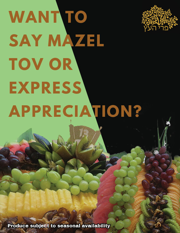
Hard to read on the background. Maybe find a nicer font. The color also seems a bit dull, it’s not popping out.
The pictures on bottom are beautiful but dull, Can you up the levels in the fruit? I would put a solid background on top not divided. And like @schlomithsassoon wrote, can you find a more interesting font?
Maybe do a pretty colored background with a more inviting font, the font does not need to take up all the empty space.
Any ideas of fonts?
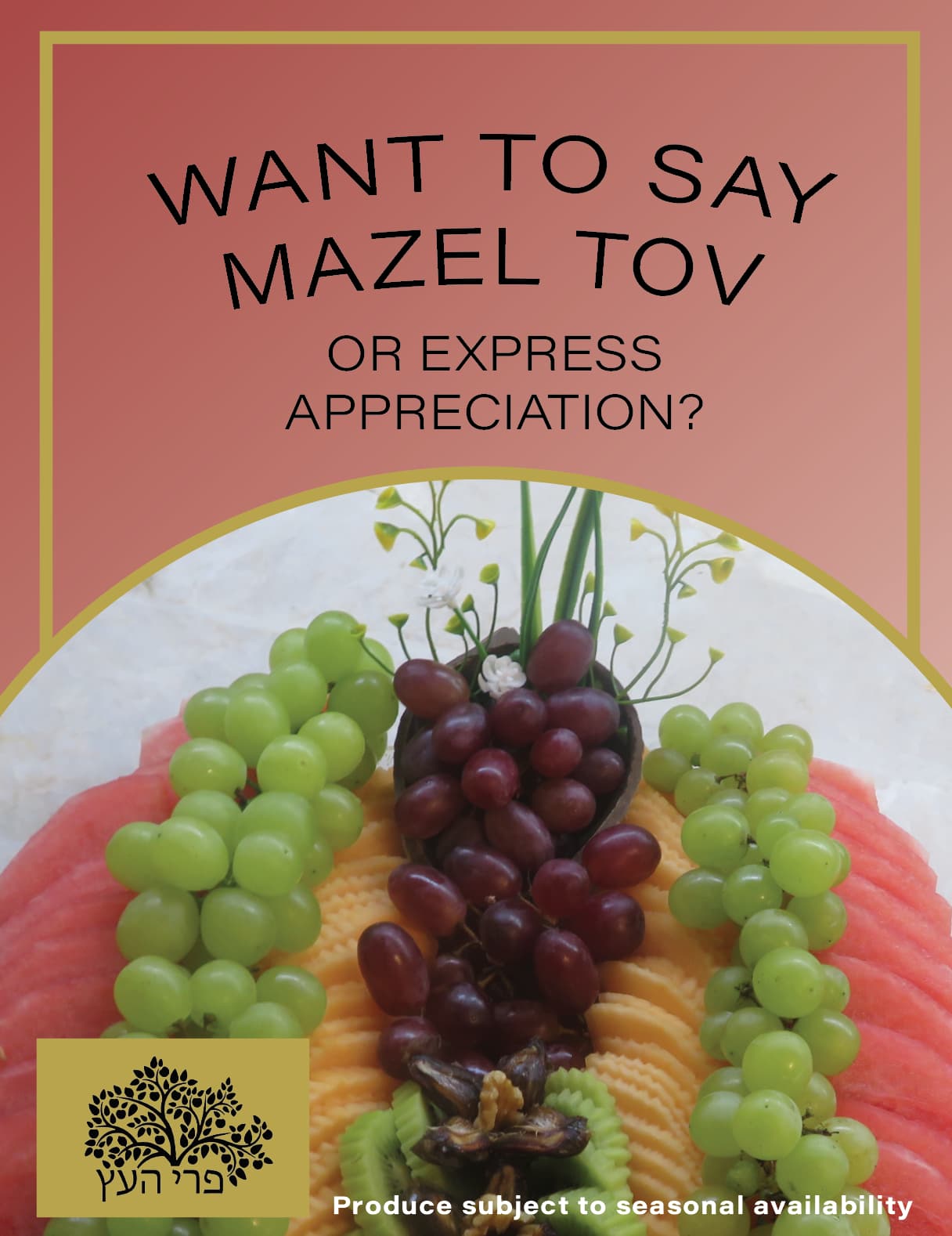
With a plain background it looked like it was missing something…
@chavi, what do you mean by a colored background?
Find a nice background from shutterstock. it can be a gradient or something simple but not a solid background.
Like @chavi wrote- find a gradient or a subtle texture. But the split doesnt look right
I would photoshop the fruits to make look more vibrant
Can you find a more interesting font? The whole thing looks bland. Also the picture, as well as the top.
Look through some of these images, you’ll see what I mean
https://www.google.com/search?safe=strict&sca_esv=73d0a1271b02ef32&sca_upv=1&rlz=1C1CHBD_enGB949GB949&q=flyer+design+for+fruit+platters&udm=2&fbs=AEQNm0A-TSThzBStWy2iQzbzvM8Eh_6ApuFddKkoj5zANazlqU1n93c0bTwp0p-H4C5RAV9Ypcj2zREXKK0PXEaiuH3qFTw-Kni8IWq01SxzXmgNrqJE03KB3pw6uqClMJiwdQ69lw-SoZElsbOzpkxRKMWXFZZ0cObq6SS4lb53wG8fN5I5XtqLAGSaRFX7zF6SqyPt1xEZ7l1AfjK88wf0vIeHTtK8SA&sa=X&ved=2ahUKEwjqyLPzt5eHAxVoVEEAHYVBDXIQtKgLegQIFBAB&biw=1536&bih=730&dpr=1.25
Do some research to get inspo.
Hatzlacha!
I will brighten the whole thing I think but it’s not supposed to be very original or show stopping davka. It is more to get the word around if that makes sense
I just looked at my laptop again.
I’m going to try and repost the screenshot cuz for some reason the coloring on the one I posted before looks really bad compared to the actual document.
Does anyone know why it looks more vibrant on Illustrator and more dull when I post it here?
Usually because of cmyk to rgb.