All critique is welcomed! thanx
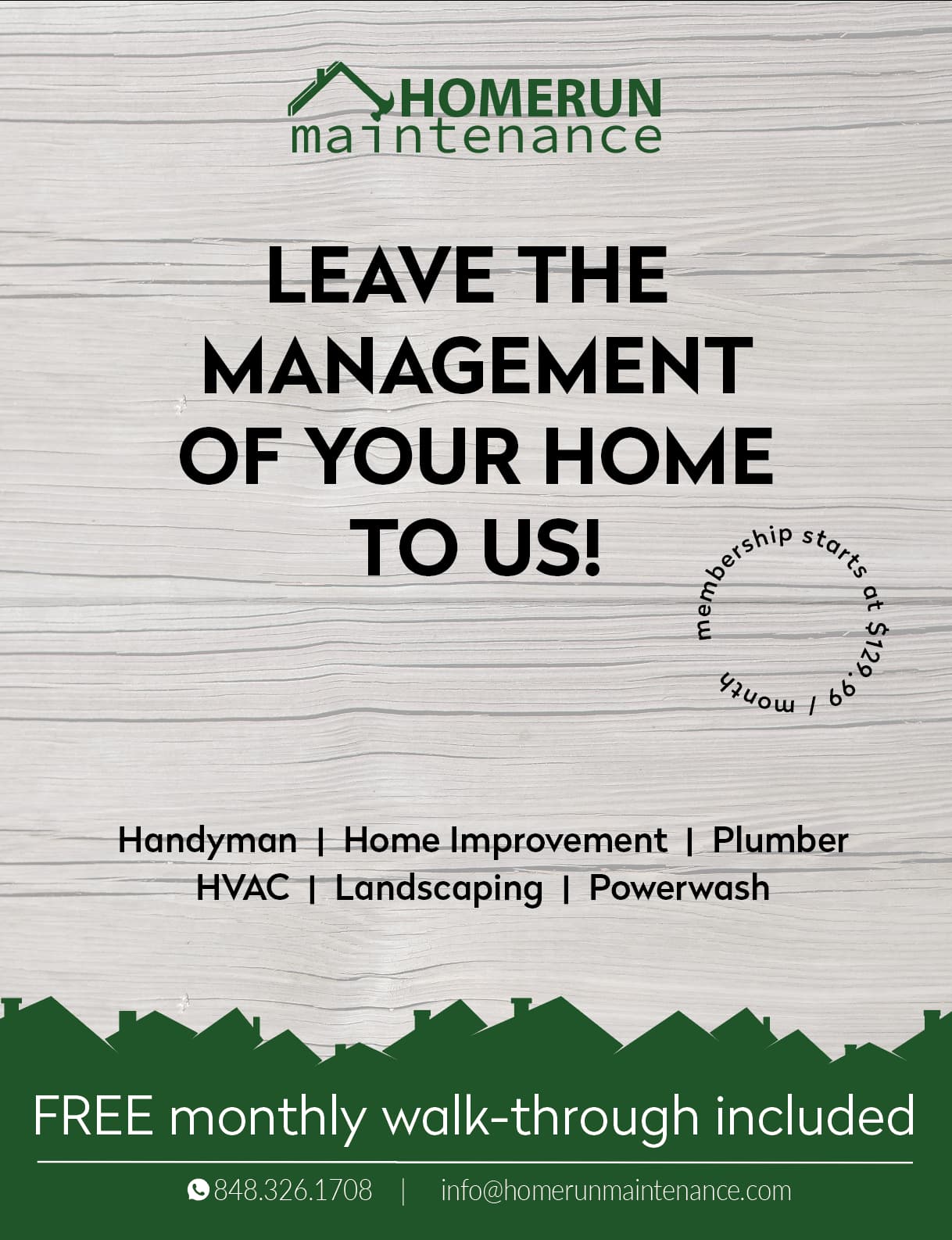
Really nice! I love the roofs you have on the bottom by the contact info
I think the line “FREE monthly walk - through included” should be bit smaller
I think the focus could use a bit more color or better typography to give it some more interest
Could you fade the wood pic as it gets to the bottom so the words Handyman | Home Improvements…etc. dont have lines under them…
Really nice!
Would you be able to add some sort of image to break up the text?
i love the overall feel and look, i think will def appeal to women who want to get someone to take care of their home, has a warm inviting feel with that soft wood.
my only issues are the words ‘homerun’ stuck together in the logo and the font of the word ‘maintenance’ in the logo, feels typewriter-y… and feels the dot of the i is stuck to the hammer by mistake rather than on purpose… maybe diff. colors/weights/opacities for the words ‘home’ and ‘run’ and ‘maintenance’ ?
also in the email address, i read it as ‘homer unmaintenance’ - maybe u can capitalise so its info@HomeRunMaintenance.com even though it looks less email address-y
The membership circle is a bit hard to read the price but maybe that’s good if he doesnt want it too prominent… also the gap bothers me - maybe you can do two arches of text in a circle - top one ‘membership starts at’ and the bottom arch with the text facing the right way up - $129.99/month’ and both have equal gaps on left and right sides…
feel free to ignore all my comments coz it’s good as is really!!
Thanks everyone, this is with your ideas and his ideas. Any more changes needed. I feel like now it looks too empty with the words not in circle. Any suggestions.?
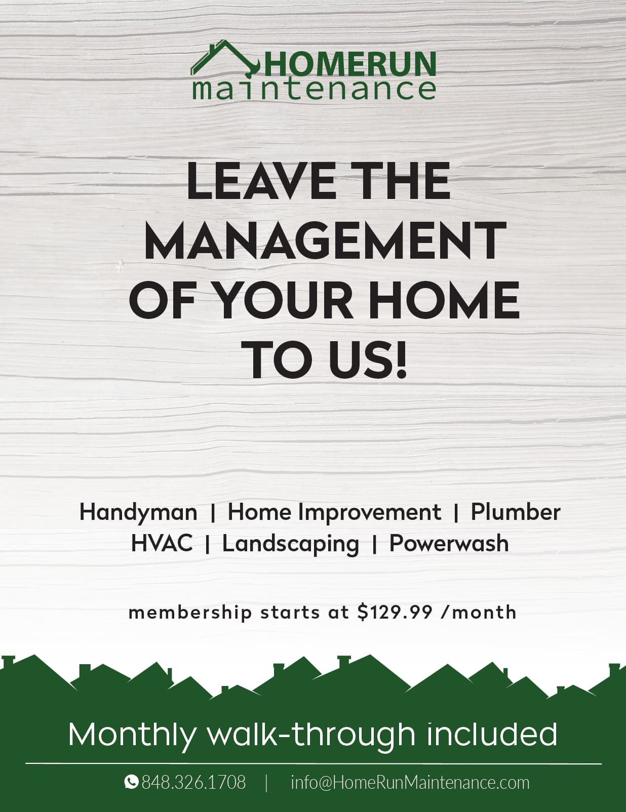
So this is the final! BH he loved it.
Now Im on to his business card. What do you think? he wants it to be really really basic.
Is this to plain? or should i change wording for the card, or try a more attractive layout?
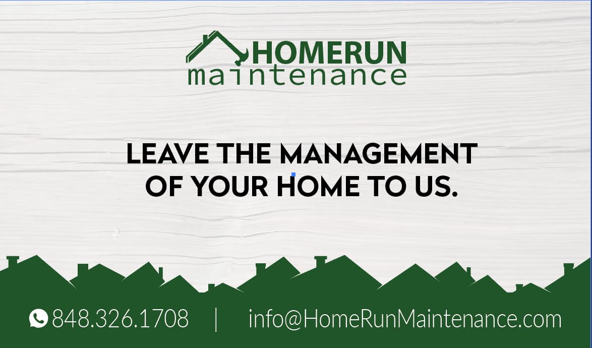
I like the way the card and ad have the same layout. I wouldn’t change it unless the client wants