Hi,
I feel like the layout of this ad im designing needs some help.
If anyone has a spare moment can you help me please?![]()
thanks!
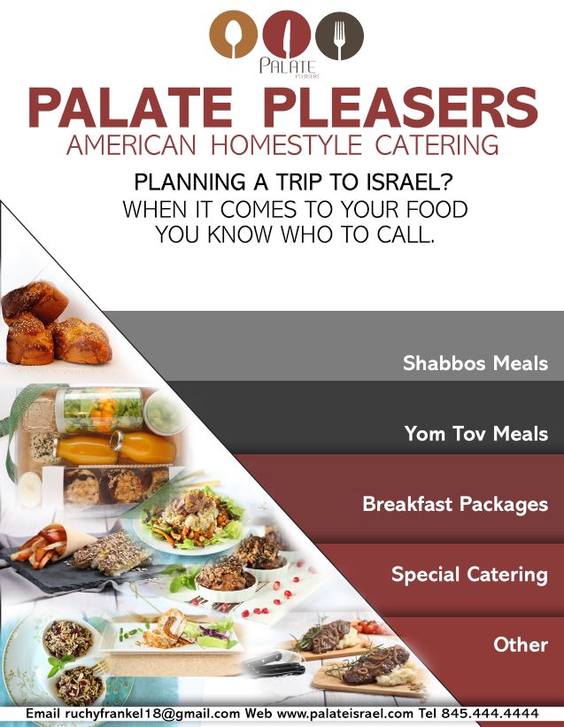
Please ignore the white “border”…its just the way i snipped it. really its not there…
I actually got help from another graphic designer (though not from DA)
this is the revised much better version…im still open to critiques though…
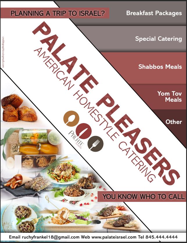
Much clearer! Love the design. I like how you stuck in the planning a trip… whith the rectangles although maybe lighten the top one a little or even switch them to the mustard color of the logo? is the black border there on purpose? and if there’s a way to organize the pictures better…
great design overall
Maybe change the black letters (on red – ‘planning your trip’) to white. I think they could be clearer.
I really like how it came out!!
thanks everyone!
Looks great! Was going to say that there was bit of competition between the diagonal middle and the right side, and perhaps to tone down the contrast on the right side by slightly lowering opacity of the white words, but now that I see the animated version the middle is definitely the focus, so all looks good!