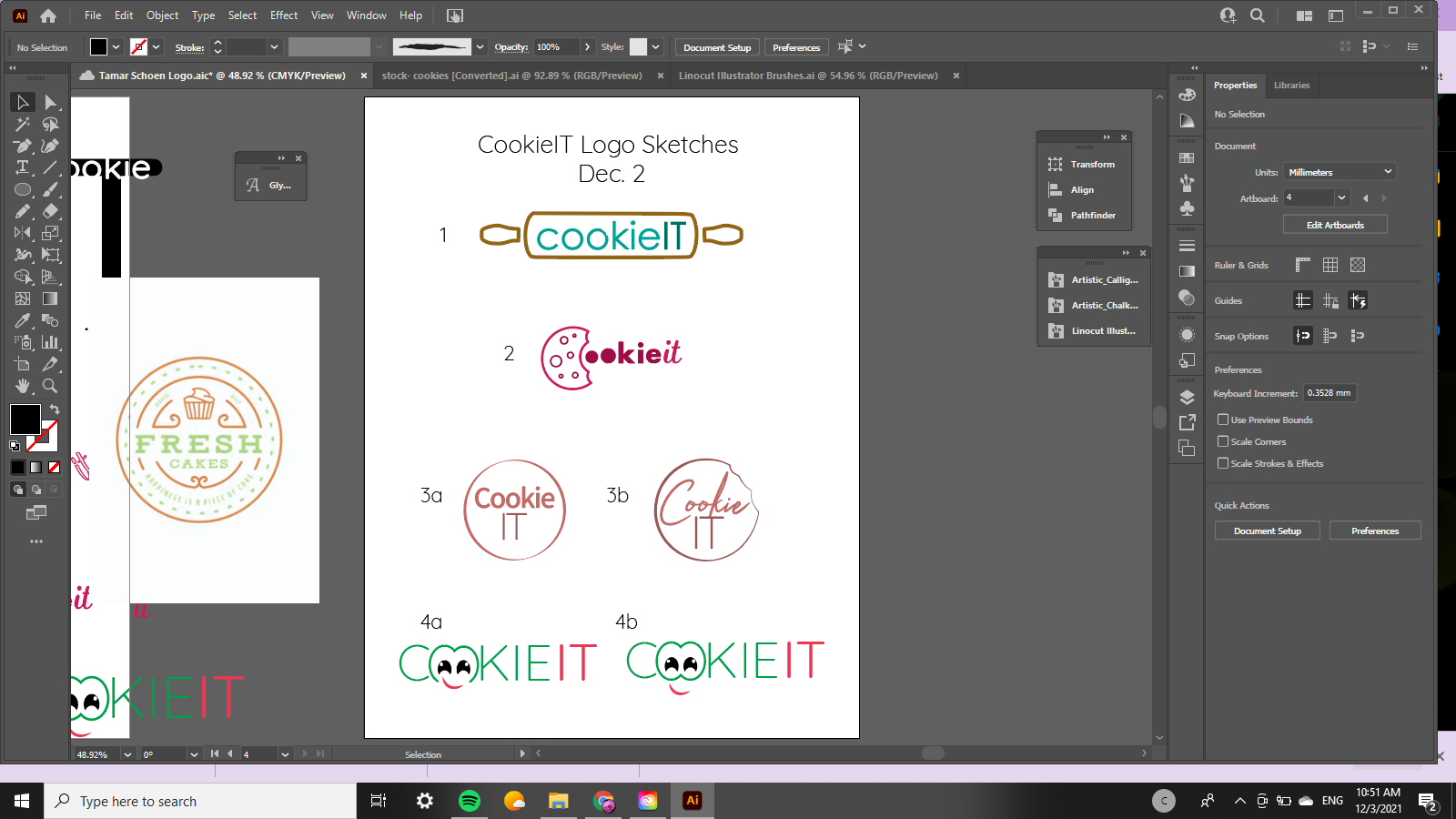
I’m creating a logo for a cookie business that’s being called cookieIT (it stands for the names of the owners and they think they want it capitalized but for sure can be changed)
Here’s my rough rough sketches that need major critique ![]()
All advice welcome!
and I also would love if anyone has another one or two ideas (of like diff. concepts so I could send her some variation)
Thanks in advance!
Shani
Nice start!
Are they selling anything else other than cookies?
Maybe brainstorm a bit more on paper. Research other bakery type logos.
Do they want it to be more child friendly? Modern?
Anything special about the cookies they sell?
Of course you can always try making the O’s into cookies. The C into a cookie with a bite out of it…
Rolling pin, choc chips, oven, yummy…
just throwing ideas out there:)
Can’t wait to see what you come up with!
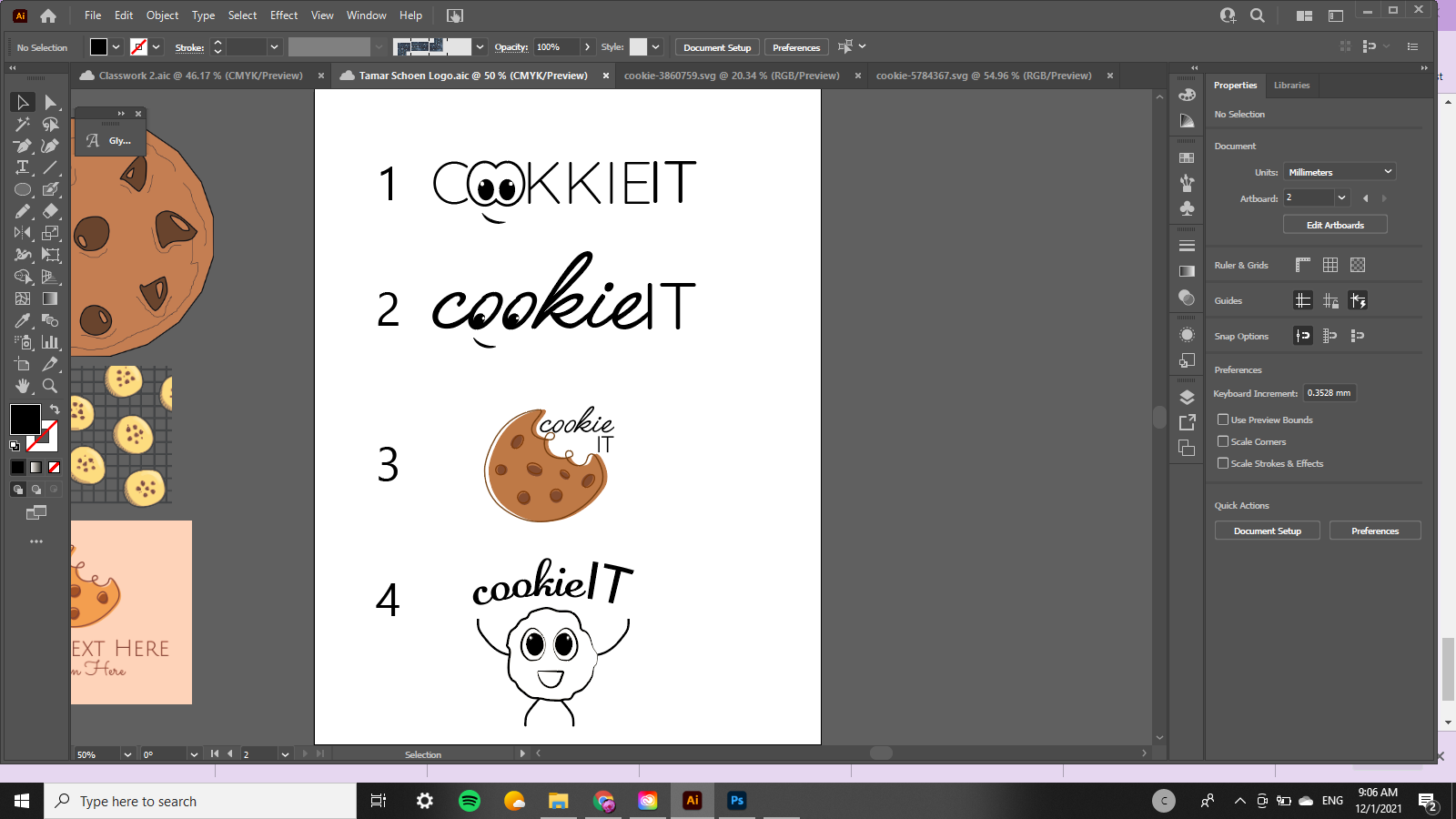
These are adorable. Just want to point out that in the first option you wrote it with 2 'k’s. 
you might also want to keep in mind that logos for food businesses should be easy to put on labels/cards/packaging…its usually best in these cases to keep the image part of the name of the business (option 1,2) rather than having a separate object ( option3,4)…
thank you!
The logos you have here are nice, but they have a fun kind of look and I think you need to show the client some varied styles - fun, clean, sophisticated, modern…etc.
One idea I had was to take the initials I,T and make it big and then have the word cookie either cut through the letters or underneath it…
Good Luck!!