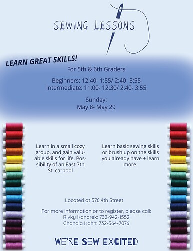
Great Start! I would use more defined boxes-Like instead of feathering the dark blue area maybe make it a round rectangle. Also, I would take hyphenation off of the middle 2 paragraphs and maybe put a light line between them. where it says learn great skills, I would maybe round it around the rectangle if you add one on or make it straight…
Cant wait to see the updated!
I feel like there is no exciting focus to pull the viewers attention. I suggest getting a nice close up picture thats sewing related and make that as your main focus.
I also think there are so many groups of text - you can organize it more. Take “for 5th and 6th graders” and put it under “sewing lessons”
Then underneath that should be your new sewing picture and have under that the two groups of text “Learn in a small…” and “Learn basic sewing…” - A line between them is a good idea as @Ahuva suggested.
Underneath that put the rest of the info such as : “beginner: 12:40…Intermediate 11:00…etc.”“Located on 576 4th…”
Then under that, you can write “for more information…etc.” - maybe put it in a box as it looks more “trendy”
and then the “we’re sew excited” - maybe slant it to the right or keep it straight depending on if you round the words “learn great skills.” - I would round it near the picture.
You can also keep the threads along the side of the page (although it might look better along the whole page since its dividing the page half half) but maybe make it very transparent - you could also take if off if it is competing with the main focus…
I hope I am clear enough.
Good Luck!!
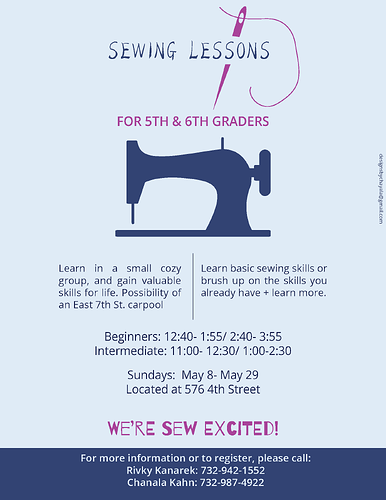
Here’s an updated one. I couldn’t find a picture that looked neat enough- so just stuck to very simple. Do u think this is better?
Thanks so much Breindy and Ahuva! Really made a difference and thanks for answering right away!
I think the organization is much much better but I think it could still use some more color…
You can check out these links to see if any of these pictures appeal to you…
Sewing images from Freepik
Needle and thread pictures from Vecteezy
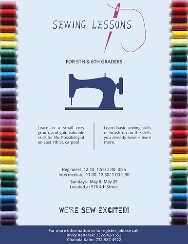
If you still can’t find from here or from any other place, I think you should put the spools of thread back on the sides (full length…) and if the picture isn’t big enough to extend the whole length - then just double the pic
Whats’s the font size btw? the info “beginner - 4th street” looks a little big - maybe make it a little smaller
Looking much better!
I liked the purple you had on the words “for 5th and 6th graders” and “we’re sew excited”


