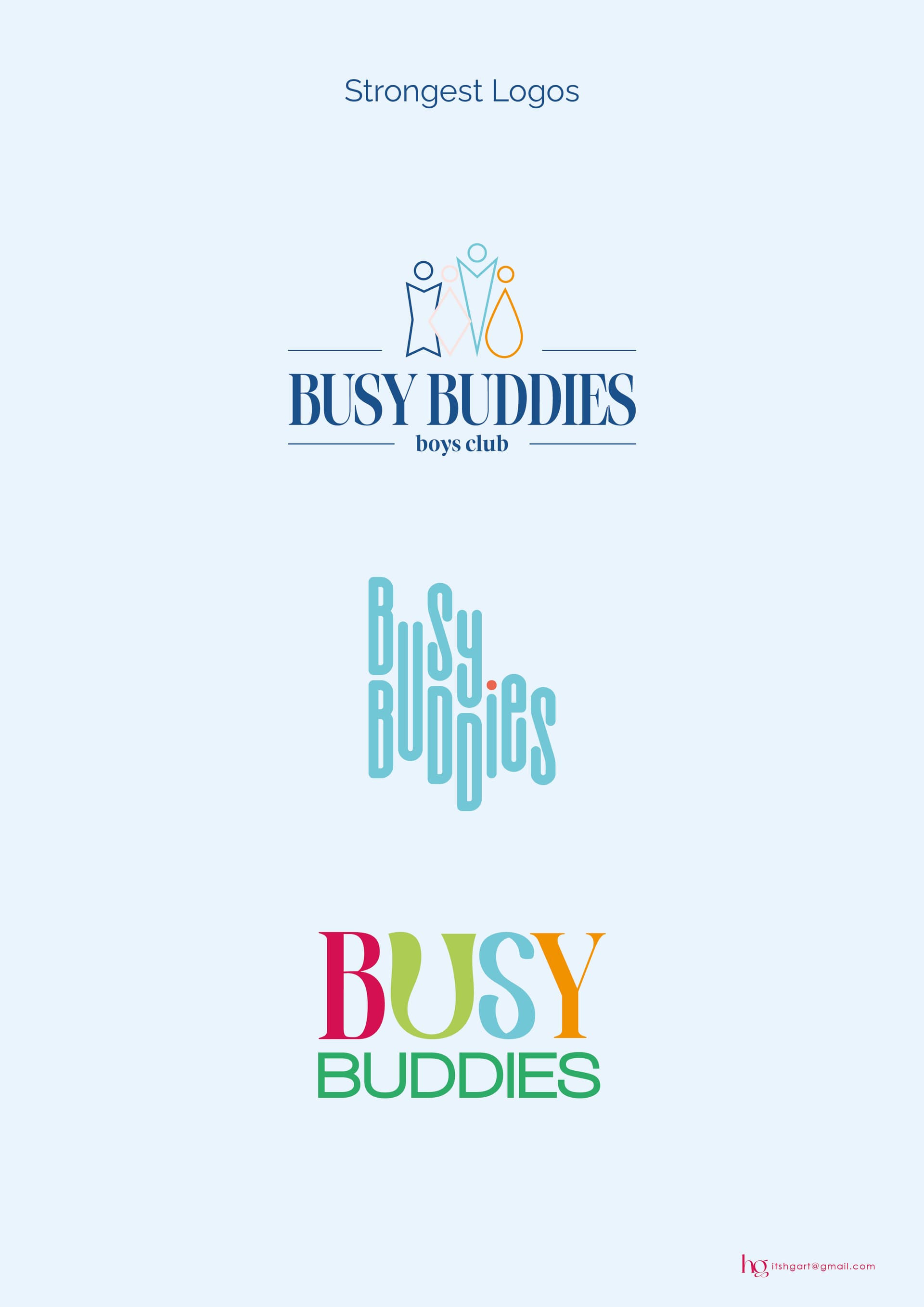
Hey, this is a logo for a Boys club, (ages 3-12).
I’m want some critique, and struggling to decide on how to colour it…
(ignore the bottom right)
here are also previous concepts, if you think they are better.
Hey, this is a logo for a Boys club, (ages 3-12).
I’m want some critique, and struggling to decide on how to colour it…
(ignore the bottom right)
here are also previous concepts, if you think they are better.
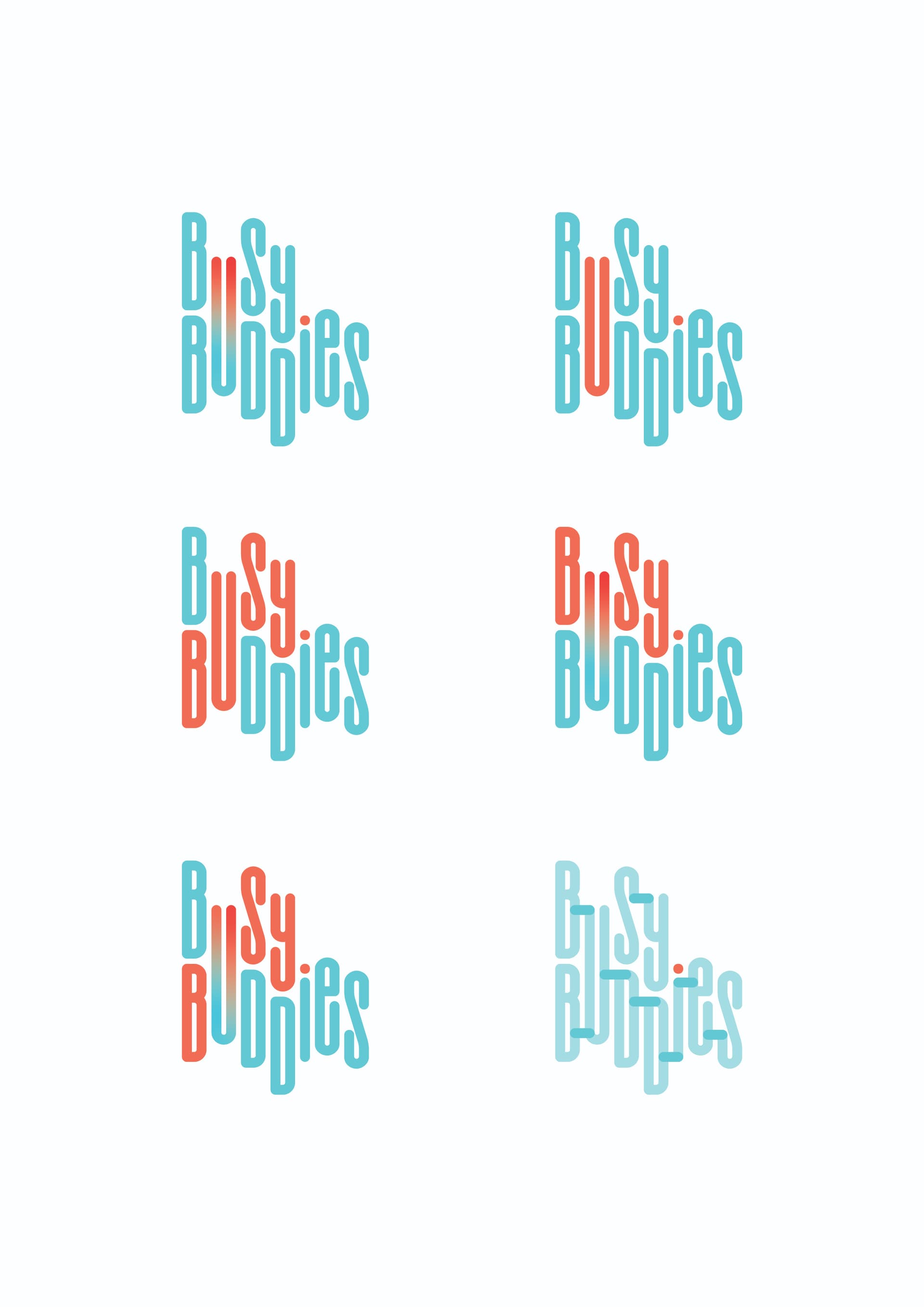
I’m wondering if the concept is too sophisticated for boys age 3-12!
I would stick with serif-bubbly fonts, and maybe do the concept of what you’ve done on the colourful one on the previous concepts.
I love it! My favorite option is the middle one on the left. Fits the vibe perfectly!
They want slightly sophisticated logo, will probably have it illustrated for the kids version…
Yup, also like the middle one on the left!!
it’s really good! im just wondering if you can make the letters slightly wider it might be a bit easier to read especially when small…
The one with Busy fully in orange is excellent!!
Yup, agree with that! Otherwise great job!
Thank you for advice, going for second left. will update when i finish rest of project…