HELP!! What do you do when your client gives you very, very little info about the ad they want. This is everything. I have no direction from her.
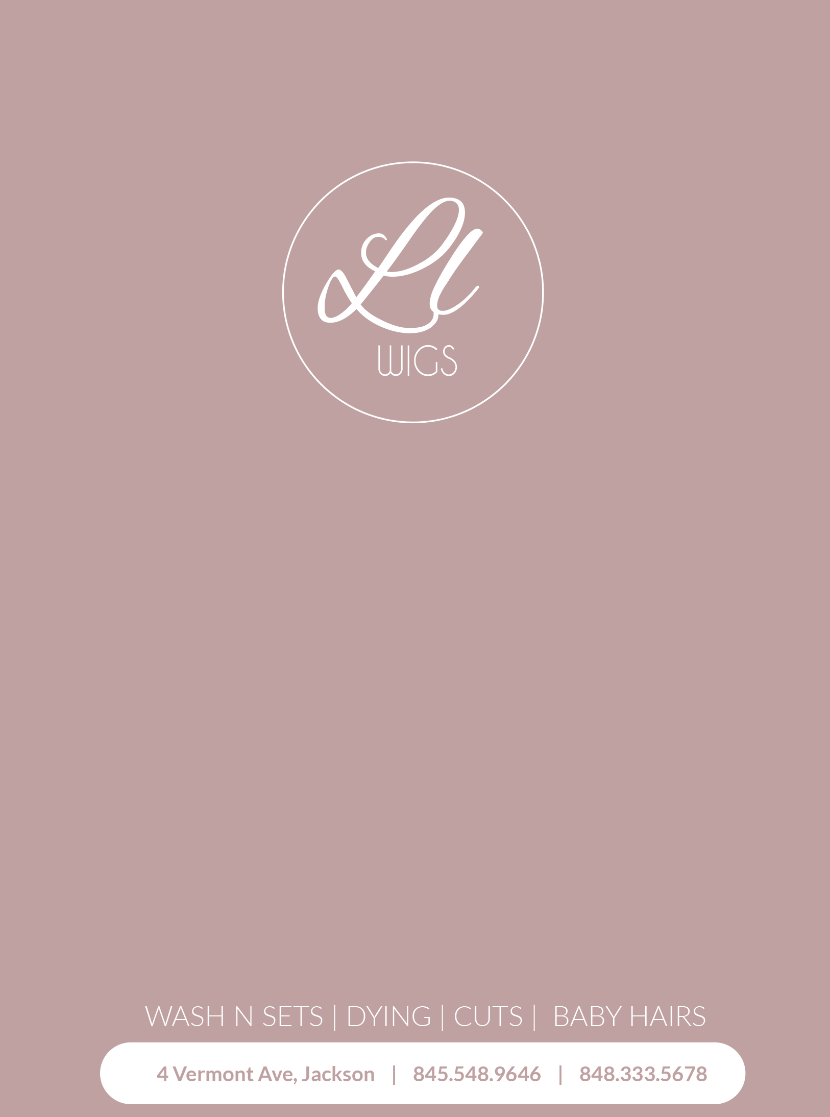
Im looking for something to add but im not hitting on it…
HELP!! What do you do when your client gives you very, very little info about the ad they want. This is everything. I have no direction from her.
Im looking for something to add but im not hitting on it…
Ask your client for a slogan. You need something to fill the middle
If she doesn’t give you one - make up your own (Here’s some I thought of - Styled just right, look good - feel good)
You can find pictures of a blow dryer, scissor…etc. - and maybe put on 3d pedestal
The picture you have is nice and pretty - maybe you can fit it in somewhere depending what you do in the middle
I love the color you used and the layout looks nice so far!
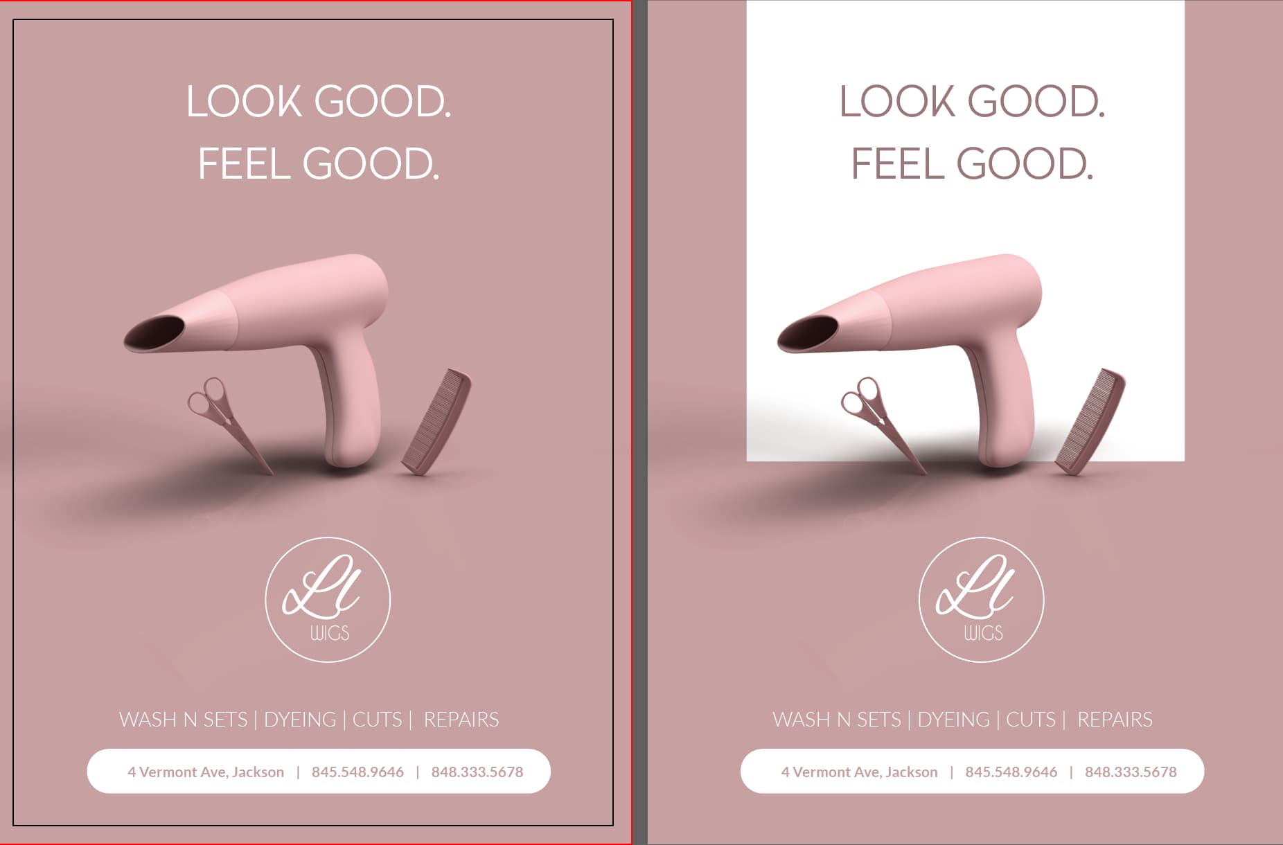
Good so far. I would an image.
what type of image. thats what im having trouble figuring out, should i do a floral kind of image or more graphicy like blow dryer…
I dont think it would go with floral…cuz it looks more like a sleek style – maybe a slight texture in the background…with some slogan like Breindy said or image related to hair/ wigs ? I love how you did the info on the bottom
Hey!
Love the overall idea and the info at the bottom. I like the floral idea, but would make it white and place it toward the bottom. I would also put in ‘repairs’ instead of just ‘baby hair’
I love the colour and the layout so far! not loving the combination with the floral
Dying needs to be changed to dyeing
Yeah I would put an image that has to do with hair. I love the layout so far
I agree with adding an image that has something to do with hair. Also, I would suggest moving the info on the bottom a bit higher up and the logo lower down so you have more even margins
I love love love it!!  I think the second one is better.
Thank you!
Amazing! I love the image.
I vote for the second with the white box
love it!!! looks so perfect… not sure I love the 3 different shapes on the second( square, circle, and info rounded rectangle…) but they both look sharp…
really love it! I like the second, but maybe make it the ends round and pull it down past the shadow of the hair supplies. Great work!
It’s funny, I like the first one but I would make the blow-dryer bigger so it touches the words to make it one focal point
What font did you use for look good? That k is unique
Another vote for the second! 
I hear that, would you take out the scissors and comb as well or leave them all in just make a drop bigger?