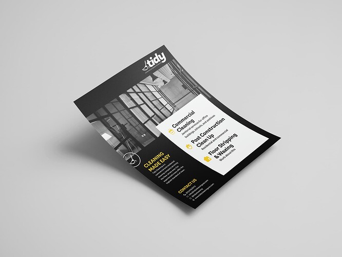
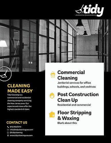
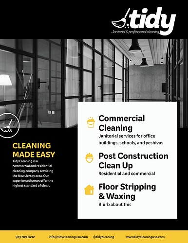
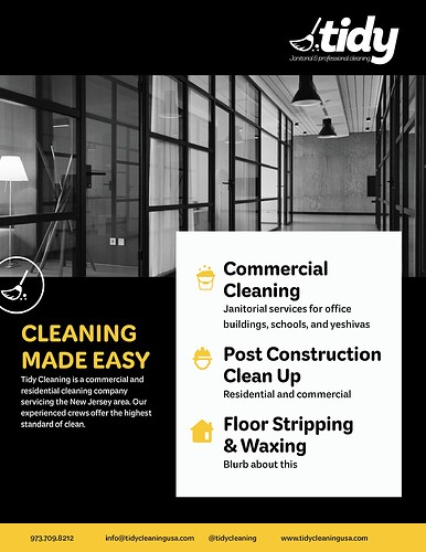
If anyone has any feedback on this. Still waiting for some of the text from the business so I put in filler text for now.
1 Like
Great job!!
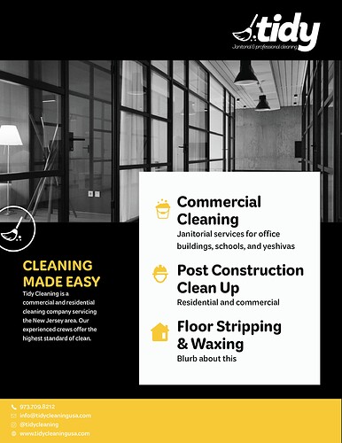
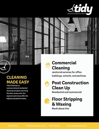
Maybe try the contact us along the bottom in Yellow bar
1 Like
Thank you
I’ll try that
THe contact details should be along side each other
I’m loving the yellow! It’s so fresh!
I would try the title of the advert much bigger than you’ve done it…
Because now the other white box is overtaking - and if I’m understanding right - that should be secondary to the title…
The contact information can be with/without icons and should be in black to increase contrast.
the only thing is I feel like the top looks too empty then
I actually didn’t mean the logo - I meant the “Cleaning made easy”

