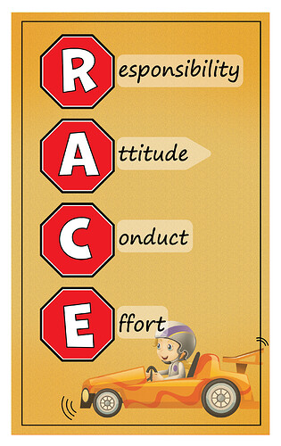
Hi, could anyone be so kind to give critique and advice on this rules sign for a grade 2 class?
1 Like
The only critique I would say, is maybe make the race car boy a drop smaller so that it doesn’t go into the word “effort”.
Other than that - it’s very cute, simple and yet still stands out in a appropriate way and is very nice!!!
Good job!!!
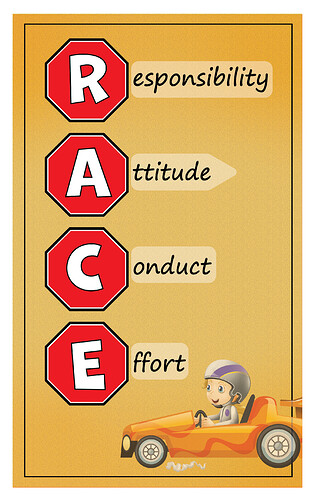
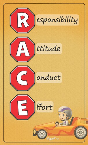
here is the updated version, what’s better the rounded rectangle or the pointed one (arrow) by the words?
I like the arrow! Adorable poster
This is super cute! I like the arrows better too


