Hi! I’m making a classroom welcome poster for someone, and I’m getting lost in my work… the options are endless!!! I find that when I work on projects I spend a crazy amount of time playing around AFTER the job is done just to check if maybe something else might look better… anyone can relate??? I hope it’s just because I’m so new to this…
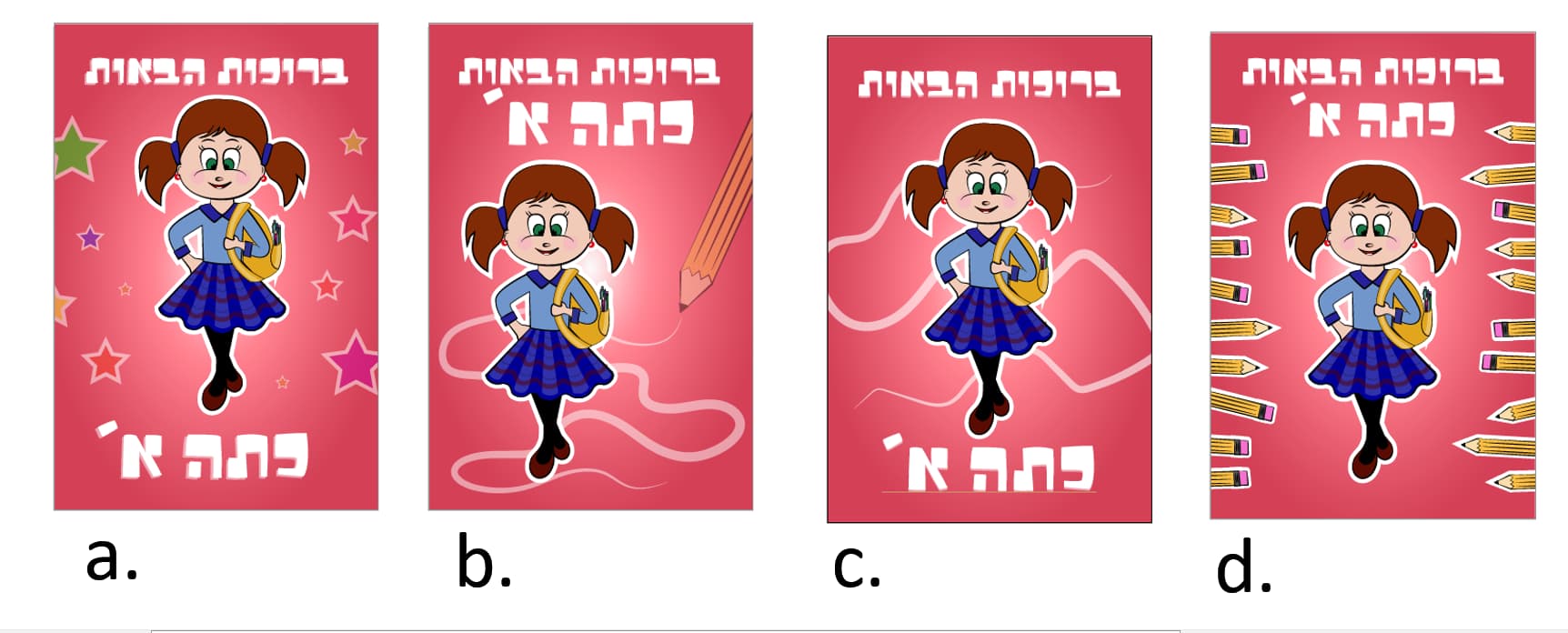
For this poster, I made the girl, added the background and words but now I’m stuck with the layout, I can’t think straight anymore:)! Which one looks the best?Screenshot 2023-07-24 022241|690x275
Btw - I still have to fix many things but first I want to decide the layout
I like the first 2 best- unless the teacher wants to put every girls name on a different pencil(in the 4th) but it looks more Squished to me… love the girl:)
i think that the font should be a bit more roundish, more girlish
Can totally relate! 
Love option D very neat and schoolish
I like B. most. the side angle catches the eye.
I like b the best. It’s full of action.
I vote for B. I like the side angle, it adds interest that its not perfectly symmetrical. Can totally relate to the drive to keep on perfecting my designs! But I think it has to do with my personality… I think that even when I’ll be more professional I’ll still prob be this way…! I happen to like the font. Its cute and funky.
really cute - i say ask kitta aleph girls to vote (i would ask for you if mine was awake)! i like a and b best.
i do not relate to tweaking stuff once already finished!! once it’s done i’m on to the next new thing… maybe personality type but also sounds like a newbie thing coz you have time for it and also you your portfolio matters more… i can relate to taking too long on a creative project though!
Really cute:)
I would say to soften the girls face and make her smile bigger.
I like c. Maybe because the girl is spaced between the words better and its not so busy.
I really like them! I teach second grade so I can relate to the age, try combining the ideas of c and d, the word layout of c, and the pencils of d. maybe try to make the words bigger and the girl more cheerful, I love the pencils don’t like how it looks like knives pointing at her. maybe u can do one for me for second-grade English? 