Hi,
I designed this logo for a day camp CIT program.
They love the concept but they are looking for something more polished/modern/sophisticated.
Does anyone have any ideas to help with that?
Thanks!!
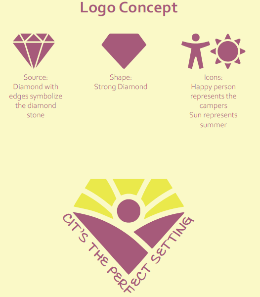
Love how you showed the shapes you based the logo off!
Maybe line style/outline for the icon and sans serif font?
Maybe straighter lines inside instead of rounded?
Brighter colors?
I would also play around with different positioning for the words as I think it’s a bit hard to read now.
Hatzlacha!
The icon is really nice and I also liked how you show the breakdown of it…
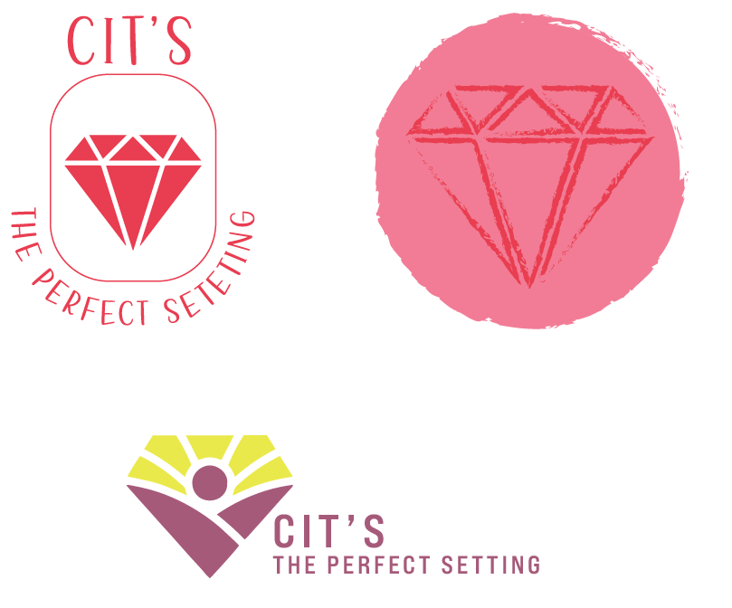
Maybe switch the layout and put the icon on the left and the wording on the right or put the text around the diamond in a circle
yup i agree with breindy. i think it will be very transformed if you keep logo as is but work on the typography - even tho the text as the diamond setting concept is cute but i think would be ‘more sophisticated’ as just lines as a V (if u need to show the ‘setting’ at all) and then the text on the side, maybe a cleaner font or CIT’s in big and ‘the perfect setting’ below in a small clean font.
Also maybe the purple is not bright enough for a camp logo? maybe u can try a super subtle gradient of the colors or maybe split it vertically in half and make a slightly shaded half on one side and lighter on the other…or add a subtle gloss e.g. https://www.wikihow.com/Add-Gloss-in-Illustrator...something to make it come more to life.
May also be worth asking client for examples of logos they think are more polished/modern/sophisticated so you can be on the same page!
Hatzlacha!
Thanks everyone. I will work on it and let you know how it goes…
i just saw this on a bonei olam ad and thought of your logo… this might give you inspiration for a better layout of the text… i love the icon!
Thanks so much!
I really loved the original icon!
Maybe try using that hot pink colour for the person and the text, and maybe also try putting CITs on top of the icon and the perfect setting underneath or in a circle as breindy suggested
yes i agree use your diamond icon with the brighter colors and maybe only two-tones of one color or even one color…
i like the friendly font on top left but not the curvy text on the bottom (also typo on text there)
it may look good on a circle with CIT’s curved on the top and perfect setting on the bottom
maybe look at other logos with curved text for inspo - see below:
Thanks everyone for your input.
I am open to so much!
This is my first logo that’s more official looking… so it’s taking me a while