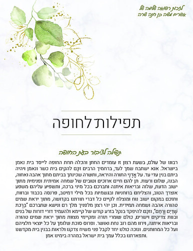
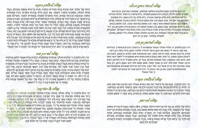
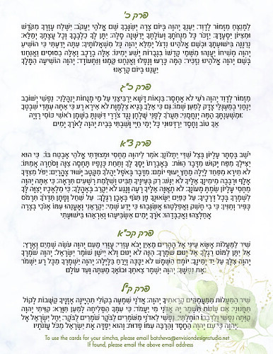
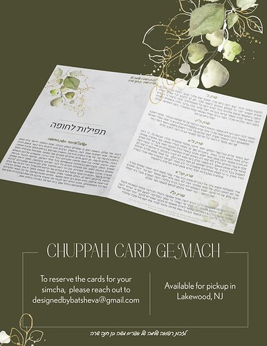
Looking for critique on the cards and associated ad…
Beautiful! I love the whole vibe.
Make sure all of the paragraphs are justified centered.
All headings should have the same space after.
I would add a . at the end of each paragraph.
The leading doesn’t all look equal. Did you justify this vertically?
I really love what you did! I noticed that some tefillos are with nekudos and some without… maybe try doing all of them with.
For the advert I would try changing the mockup to be a card standing upright slightly open, where you see the front and a drop of the middle page…
Really pretty! Double check that everything is centered and justified properly. And you might want to add nekudos for the tefillah on the first page.
On the first page, I would put the text lzchus refuah shelaima… at the bottom. You can move up the actual tefillah to give it room.
The ad is really pretty


