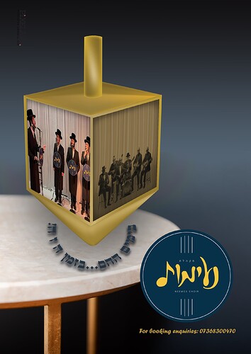
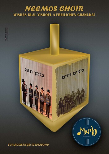
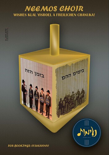
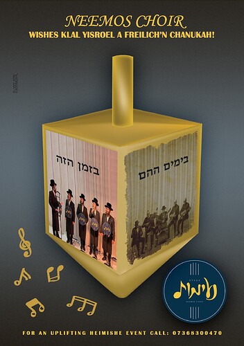
Hi, any idea how to finish off this ad? Seems to be missing something…
I feel like I am critiquing everyone’s work today! But I have time, so I can 
Nice idea!
The perspective of the pictures on the dreidel are off. How did you do them in the end?
I personally feel that photoshop is the best for it. Do you know how to use the perspective tool in photoshop?
Size the image on top of the dreidel where you need it to go. Go to Edit: Perspective Warp. Select the image (click and drag). Press enter. You can then move the corners to the corners where you need them to be. The perspective automatically adjusts accordingly, then when satisfied, you press enter again.
I wonder if the table is necessary… What do others feel?
Do you want to add stars to the background? Slight ones that sparkle? Like a night sky.
Without the table, you can center align the whole page. Just the dreidel middle and center, and the logo underneath. Smaller. The words centered on top and straight.
Thanx so much! I used vanishing point to do it, don’t recall having learnt the perspective warp tool, your instructions were really clear!
How about using the poeple as background image? Squeezing it into the dreidel makes them look less important. Let it be more prominent.
Hi, Thanx for the suggestion, but client speciifically wanted it on the dreidel. any other ideas how to maake it a bit more exciting?
can you combine the two ideas? music instruments and the images? background and dreidel combo?


