Hi I totally got stuck with this design. It’ll be on 3.5x5 postcards going to families in the neighborhood.
It’s a lot of info just plopped down and I think the wording needs some help and it looks pretty boring
And which looks better? with the split boxes or one big box?
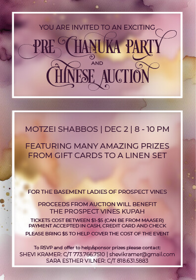
I like the 2 boxes.
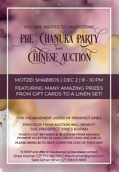
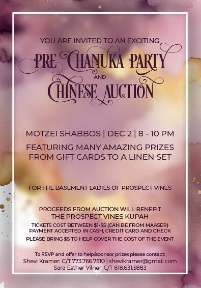
The purple stripe does help a lot. Can you try using different weights for the font to create more hierarchy between the more and less important info?
The purple stripe does help
I don’t like that there are so many glyphs used. I feel like it’s a bit to much - how about by the P of Pre, either the C or U of Chanukah and the Y of Party
Take out the glyph by I of Chinese and either the A or N of auction - just my personal preference…
Also why is the info squished on the bottom - you can totally move it up closer to the purple stripe
3 Likes
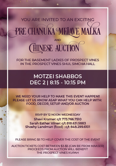
Beautiful!
1 Like