Hi all,
This is a rush job and going to print tomorrow.
Any feedback will be greatly appreciated!
Use your eagle eyes if you can  , because this client wants very neat and aligned, etc.
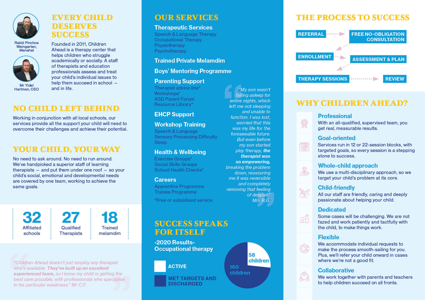
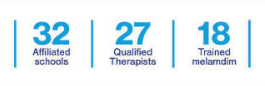
Specifically wondering how to make the row of icons look aligned - I cannot distribute the space between them equally because each item has a different amount of lines after it…
Thanks so much! I really appreciate all of the feedback! Have a great week!
(And yes, I learned from my mistakes and from everyone’s advice and got a template from the printer before designing this brochure!)
Some small changes to back panel:
Nice!
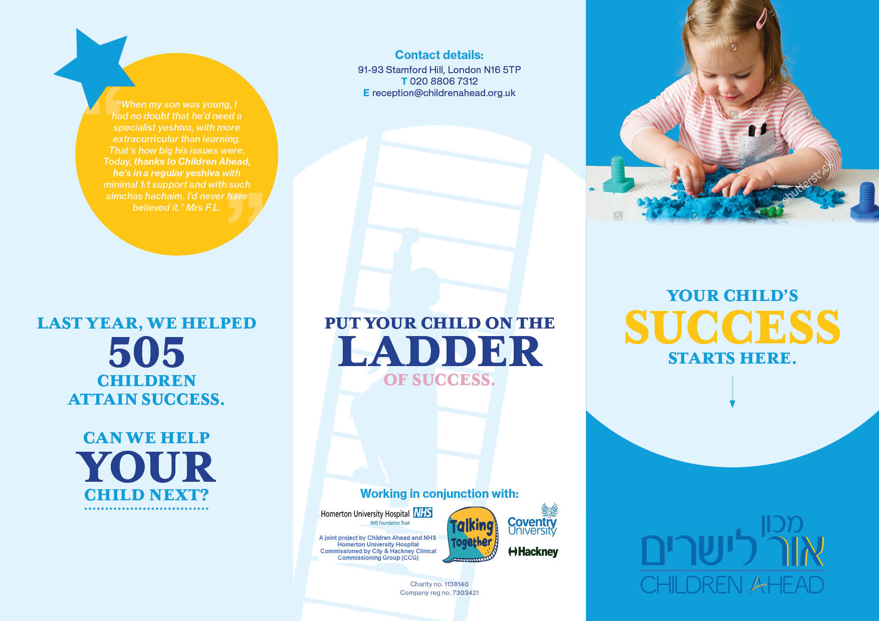
The first thing I am noticing is that the pull quotes are way too long and too light on the colored background.
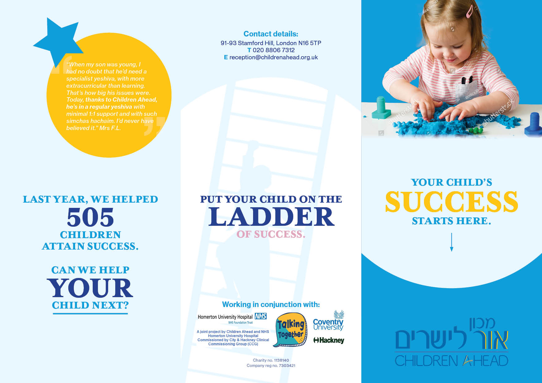
For the “page” next to the back cover, maybe you can move down the group of text “Last year…” and then put the pull quote in the yellow circle. The quotes shouldn’t look like extra text - it’s sort of a “break” for the eye from all the important info…
The icons don’t bother me so much…
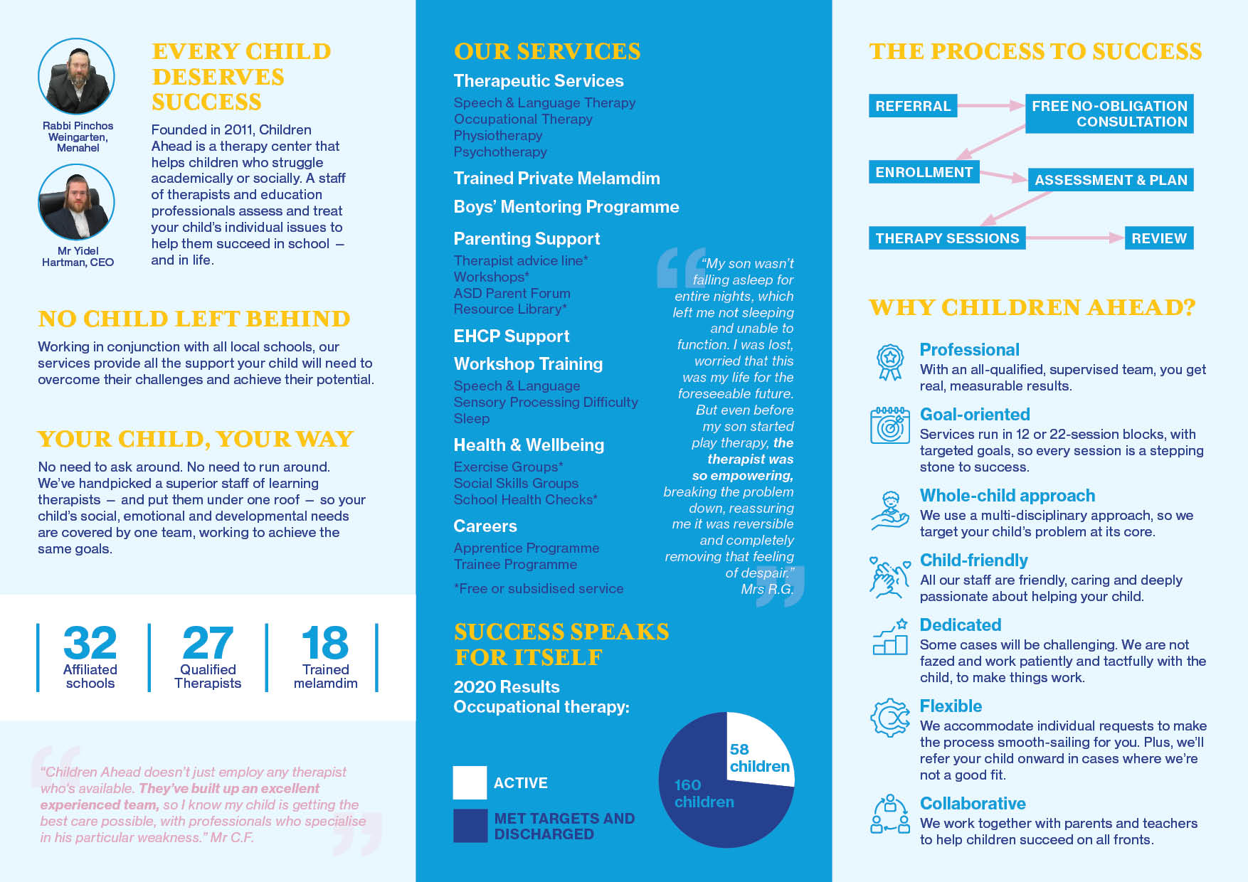
Looks really nice to me! The icons look very neat! Maybe bring the title of the icons list up a bit
Some comments:
- The testimonial on the first panel to the left looks out of place a bit, I would stretch the text box to align. And the one on the middle panel I would do white (or white with low opacity)
- On the next page, I wouldn’t have that yellow circle overlap to the back panel, I think it will look funny in print
- I would bring down the cover title to center align in its circle shape.
Maybe the number 505 should be the same font you used for numbers 32, 27 and 18 on the previous page?
Agree with Breindy’s comments as well
You guys are amazing! Thanks so much!
What else can I fix?
Now I’m also thinking maybe switch the “working in conjunction…” with the contact details… but not sure - maybe its good where it is…
try as much as you can to loosen the leading - it shouldn’t look like body text…
its very good!
This looks to me sqooshed.
add line height and maybe less bold. the lines between can for sure be thinner.
Give the arrows and boxes (on the left top) some space. Dont attach the arrows to the box.
icons can be smaller. Gives it more space to breath.
Thank you so much @Breindy-S @goldie-mezei and @schlomithsassoon for your critique!
Anything else?
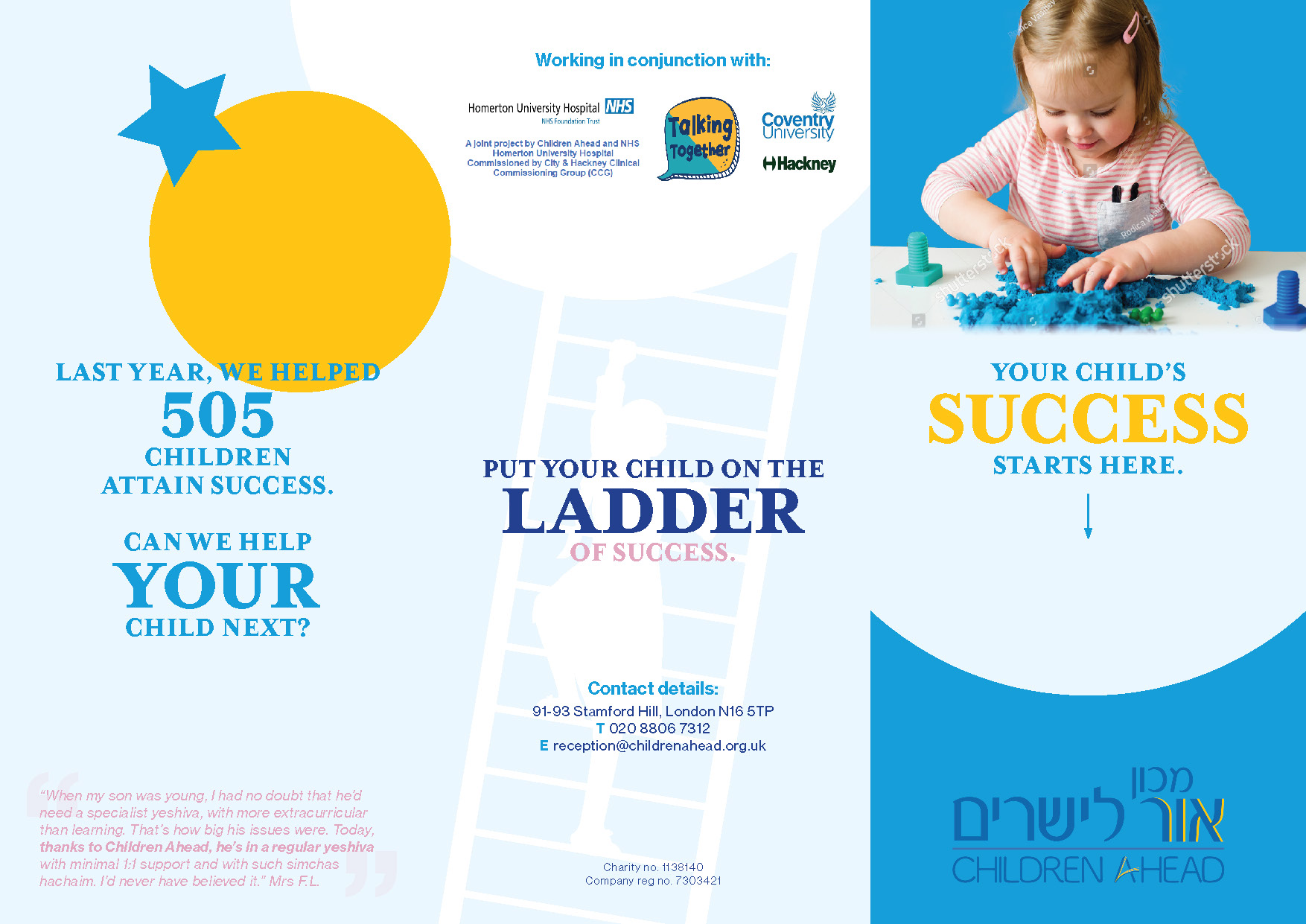
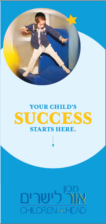
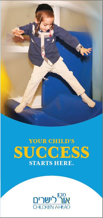
Client gave me a photo for the cover:
Any suggestions/critique?
can you zoom in more?
i keep on looking at the מכון אור לישריםetc title at the bottom. I am wondering if you want to add more contrast instead of the two blues. Did you try a light color font?
Thanks @schlomithsassoon !
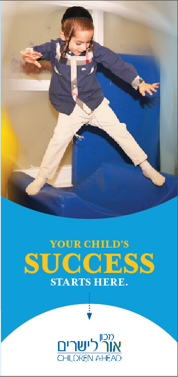
How’s this?
I really appreciate all feedback!
Makes more sense without the arrow?
Chani, you did a gorgeous job! I think you should leave the arrow, it adds a nice dimension.
Thanks so much to all of you!
Getting your input makes all the difference!!
Nice! Did you try keeping the blue background (which blends in very nicely) and putting the font into that very light blue / white?