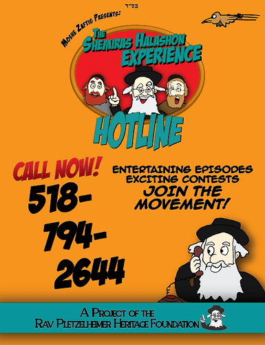
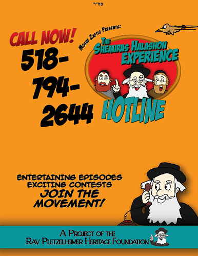
What do you think of this ad for a children’s Shemiras Halashon hotline? Any design critique/advice?
It’s not really going in any newspapers, more for rebbeim to give out to their talmidim…
1 Like
really cute! change the background color to something lighter.
Agreed that the orange is a bit strong, yellow might be better. I know this is just to hand out to the kids but could be a little more organized perhaps if you right align the black text in the middle and group more with the rebbe on the bottom and tighten up the top area by moving the bird closer into the logo with more movement lines and moving the curved text closer to the logo
So child-friendly and fun!!
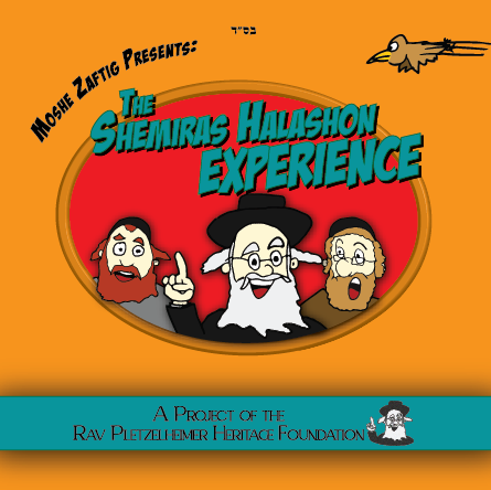
I hear what you’re saying about changing the background color but it’s already kind of part of the logo that they had made. Whenever they send out emails with new episodes they attach this picture. I just copied their colors.
You think I can still change the background color for the other ‘ad’?


