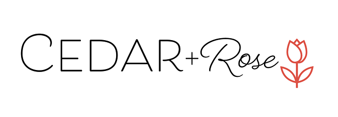
Hi! any feedback on this logo/tag design for a new children’s clothing company? Thanks!
I just realized its not properly aligned…but other than that I guess
I love the concept!
I would make the style of the letters in the word cedar more similar in feel . i. e. either curvy or straight.
I like the rose font. Maybe try the edges of the rose should be less pointy and the line weight should match the word rose wider/thinner.
It looks really good!
Great job! Some suggestions"
- The script font for “Rose” feels slightly thin compared to the “CEDAR.”
- The tulip is nice but sits a bit far from the text try to integrate it with the lettering, like growing from the “e” in Rose or slightly overlapping.
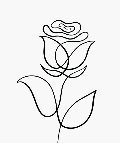
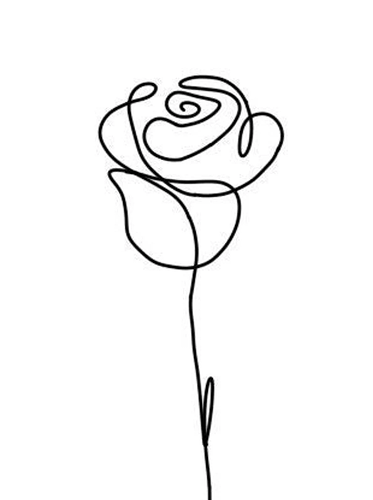
- Maybe use a line art look rose. (see attached style)
I’m not sure what kind of look you’re aiming for, something more high-end and boutique, or playful and childlike?
Overall, the logo does give a very gentle and child-like feel - great for the look you’re going for!
Personally, I recognize these fonts.
I would suggest customizing the letters a little or adding some glyphs to give it some more personality. I agree with what others said about the two R’s clashing.
I love the lettering. Maybe increase the size/letter spacing of rose so that it’s a bit more balanced with cedar?
I would use just the type on its own as the main logo, and then incorporate a rose in the secondary logo, something more rounded or with more personality as others mentioned above…
Just adding my opinion to the mix ![]()
Love this idea!
I agree with all the points suggested.
Just to add another opinion…
I think that there is not much contarst between the 2 fonts - they are both the same weight, same size and same colour, so it feels a bit much…
Could you maybe make the CEDAR more bold or the word rose the same colours as the rose icon?
Agree with mentioned comments, specifically also that there is not much contrast between the 2 fonts, make the difference look more intentional.
Also, it feels quite long to me, dunno if this is bothering anyone else. If you keep it this way, make sure you have another lockup variation that stacks the 2 words.


