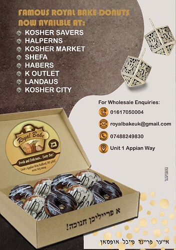
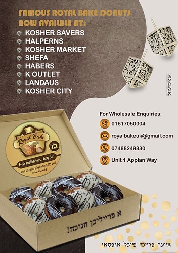
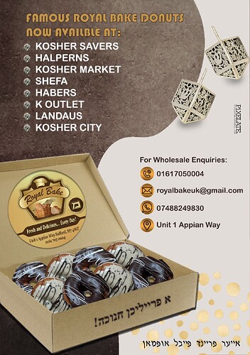
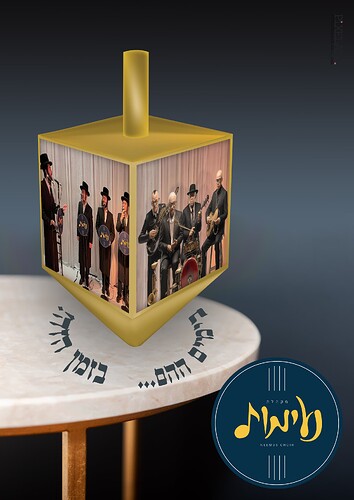
Hi, Im designing an ad for a wholesale bakery, and am looking for general critique on the ad; and specifically for the dreidels. Does it look better with or without the shadow?
I think it it looks better with the shadow but you should make it less harsh
Looks really nice! Yes I agree, with the shadow is better  Hatzlocho!
Nice job
Can you try to find a more contrasting color for ‘famous royal bake…’?
Nice ad! I prefer it without the stroke, but still think those words need a bit more contrast.
Also, just change spelling to ‘available’.
Beautiful ad! I would use a different font for the famous Royal Bakery, more matching to the words below. I would also make all this text a bit smaller, so it fits more inside the margins.
For icons below wholesale inquiries, I would use a solid color instead of a gradient.
Thanks, didnt notice that spelling mistake!
Thanks for your help!
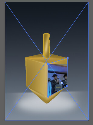
Im trying to position a pic on the dreidel, but when trying to do it with direct selection tool in illustrator, it just moves the bounding box, cutting off the picture. Any advice on how else to get the picture onto the dreidel?
TIA
You can try in photoshop with the perspective tool
I think you should change fonts, download some trendy fonts, (not those that come already on your PC).
agree about fonts. The famous royal bake needs a totally new font choice and the list of shops should be smaller with adequate contrast between the list and txt above it. Also move the Pixelate to a less priminant place and it should be smaller. Why 2 hebrew fonts and the curvy shape needs to be more gradual and less bumpy as it looks unatural.
But since its chanuka trw im assuming it went to print as it was 
