Hi, I was having a really hard time coming up with a concept for this advertisement.
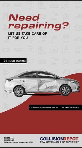
Here’s a very rough draft of an idea I had.
Still need to photoshop the car better.
Would love to hear some feedback!
the advert has a very flowy look (rounded edges), try more sharp, broken, spike edges
I think there should be some clear “division” between the crashed part and the fixed part, so that it looks more obvious.
It a little bit looks like the front of the car was crashed but the back wasn’t… not necessarily obvious that it was FIXED
Oh wait lol I didn’t even notice that. My intention was to just show a crashed car!
Which makes more sense to be the crashed part? The front or back?
There is a lot of extra space, can you make text bigger to pull it all together?
I would “repair” the back - looks easier to do in photoshop
Any thoughts on this?
Also I just added an oval for the shadow under the car. What’s the best way to add the shadow to the car?
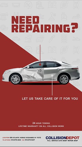
I would maybe put the diagonal the other way?
So that the damaged car is sitting on the grey and the fixed car on the red…
So what I did was on the grey there’s a very faint pattern with repair symbols. I wanted the repaired part of the car to be on that.
Maybe try putting the pattern on the red?
I just think that the damaged car should sit on the half that says ‘Need repairing?’
So you could either flip the car or the diagonal…
I think you did a great job showing the broken and fixed!
And I love the idea 
The oval is ok. make it longer- it should almost be as long as the car.
Bring the red line closer to the words. It’s looking a little lost.
I wonder if you should make the car bigger even though it will go off the page. It seems squished in there.
Watch out for the margins in the contact info.
I feel like there is so much space that you can make the bottom info slightly bigger and move it all up a drop.
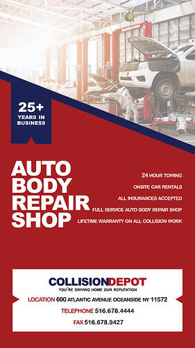
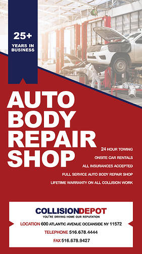
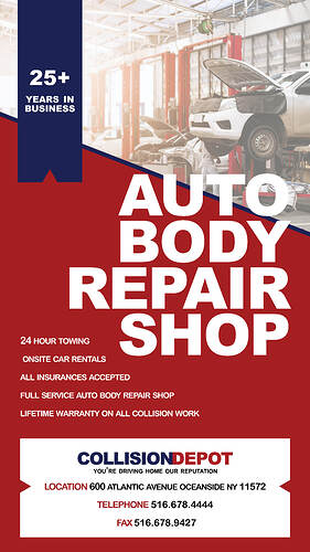
The client didn’t like this concept. They wanted to mostly advertise the information of the company. Would appreciate some feedback on this! Thanks
can you move the small text a bit lower (24 hour towing…)
yes.
Very nice! it’s missing a comma after Oceanside
So sharp!!
Some suggestions in case it can help:
-
The blue banner can be all the way at the top
-
Headline could be much larger to add contrast, maybe even going over the colored section and into the picture to bring it all together
-
I wonder if the list would look better left aligned
Blue banner shouldn’t be bigger, just move the original one up. And then I would do all the text left aligned if it fits in properly. I think I like the overlap 
