
Any critique for this ad?
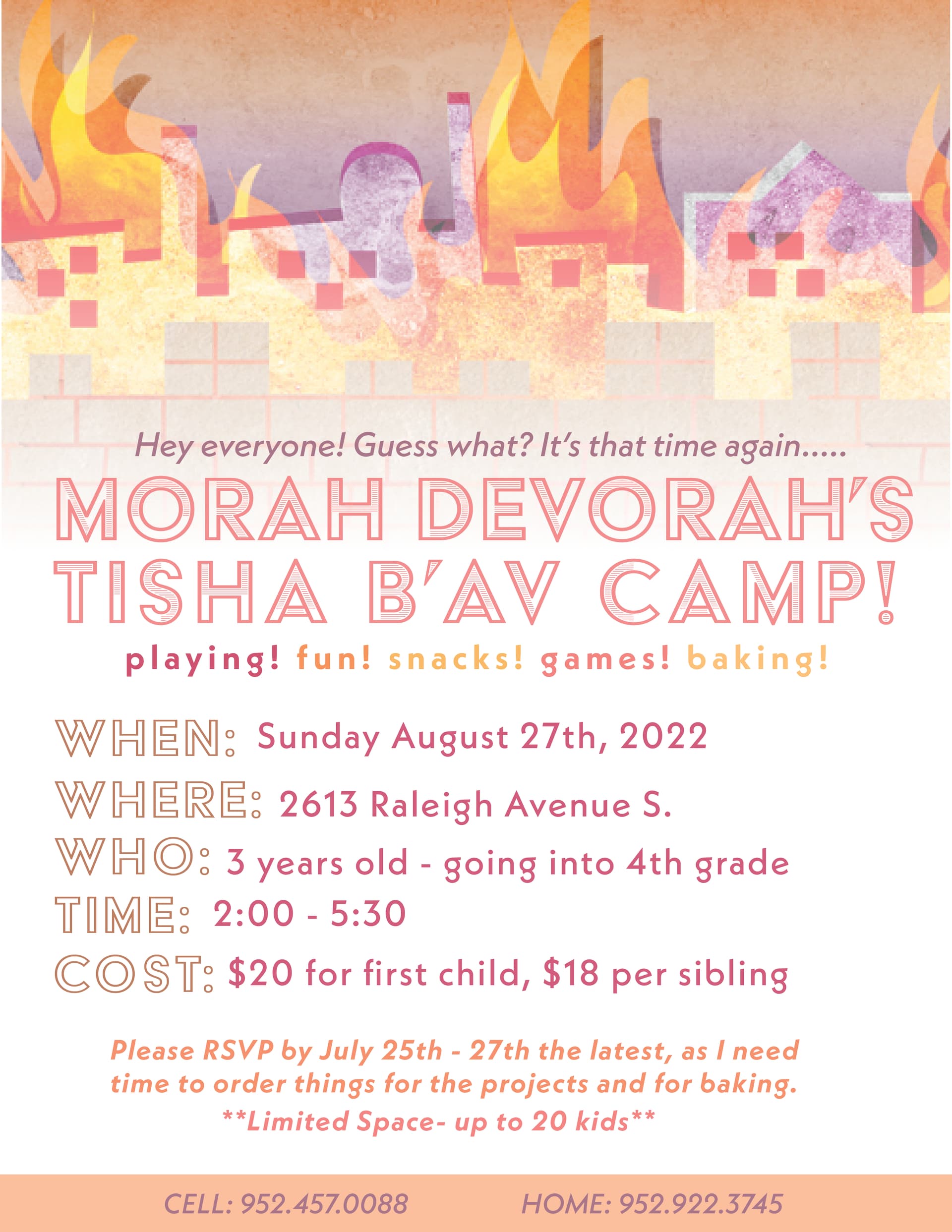
Love the beis hamikdush on top. I would just make the text a bit smaller as its taking up the whole space
Really nice! Just think the date is wrong - tisha bav is 7th august not 27th…
love the image on top… just wondering about the wording- if that even has anything to do with you - but I would tone down the fun playful language on top -ie; " hey everyone…" right under a burning Bris Hamikdash seems off to me… “its that time of year again…” doesn’t seem so appropriate for Tishah Ba’av. I know it has to be exciting for people to sign up… but could there be a different way to give that feel …?
Beautiful top!
I agree with chayala.
Is there anyway to make the wording more “hashkafically” in touch with the day?
As much as we mothers may need our children taken care of while we’re fasting we also do want them to “feel” tsha bav
You can probably just take the top text out - it’s fine to say Morah Devorah’s Tisha B’Av camp…
What’s bothering me is that the middle text is so squished. I also think it should be centered (as well as the paragraph underneath about the RSVP)
other than that, it’s great!
@adinacahn and @chayala thanks! I actually agree with you about the wording, but it has nothing to do with me, and the client is not really the type that would agree with a suggestion to change the wording  and @breindy, thanks I made the spacing a little bigger/made the words a little smaller…
In that case, we go with the client 