Hey I’m working on this double sided business card. she wants her electrolysis business on one side and her makeup business on the other and she only wants to put the info once. what can i do to mae these look a little better and more up to date?
Bumping this up
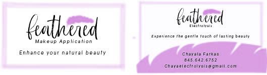
You can try putting the contact info horizontally (across one line) in a purple bar across the bottom and then put a white feather as “bullet points” before her name, number and email
Then you can have both logos equal size on each side of the card
Also, do you think you can use a different colour for 1 of the logos, so people should realise it’s 2 different services
Right now at 1st glance it looks like you’re just repeating the same thing
1 Like
I like these ideas! Thanks!
Hi! This is what i came up with to try to make the 2 sides look different.
I was wondering if i can get some critique on the design and wondering what yall think of it!
thanks!

Maybe bring out the word electrolysis and makeup application so that its noticeable that its different service.
You can try making it bold or different color.
background looks great!
@miriam is right. You can put the words on top of the card and the logo a bit smaller.