Business Cards Design

Hi!

I’m designing business cards for a company’s employees.

Does these designs look good? I want to give the employees a few options to choose from.

For the first one, the contact info at the bottom is 6pt. Is that too small?

For the vertical ones, I plan to add icons by the contact info.


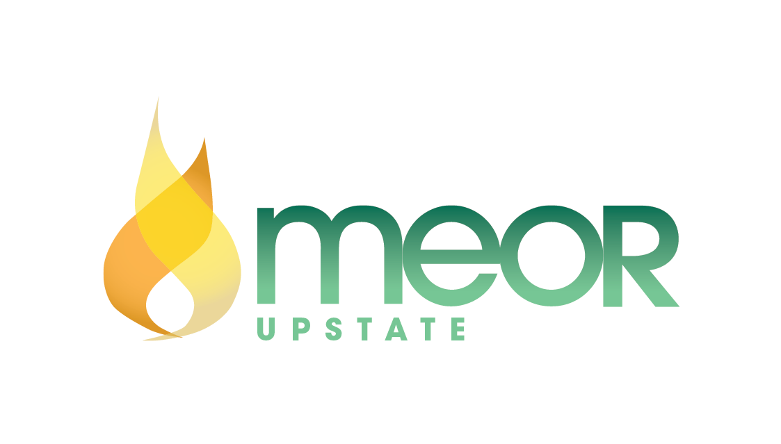
These are really nice! What about an option where you have the logo on white with the green background for one side and then the info the way you set it up with the flame on the front?

nice, did you make the logo too? i think 6pt ok for a b.card

Thank you so much!

I didn’t create the logo. I’m just redesigning the business cards.

This is the design they ended up choosing. Do you think it’s better with the employee name smaller or bigger?

Also, do you think I should put something on the back, like the logo? Or it’s good as is?

i like it as is
re double-sided or not, some ppl say it’s good to leave blank so ppl can write on it
normally it’s same price to print both-sides and clients want double-sided so i just put the logo (and tagline if they have) on the other side.
i guess a compromise is what you did to have the logo on a white background coz then they can still write there!!