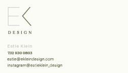
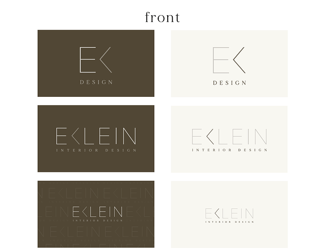
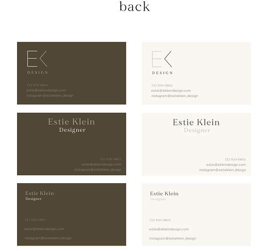
Hi, any critique on this card? is it too left heavy?
I think it’s very nice and classy.
It is interesting that the “K” without the line makes it an arrow pointing to the left, plus it is on the left, plus it’s a different color than the rest of the logo. So that’s why it’s left heavy. But that’s the logo…
I wonder if it would help to make the backround the letter of the K, and have the K white. (Only on the top one)
Front is great!
The back I would try to balance it a bit better
I would try the back to have side by side or centered. logo on back does not need to be so big
So classy.
Maybe take the design style from the front bottom left, where the logo is the background lighter transparent, and use it for the back and put the info in the bottom center.


