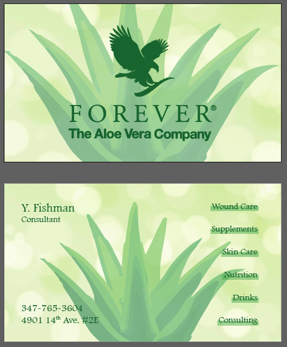
hi i wanted to know if theres anything that needs to be changed
somethings bothering me about it, but cant put my finger on it.
i did want to make the plant in the front one in a faded gradient, but couldnt figure it out (thank you anyways @adinacahn ) so i decided to leave it as is
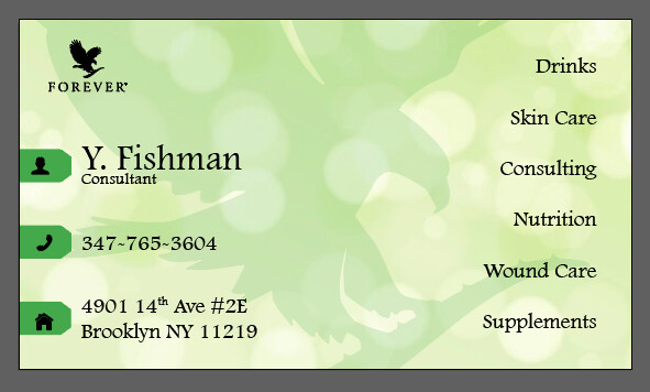
Would you consider adding black for the text on the back? It’s hard to read even though it is a darker green.
Maybe you can fade the entire background on the back too. To help with contrast. And I would recommend keeping the front simple rather than keeping the plant on both front and back.
I’d take the plant off the front. Is it vector or a photo? If it’s vector, I would make it smaller and put only on 1 side of the back, ex. where contact info is now, and move contact info elsewhere.
Agree that the back text should be somewhat darker.
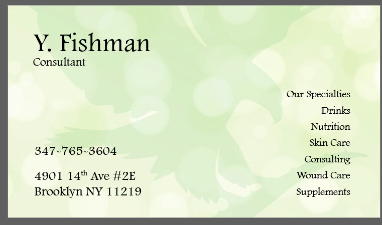
how does it look now?
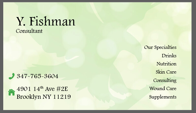
i need all the info on there, and just not sure any other setup, ive tried 3 other ones, and none sit well with the eye…
any other ideas?
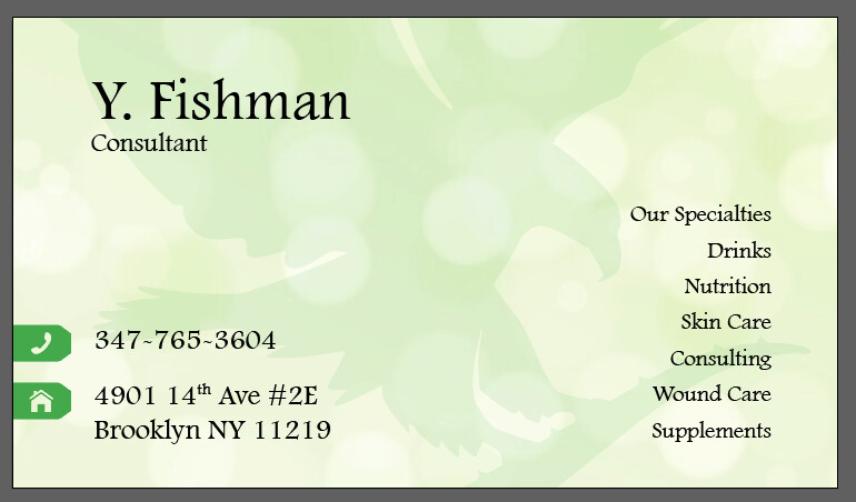
Background is still too busy. Lower the opacity. The name should be much bigger. Title as well. Also the title is stuck to the name - add line spacing.
Then I would group the contact details better. The icons are cute. Maybe they can be green without a background color?
Need better proximity-group info more clearly together into no more than three groups-items placed too far apart feel like separate groups rather than one unit working together.
Overall text is too big and bold…
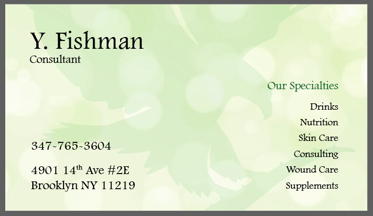
Agree about the first one being the neatest, and that the words our specialties should be separated. Either change boldness or do it in the green color…