A student would love some feedback on which one of these business card designs you like, and any helpful critique would be appreciated!
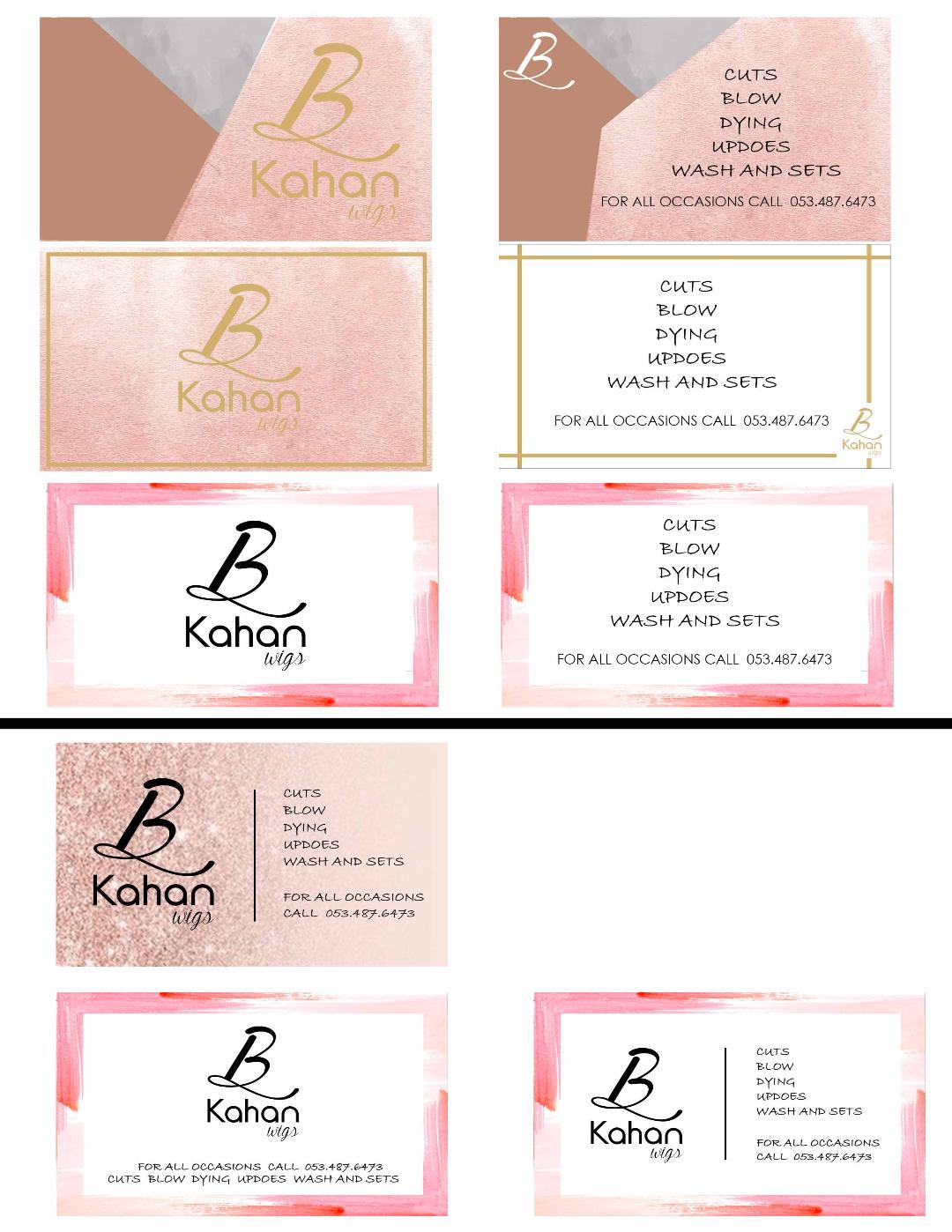
These look nice! Not sure if they are meant to be mixed and matched, because the ones with the texture don’t feel like they go with the ones with the stronger pink borders, so probably you would use a front and a back that “match”. Or maybe you intended the ones on the right to go with the backs on the left…that seems to make sense the way you set it up.
I am assuming that the gold-sh color on the top ones is gold foil or pantone gold…the yellow ochre color itself doesn’t have great contrast with the backgroud. I also feel like the top two are a little too busy in terms of many textures etc., and the one on the top right feels a little awkward the way the shapes are cut. I like the one second from the top on the left side, but the right side seems to be missing something. Maybe on that side, you could eliminate the lines on the top and the left, and just use the two that intersect with the logo. Then maybe the typography on that side could be a little more diversified, perhaps the items more significantly different in visual weight from the contact info. Or maybe experimenting with the alignment on the text on that one would strengthen the typography.
I also like the other sparkly pink one, but would like the bottom two lines to looks slightly different from the other text, maybe a bit bolder, also to balance the boldness of the logo.
For the ones with the border (though I prefer the others), I like best the one-sided one on the bottom right, with the same comments as the sparkly pink one above.
the top ones are double sided- they go side by side.
ok i like those ideas.
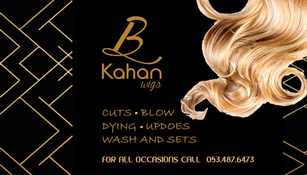
now my client decided she wants a totally different look. she wants a black background with gold or maroon lettering, with a wave of hair going through it.
Any ideas how i can make a modern card with images of hair on it?
this is a link she sent me for ideas of what type of imagine she wants on business card.
I think that would look really nice actually! A black card with gold design…
Can I recommend using a sans serif font, probably in all caps like you have… I feel like as soon as you change the font the whole design will feel more up-to-date
Not sure why you have trouble uploading, you should just be able to click the Choose File link and upload from there, I had no problem with your file. Feel free to send me files via email and I will upload. Black and gold sounds nice, it seems that if you keep the “hair” image illustrative, probably somewhat abstract and “flowy” and stylized, it could have a nice contemporary feel. I agree that the sans serif fonts would work better-Adobe has so many fonts available now that you should be able to find something classy and modern.
I love the one in the top left and one on the bottom right. (I’m assuming it’s front and back.) The colors are gorgeous and overall theme is really nice! For the front with just the logo, I would change to the logo to a darker color as it seems to be getting a little lost among the other light colors. Otherwise, I think the rest looks perfect. Good luck!
just saw in the other comments that you are switching the design. sounds like it will be really classy! please show us the final results!
thank you everyone for all your ideas.
anyone know how i can download really nice pictures of hair?
i have the hair coming from the corner but i would also like to have the hair coming from the top of card near logo towards the bottom left right corner. I haven’t found any good pretty looking hair for that…
how do i get the hair to look neat and sharp/ not all chopped up?
Chavi,
Colors look nice, and I like the pattern on the left side. Good overall unity and balance. I think you could try some other fonts for the items and text below, I think a sans serif would feel more sophisticated and sleek. Also, I wouldn’t use two different fonts, since the card is small and too many fonts feel too busy, try varying tint or boldness instead. At the very least, not two decorative-type fonts, and the ones you chose feel a little outdated, check out the Cloud for a more contemporary selection of fonts.
I think you said you are still working on the hair…if using this one, you would need to clean up the edges more etc. But I was thinking something more illustrative and abstract might work better, more stylized. What do you think?
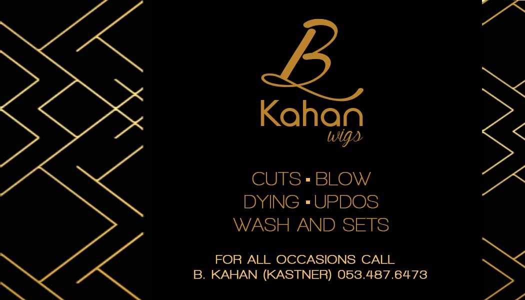
beautiful!! it’s really sleek and classy
Looks great!
nice design.