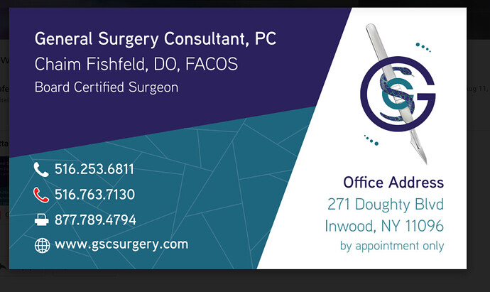
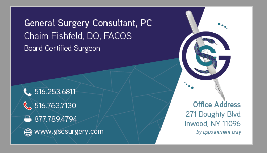
I created the logo and designed the business card for my father in law.
Any critiques?
Don’t really know how much to charge, especially since it family, but he insists on paying…
nice work. i would make the logo smaller it takes off from the address info and/or keep the address info in one color.
Nice! Would create a stronger focal point and hierarchy. Do you want the logo and address to be the most prominent? If so, possibly enlarge logo a bit, maybe even have it overlap and extend out of its “area” onto the darker blue (the top of the tool could overlap) to unify the different part of the card. Then you could bump down the visual effect of the other text, possibly smaller, or possibly a bit transparent so they are less bright etc. As it is now feels a little too evenly divided into thirds. For office address, would make all the same color but could vary boldness or shade to make the subtitle stand out and the by appointment only less prominent. Would tighten leading there as well.
Thanks, great ideas!
Any suggestions regarding pricing?
i would put main info (name and business descrp) larger. contact below can be bit smaller. also are you sure they need fax there? no one uses fax anymore
I like the changes, good visual connection created with the logo! Would make the by appointment smaller or lighter, maybe italics. Would probably make the address the same size as the other contact info so all contact info is the same size and visually connects, his name and info on top would stay the biggest of the info.
The tracking in the word “appointment” doesn’t look the same… There is a space between o and i and it’s a bit squishy.
Otherwise, I think it looks great now!


