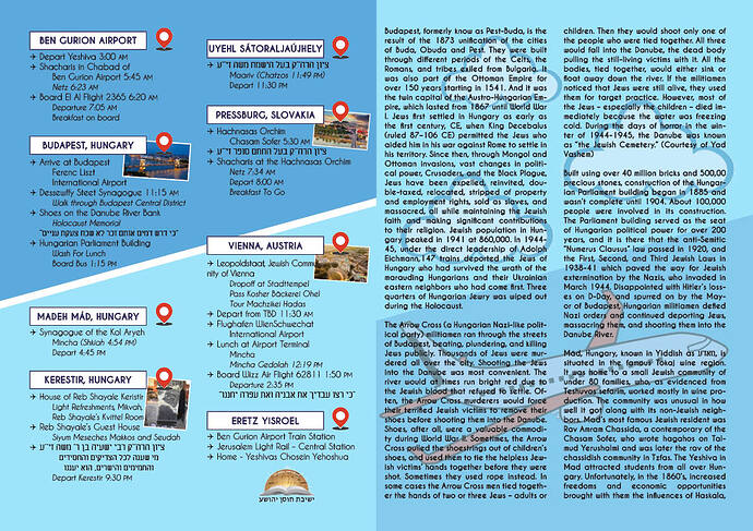
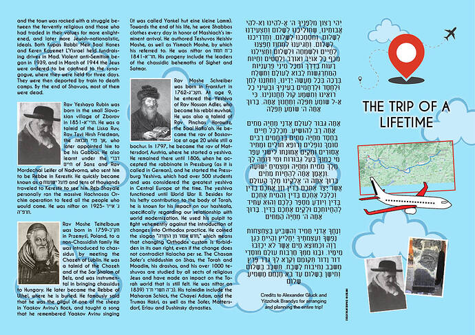
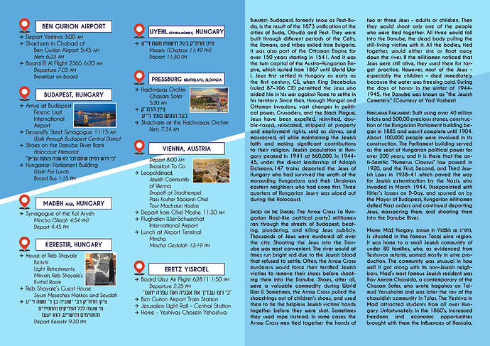
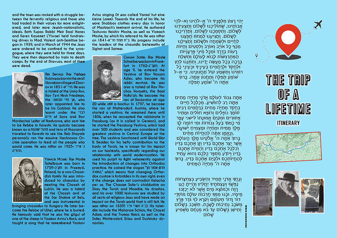
Hi! I am making an itinerary for a Yeshiva trip and want advice and critique!
It is being printed back-to-back and as a 4-fold.
Really appreciate it!
Thanks!
nice… my feedback would be:
- i really like the color scheme, nice and fresh
- i think the location markers should be on left side of each location rather than on right side - then it serves as more of a bullet list and i think would help the eyes flow from one location to another more easily
- front page heading ‘the trip of a lifetime’ doesn’t feel bold enough for something that is the trip of a lifetime, i’d try finding a bolder more memorable font…
- the airplane on front flap feels too ‘clipart’-y… i see that it matches nicely with the location markers and i like the idea of a simple style but that image itself is not sitting well with me… feel need something more ‘quality’ looking for a trip that is probably quite expensive to run!
- i’d write somewhere on front subtitle ‘itinerary’ to give the booklet context
- i like the addition of the images to help balance the large amount of text.
hatzlacha
@rivkah , thanks so much! Great feedback!
Especially when I was working on it for way too long in one sitting 
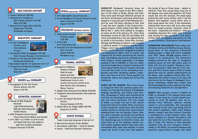
I switched up a bunch of things, especially the location markers (thanks!) which give more of a feel that the Yeshiva wants. They hadn’t given me any sort of direction to go in, but have now given me some feedback on what I had already done and I will send you the updated one when it comes through!
But would still love to hear if anyone else has anything to share 
Thanks so much!
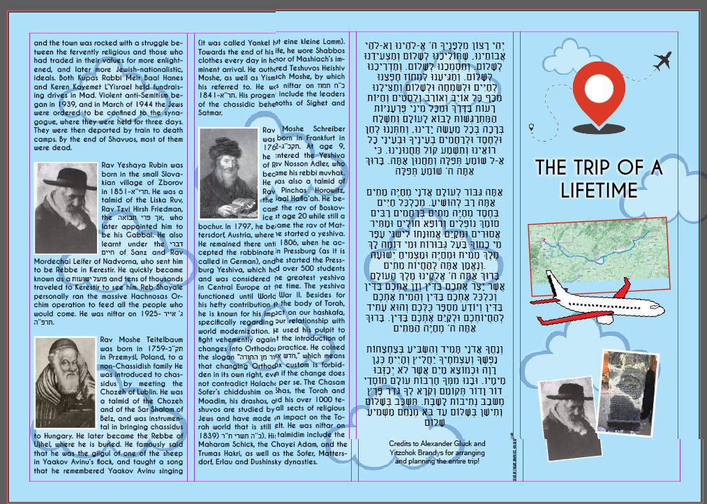
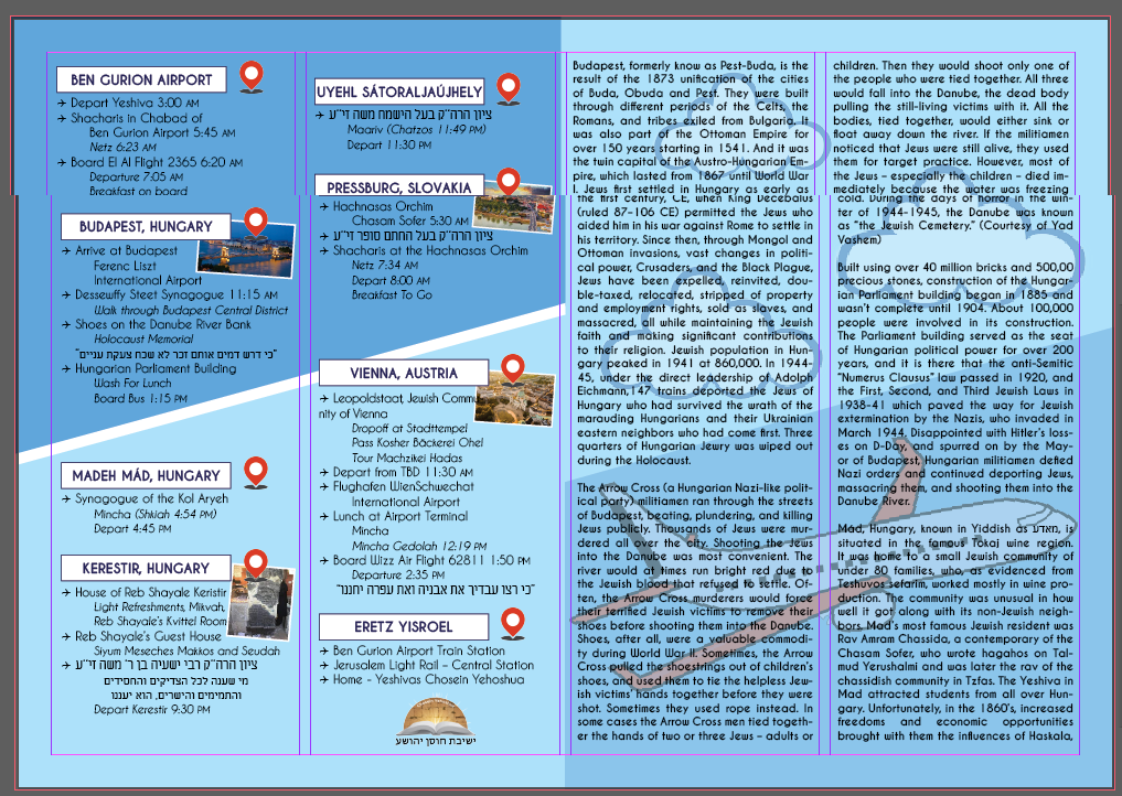
Attached is the itinerary with all the changes that I made (most requested by the Yeshiva).
Any more feedback? Help with the cover would be appreciated!
Also, they asked for ‘a more serious font’ throughout and I don’t exactly know what they want. Any ideas?
Thanks so much!
looking good! a lot cleaner without the images beneath the text. i like that new airplane!
the main body text is very rounded and friendly, i guess they want something more standard… might be a good idea to try a condensed font as then you can fit more text in and have more breathing space…
Looking good!! Its possible that they heaviness of the body font is what’s making it look to them as not serious. If you can’t change that, maybe try looking for a font with serifs but make sure it’s alight so it doesn’t take away from readability.
Thanks!
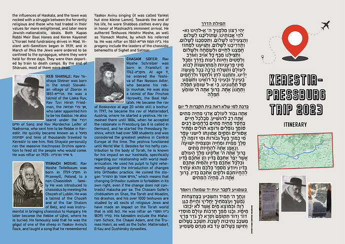
As of now, this is what they went with.
A much more tone down, serious look.
Sending it out in a few minutes! So anything else before I do? ![]()
Looks great - if it fits the client’s specifications you’ve done a great job! And IYH it’ll be of great use to enhance the trip!
Like it. Its light and presents nicely.
