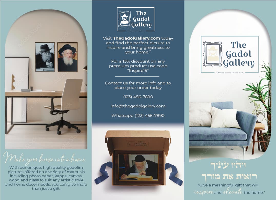
im in the middle of this brochure how can I spruce it up (empty frames spaces will be filled later when client has them)
and he has specific fonts he wants so I can’t change that
I really like it!!!
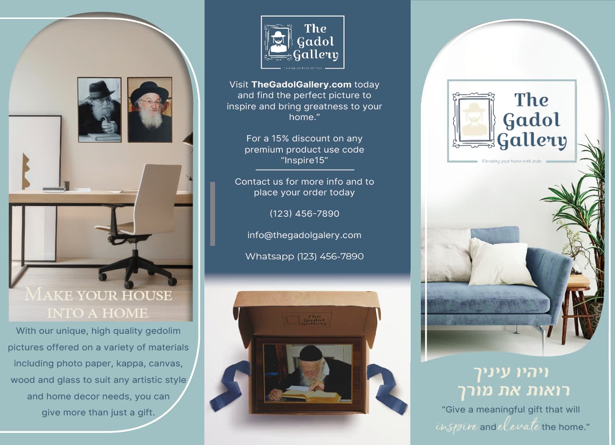
Maybe you can add a white stroke around the shapes, but not attached, make a thin white line going around about half a 1/4 inch away so there is the background coming though.
Not sure im being clear but an idea.
Very nice.
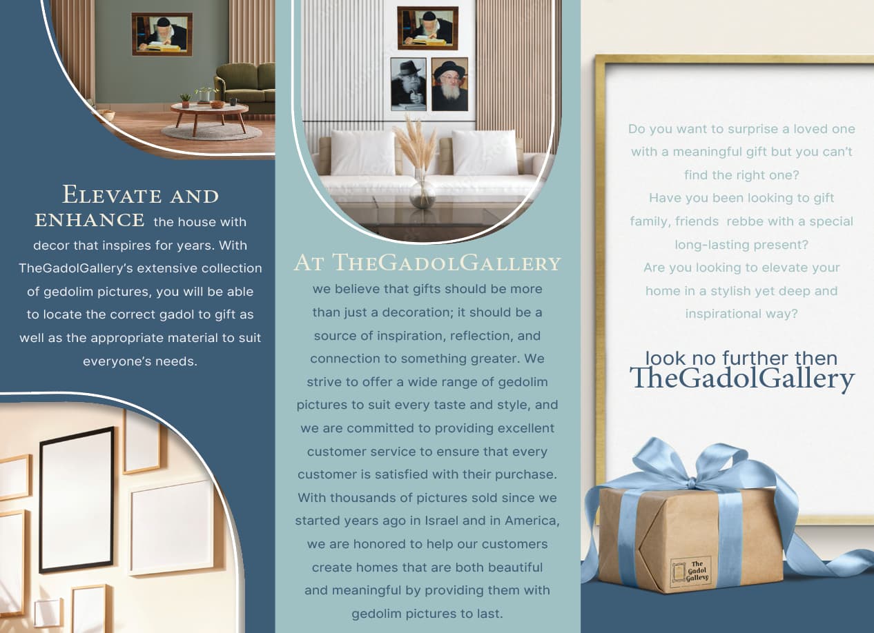
I would make the margins for the text larger on each panel.
It may look neater if it were fully justified on both sides.
Add a drop of leading to the text.
thank you
Really nice! Love the smooth, clean feel!
Can you right align text instead of center? Think it will look better. Also, the center panel on top, can you tighten the leading - feels too loose and the text is coming too low - doesn’t have enough margin.
Actually, I think all leading can be a bit tighter.
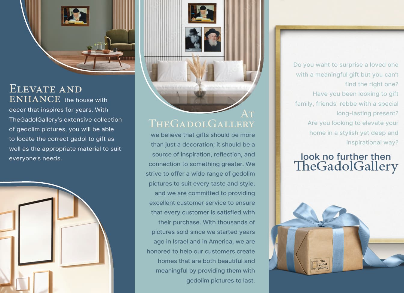
Also, center panel on 2nd page, (the back) I think you should work on the hierarchy - nothing is standing out right now, it looks like 1 jumble of text.
thank you so much
what do you suggest for the hierarchy, I wasn’t sure what to do for that cause its just straight info
Make some text bigger and some smaller, with most important being biggest, and maybe add a button for one of the contact ways so it stands out.
Try to look at ads, bottom text info, for inspiration.
I love how it looks now with those added lines!
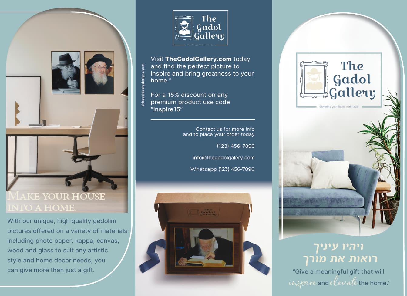
Looks really nice! Is At The Gadol Gallery missing spaces between the words in the bottom, middle panel?
ya that’s how they wanted it
Take away some of the leading. It’s too much now. Just 1 or 1/2 pt.
Left justify all the paragraphs.
Add more margin to each panel (make more space between the text and the edge).`
Ouch - I meant left align paragraphs!
I seriously mix up right and left! 
Agree with mentioned comments. Leading is too loose and makes text a bit harder to read, and more margin will give it a much cleaner look.
Particularly, the center panel has so much text, looks like one jumble.
Can you split it into 2 paragraphs? Tighten leading on it, also, maybe go a point size smaller for the whole thing just to give more breathing room.
I love the overall design, those white lines add so much and your colors are great!
thank you so much ya I did it and it looks much better the client wrote it like that so I just left it that way
Hi again I’m finishing this brochure any ideas how to make the cover less awkward the client decided they want a pic on the the cover Screenshot 2024-07-31 at 9.02.32 PM|227x500