Hi,
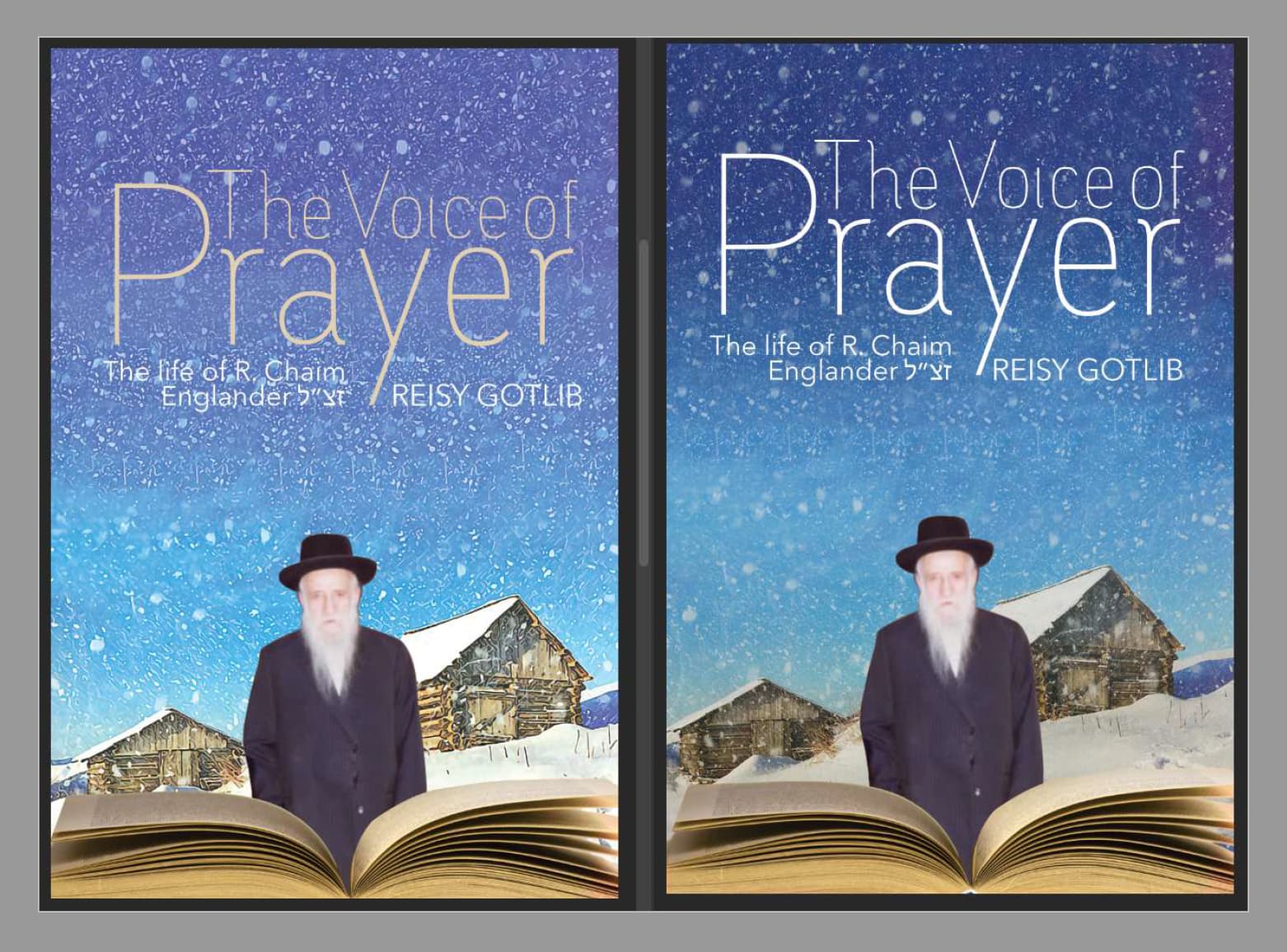
I made this book cover for my client. It’s about her grandfather who spent 6 years in Siberia. She gave me the pictures to work with so I don’t really have too much to play around with… I know the pic of her grandfather is burry (she’s sending a better one a diff time) With the left side, I was playing around and tried making an oil painting effect.
What do ppl think?
It looks really cool!
Ya the picture is very blurry so good that they are sending a new one 
I don’t like how skinny the text is-maybe try a bolder font?
also Im feeling like the location of the authors name is taking away from the sentence The life of…
I actually like the oil effect on the left I think it gives it a nice feel
Hatzlacha!
Hi!
first of all it looks really nice overall!
I think the title text needs to stand out more to be more legible. Either make it bolder of change the font to a something denser for more contrast.
The authors name can be bottom center or keep in the same place but use a different font then what you do for the title.
The compostition idea is good but it would look better i assume if it was blended together. Maybe try adding a blue layer on top of all, lower the opacity and use blending modes. that will make the whole thing look like one image as opposed to a compostition.
Hi, looks nice! I would say though that it feels very symmetrical, maybe put the grandfather on the side…not sure. Just something about it makes it a bit too even and perfect.
Agree with everyone’s comments if that helps 
I find that the images dont blend together so well, and there is not a lot of depth and atmosphere/ feeling. Much stronger type would help and definitely move author somewhere else. Maybe an overlay of darker color - even if as a gradient overlay may add some depth…
can the bottom image be larger or moved up at all?
is this a private family project or going to be published and out there for the public?
yeah I see what you’re saying…
It’s a private family project… part of the reason why I am having a hard time because the client wants me to work with the pictures she’s giving me and I have no leeway in trying out different pictures - basically have to stick to the background pic and the pic of her grandfather…
I’ll make some changes and re upload
Thanks!
Here is some new versions…
The one all the way on the left is my own pictures that I found and put together. Is it better than the other two versions with the client’s pictures? If yes, I am going to try to convince my client that it’s the best option. (That’s what I think)
Please let me know what else I can correct.
Thanks everyone!

Yes, much better! Your images are stronger, love the shadows!
Thanks!
One more question, (in the left version) does the text "The life of R. Chaim… - need tighter leading?
can u tighten up the leading of the Prayer a tiny bit more.
i think the title needs to move down even if it means the hat covers the base of the Y a bit - it will help connect the image and txt a bit more
the life of Rabbi doesn’t right align correctly on the left example and if you move it down it would sit better on the left of the title like the other 2 examples as its shame to cover up the wooden hut which adds interest to the cover. If R Chaim Englander could fit on 1 line it would be even better
Thanks so much for the help. How’s this?
The client wanted me to add snow to the rooftops and to make the Sefer much smaller…
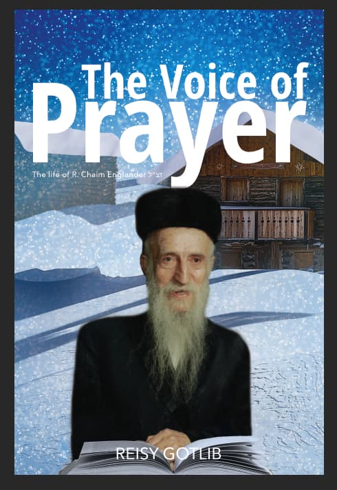
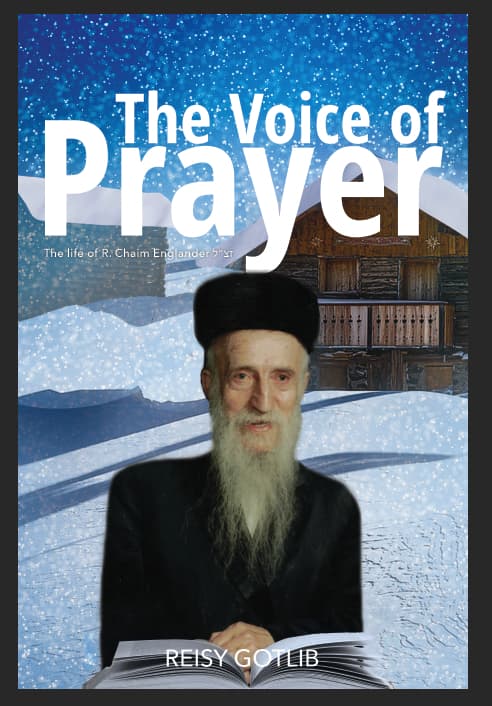
the Y is just touching his head. either overlap properly or leave a proper gap.
Is he supposed to look like he is standing outside in the snow?