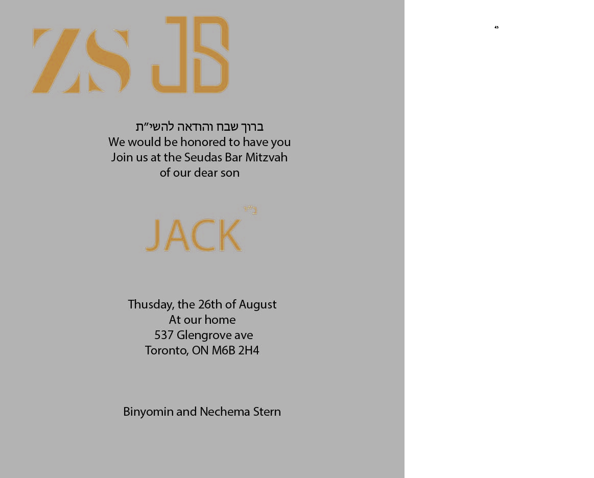
Hi, this is a very rough draft of invite but any ideas how to make it more inticing?
thank you!
Hi,
The off centered logo on the top looks a bit off balance, would probably stick with all centered. Did they specifically want the yellow? The color doesn’t feel so elegant and yellow often doesn’t work so well. Would tighten up the text a bit and leave more room on the top for the monogram. Would create more visual variation within the black text, making some of the more important text somewhat bolder or bigger, the hebrew text for example. Perhaps add another font, maybe an easy-to-read script, for certain text elements, such as the parents name. Careful of spelling, such as in the typo on the word Thursday. Not loving the font for his name Jack, perhaps if you come up with a second font it could be used there. You could probably come up with a more interesting sans serif font as well for the text. Perhaps and embossed border or subtle decorative element would look nice as well.
i would rather go with an elegent type of blue and a more elegant font. Add line spacing. you might want to play with writing the name on the left vertically full length of the page and the invite on the right. 1/3 and 2/3
thank you for that. the clien wanted a more orange/grey look(not so egelant
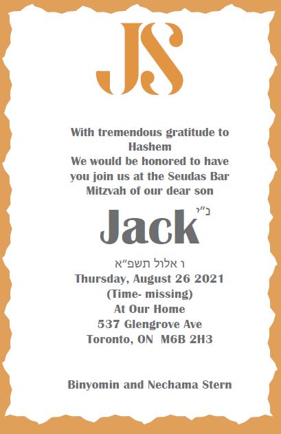
came up with this now…
(first time put on was showing diff logos…)
thank you!
take a different font for the name in the middle. the top initials are too big. the whole thing is not centered
I think you shouldn’t separate words like Bar Mitzvah and put Hashem on the top line…The font feels too bold (but maybe it’s just my personal prefrence) You can switch the main text to a (thinner) sans serif font and then keep the font for the name. It might also look nice if you made the name the same color as the logo…
I think you also need a comma after 26 in the date (but not sure…)
Keep sending revisions!
Looks alot better then the first  , something is not centered, not sure if its the whole text
Think the Yiddish date is wrong
Looks better! Centering has been mentioned. Text overall looks too bold, for the body text would make most of it less bold and only bold important info. Wouldn’t put Hashem on a line by itself, at least would put TO with it.
Maybe you can add some gray to the logo? Sorry, not sure if this is too late