Hi,
Would really appreciate if anyone coul comment quickly with feedback as I must send to the printers by tonight.
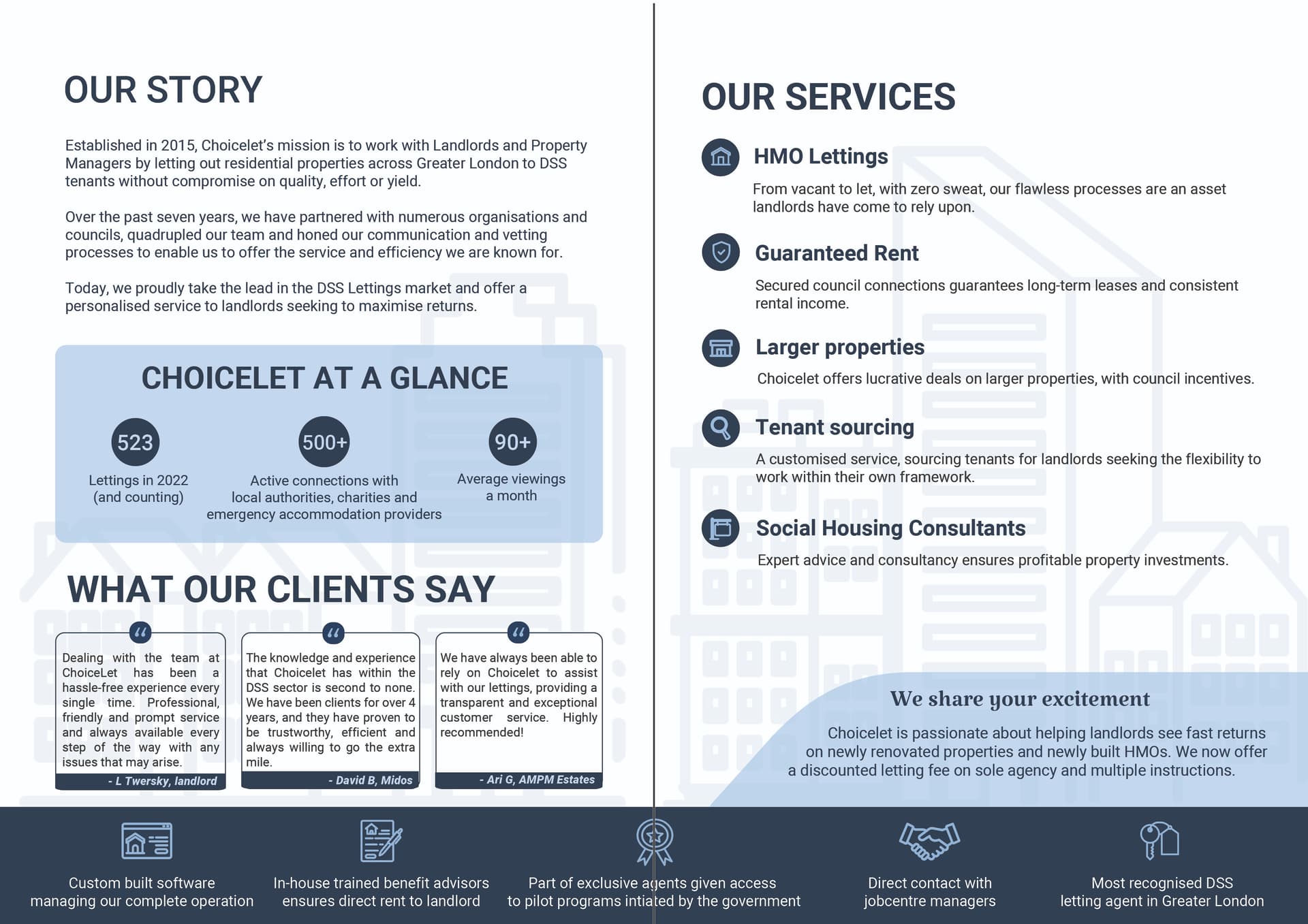
This is the inside of a bi-fold. Still working on the cover andd will post later.
Aiming for a clean, sophisticated look.
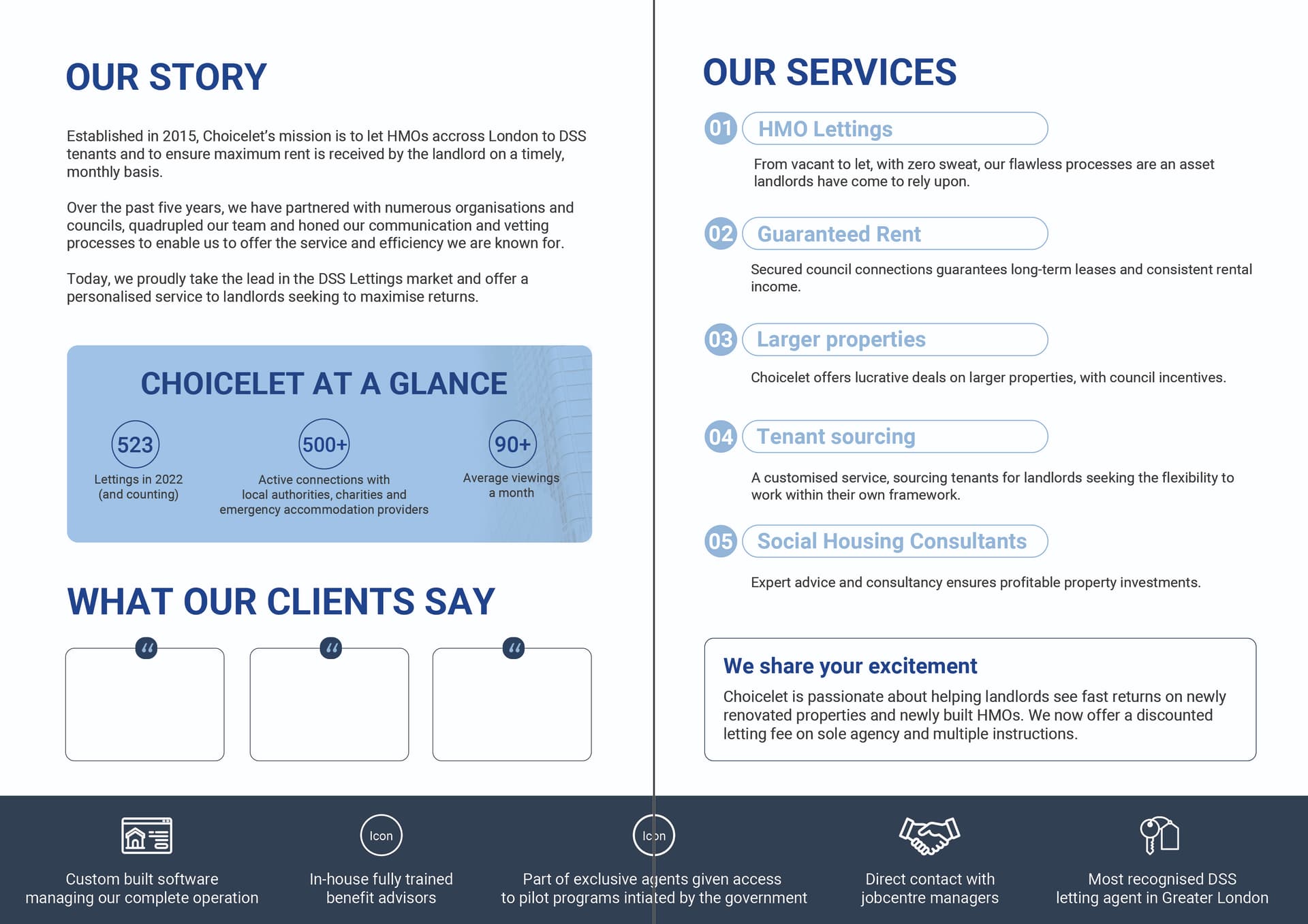
The dark blue came out very dull when i uploded… not sure why
Very nice and great job!
Are the numbered points a different shade than the stats box?
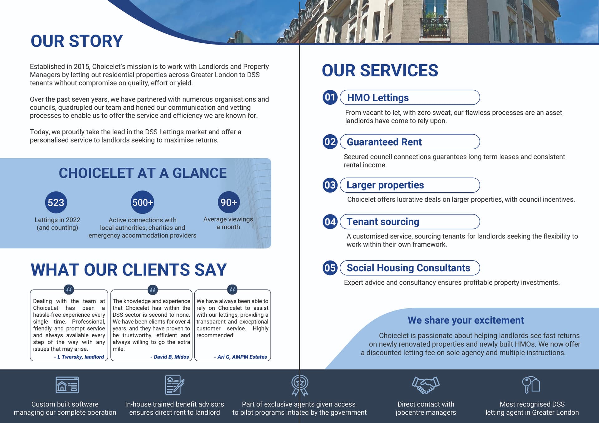
Is this better?
Any ideas how I can make it even more visually appealing yet still stick to the clean modern look?
i would say a highlight color would add more impact, i’m thinking a brightish yellow/green/orange
or maybe the words ‘we share your excitement can be in a more handwritten/script font’ - i dont think this will take away from the professionalism of it
Thanks Rivkah, I’ll try that and see what the client says as he normally uses only blues.
Do you think it needs the picture, I think for some reason it’s making it look old fashioned. Will it be too bland without?
Or any ideas where else i could put it?
good q, i’m not sure, i like pictures…maybe it’s the blue stroke/wave under it making it look more old fashioned - ironically maybe a more boring plain stroke may help even though design-wise i like what you did!
when i get stuck like this i try and look at canva.com brochure templates to get inspired!!
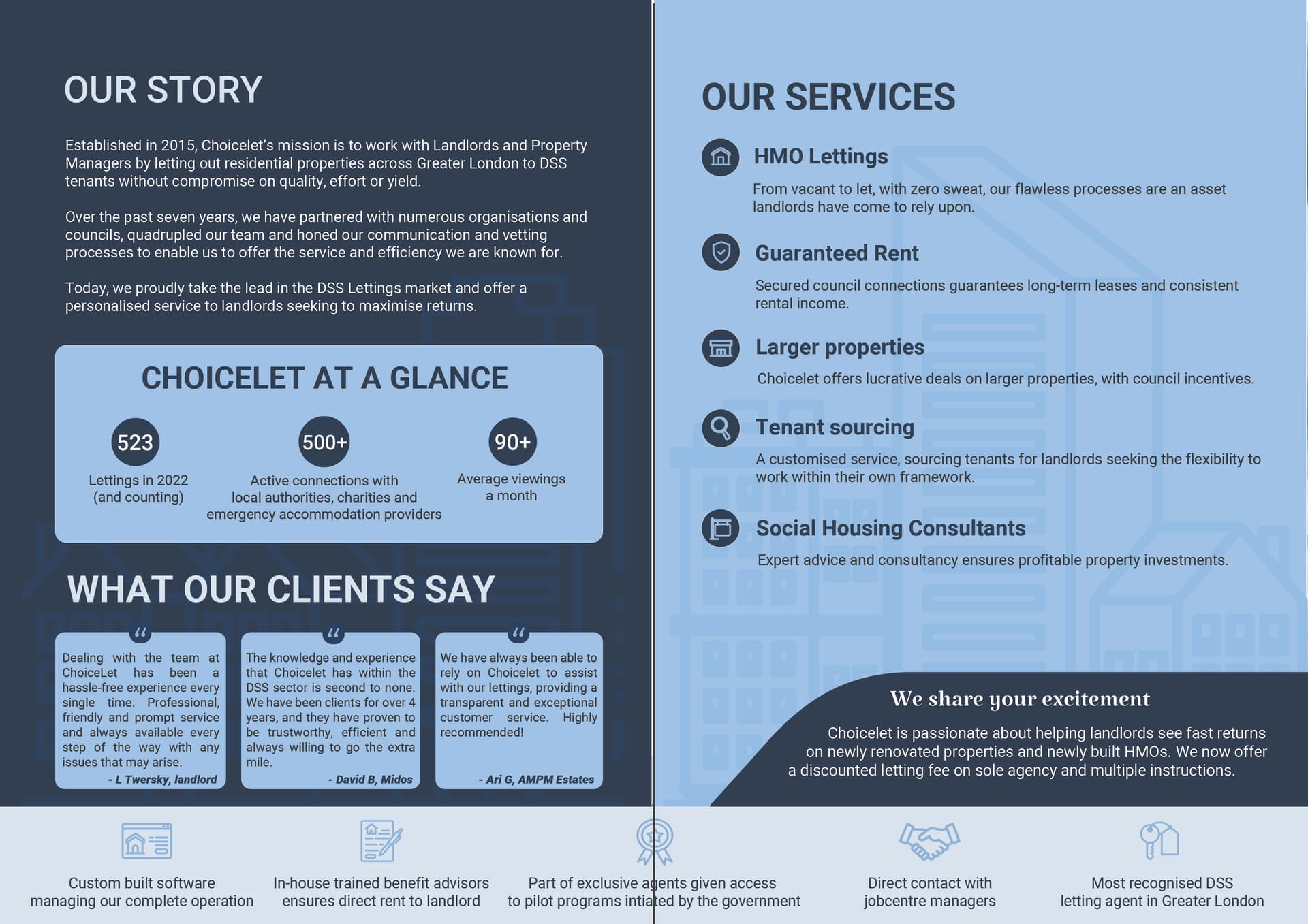
can you send them both versions and let them choose? i do like this other version. just the white on dark small text may be hard to read.
yes i think its a good solution…
Very nice! I like the last one best!
yes same
Love the last one!
Really amazing how you put so much information onto a page without making it look messy.
Our services looks bold to me I would say it should be the same as our story.
Thanks!
In the end i sent the client a few options and ended up using this one based on his feedback
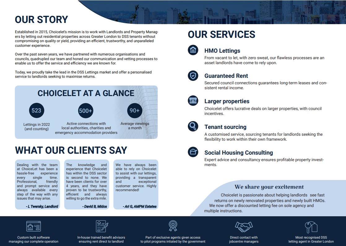
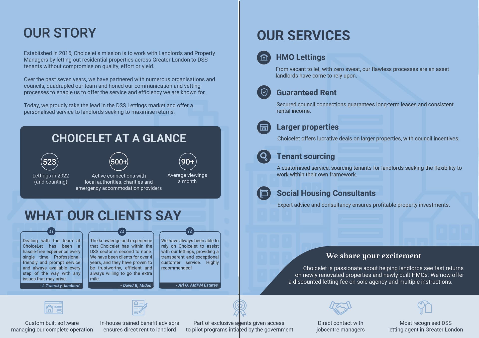
Which one should I use for my portfolio though?
I would choose the one named white for your portfolio.
if you’re still looking for critique I would give the squares of what our clients say some more margins.