Hi! Designing a newsletter and was looking for some help/ critique. Having a hard time with layout on page 3. Page 4 is the back.
Thank you so much!

Hi! Designing a newsletter and was looking for some help/ critique. Having a hard time with layout on page 3. Page 4 is the back.
Thank you so much!
Looks very neat!
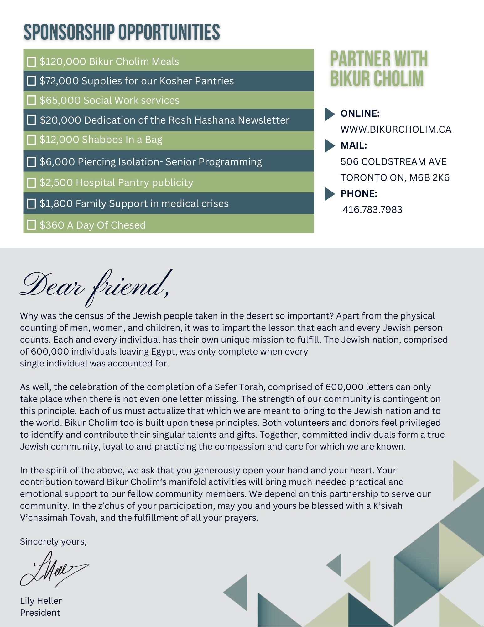
On page 3 I would put the letter on top and sponsorship on the bottom
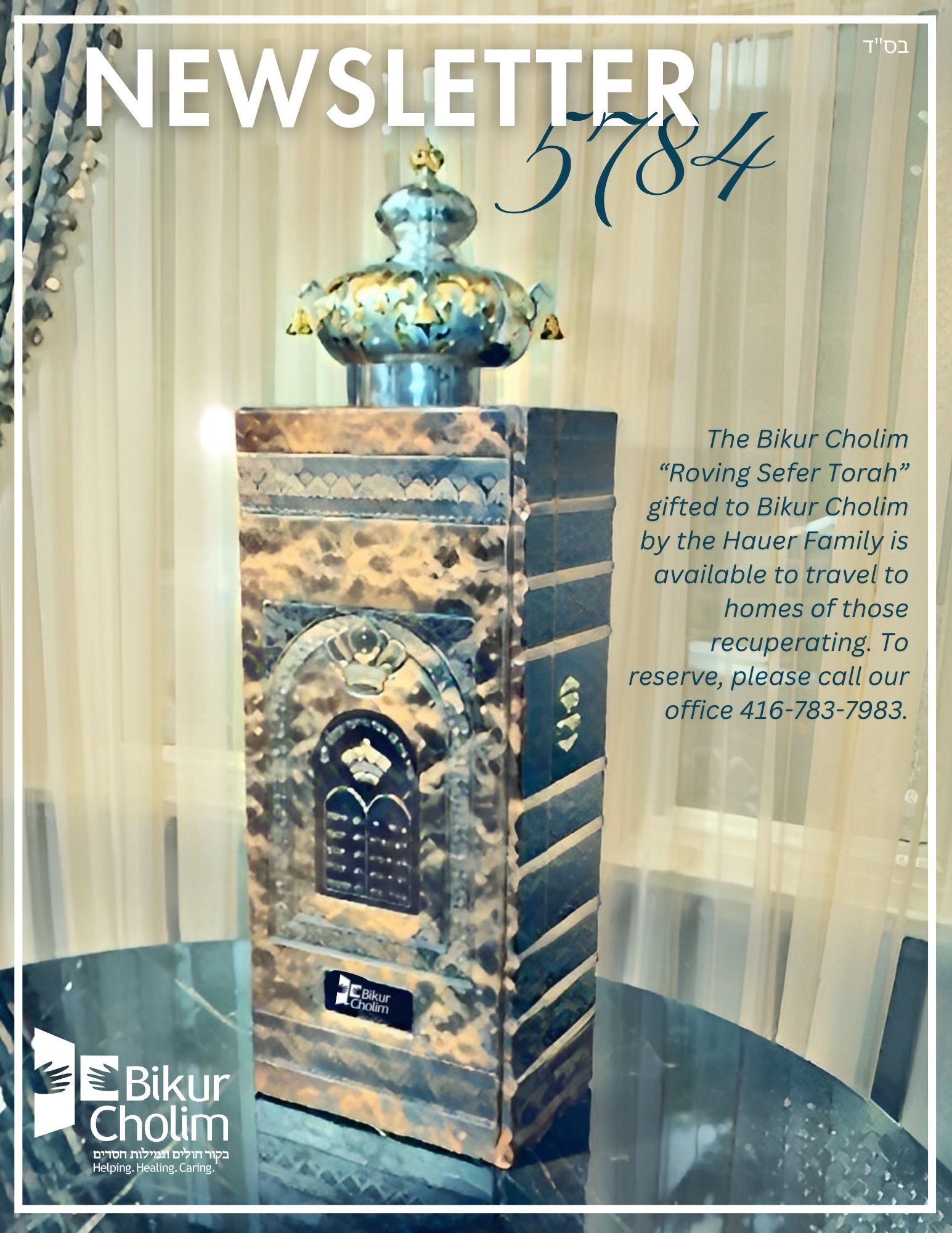
This looks gorgeous! It’s so neat and clear! One little thing for the cover: Maybe lighten or blur the picture in the area behind the words very subtilty, so that the words stand out more.