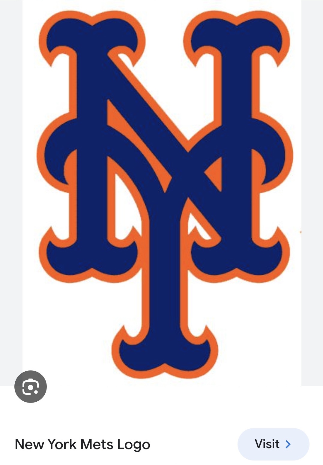
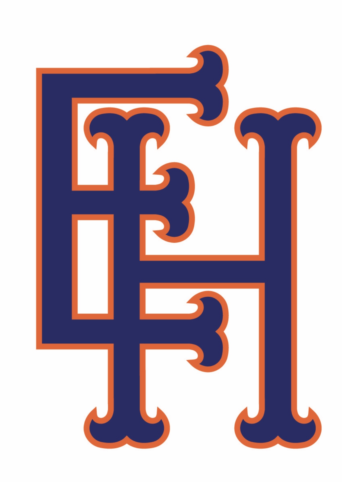
Hey everyone! A client wanted a Mets bar mitzvah logo but with her son’s initials which are E. H. I attached the inspiration she gave me as well as what I created for her. She loves the letters and how they look but she feels the way the letters cross over give a swastika look🙈.
Any ideas on how I can join these letters better while still keeping the meets logo look?
Thank you!
Looks really cool
Maybe you can attach the bottom of the E to the middle of the H
1 Like
You can do them side by side, the right H line becoming the vertical line of the E, or maybe the crossbar of the H can extend to form the top of the E.
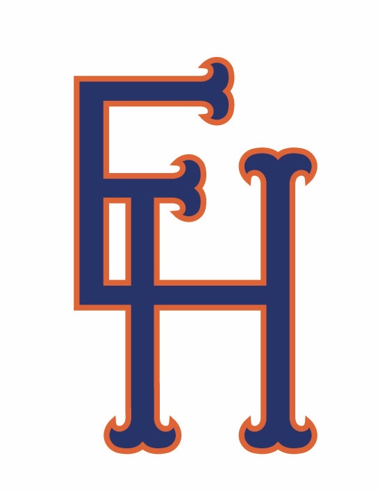
You can do something like this:
although it won’t look so much like the mets logo.
Also another thing - I think the coloring in the real logo is much brighter than what you have and also looks like a thicker stroke.
I was going to suggest the same thing that a number of other students already have suggested, joining the bars of the two letters.
How’s this? Didn’t send to the client yet
I think it looks a little off like this. Where is the tip of the H?