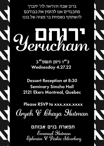
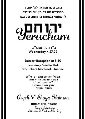
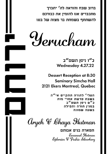
what do people think of this? is it too much?
I love the sharp look, and the patterned background!
I feel like everything in the middle just has to be made smaller and give more margin when the text gets close to the edge…
Also the & after Aryeh looks more like a V than a &
You can try dark blue instead of black, it might tone it down a bit. Also, make the text smaller give it more padding.
Nice invitation! I agree with increasing the margin. I would try making more space between the groups of text and also changing some of the text to be smaller so it doesn’t all read equal like the grandparents and the rsvp.
I agree
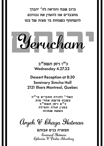
thanks for the advice everyone but…client decided they want something lighter…so here’s this…!
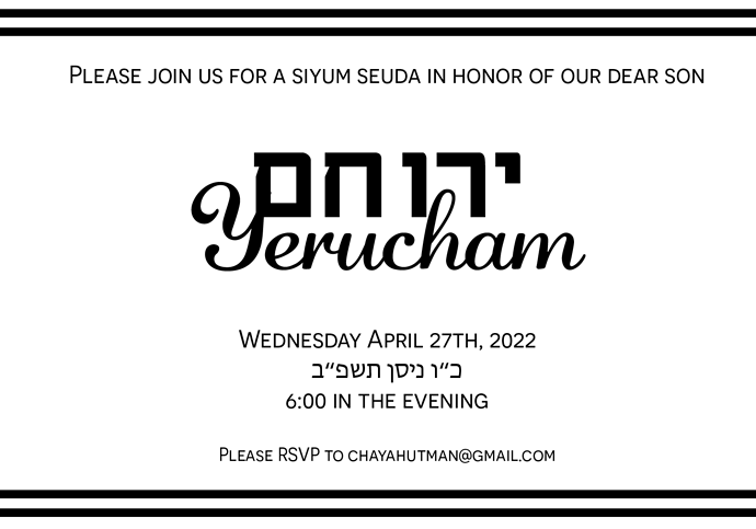
the only difference in the two is the Hebrew is watermarked and bigger in one…which do ppl think looks better? Comes with a coordinating smaller card…
Main Invite-01|357x500
I think I like when the Hebrew text is smaller than the English…
and this option looks nice as well!
Its nice also - I can’t decide which I like better… 
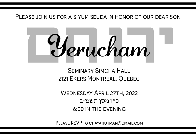
on this new option, I would make the Hebrew yerucham smaller so its not so close to the English yerucham…
i like the last one
I like the last one just make the hebrew Yerucham smaller
I like the last one too. And I agree to make the hebrew name smaller
Has anyone ever done a bar mitzvah invitation for twins? I’d like some inspiration 
