what do people think of this?
I know it needs help, I’m just not sure what…

It’s a great start!
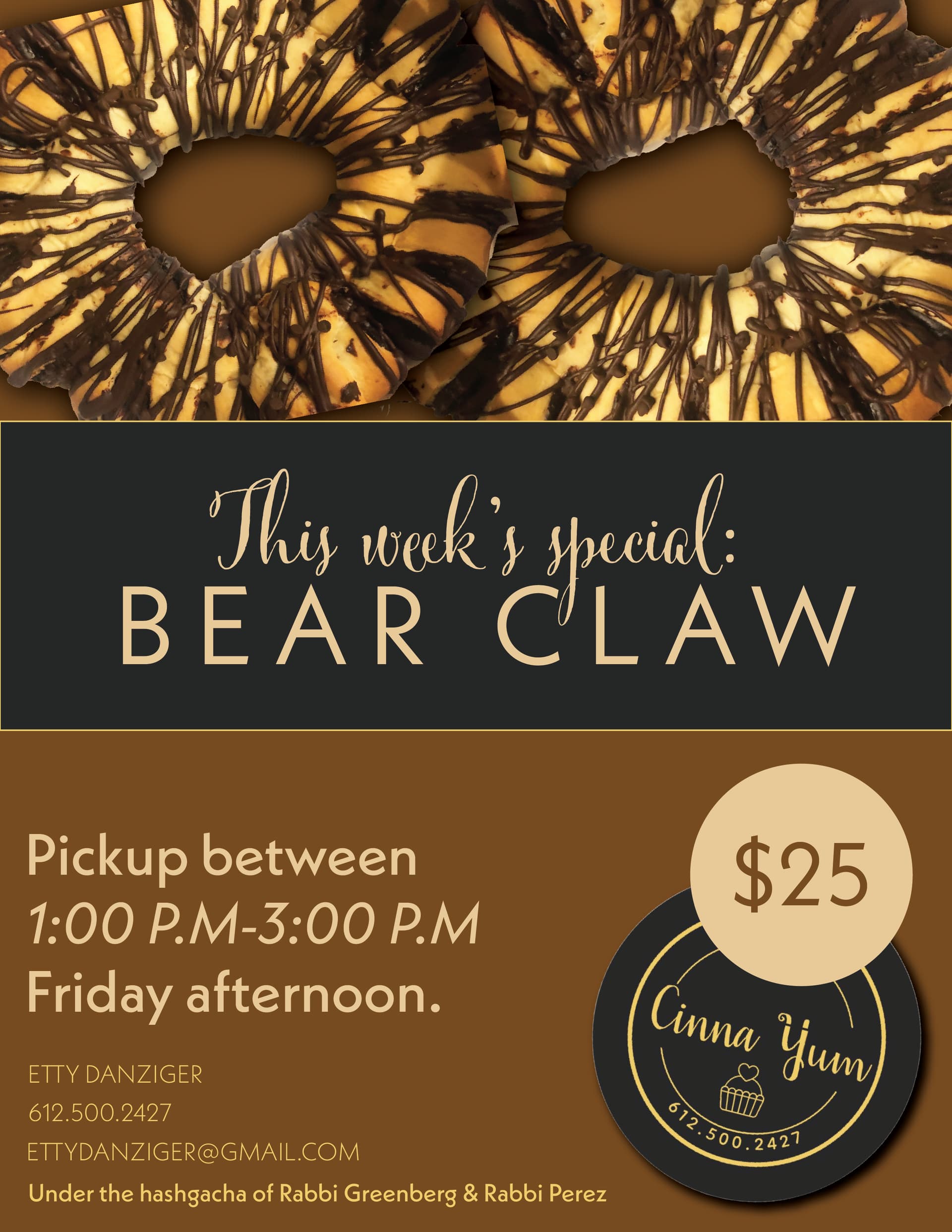
What does “bear claw” mean?
The bottom feels a bit squished. I feel like the donuts can be presented in a better way, I’m just not sure what. Maybe have it go on top of the middle bar verses underneath?
The $25 feels a bit out of place… Maybe make it look like choc gelt?
thanks 
bear claw is the name of a type of pastry (that’s what the picture is of, its not a donut)- the people that she is advertising to know that already. what do you mean have them go on top instead of underneath?
Got it.
In front- as in “bring forward”
Maybe try to have the cookies as part of the focal point, together with the words, rather than as a separate element. I think now the cookies are competing with the center words
I dont like the brown background for the cookie.
I think that you should make more hierarchy with the text. Now it just looks like 1 long paragraph that will take too long to read in a glance.
An idea: What about putting the cookies on the bottom and text on top to make it more balanced?
I still would love to see how it would look with the cookies “In front” of the middle bar.
I like this better actually just not sure what to do with the empty space on the bottom…
It is probably too late, but:
very nice. I like how you laid out the text. Much easier and enticing to read.
but do be careful about the margins. the text looks a bit too close to the edge…
Since the cookies are cut off, maybe it would be better to have them behind the bar after all.
overall though, it’s great!
thanks everyone especially @al1 I did end up putting the cookies back behind and i shrunk the text a little bit cause i also realized that it was too close to the edge. client loved it bH