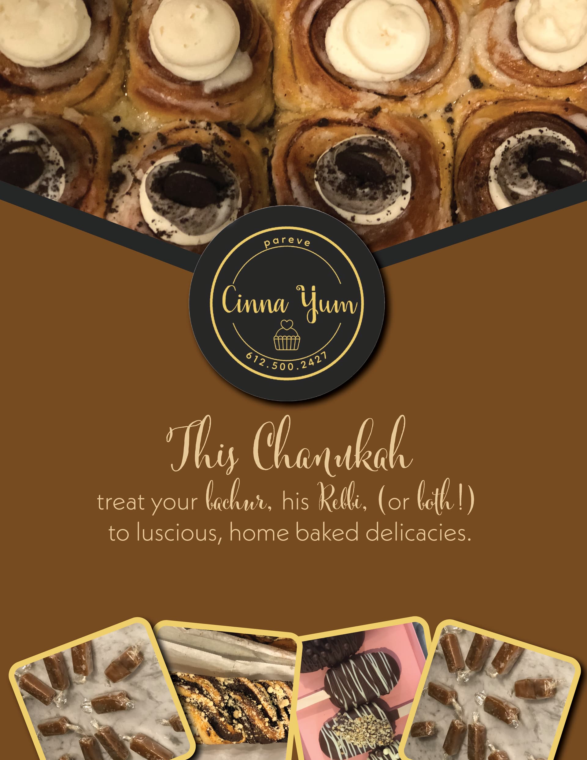
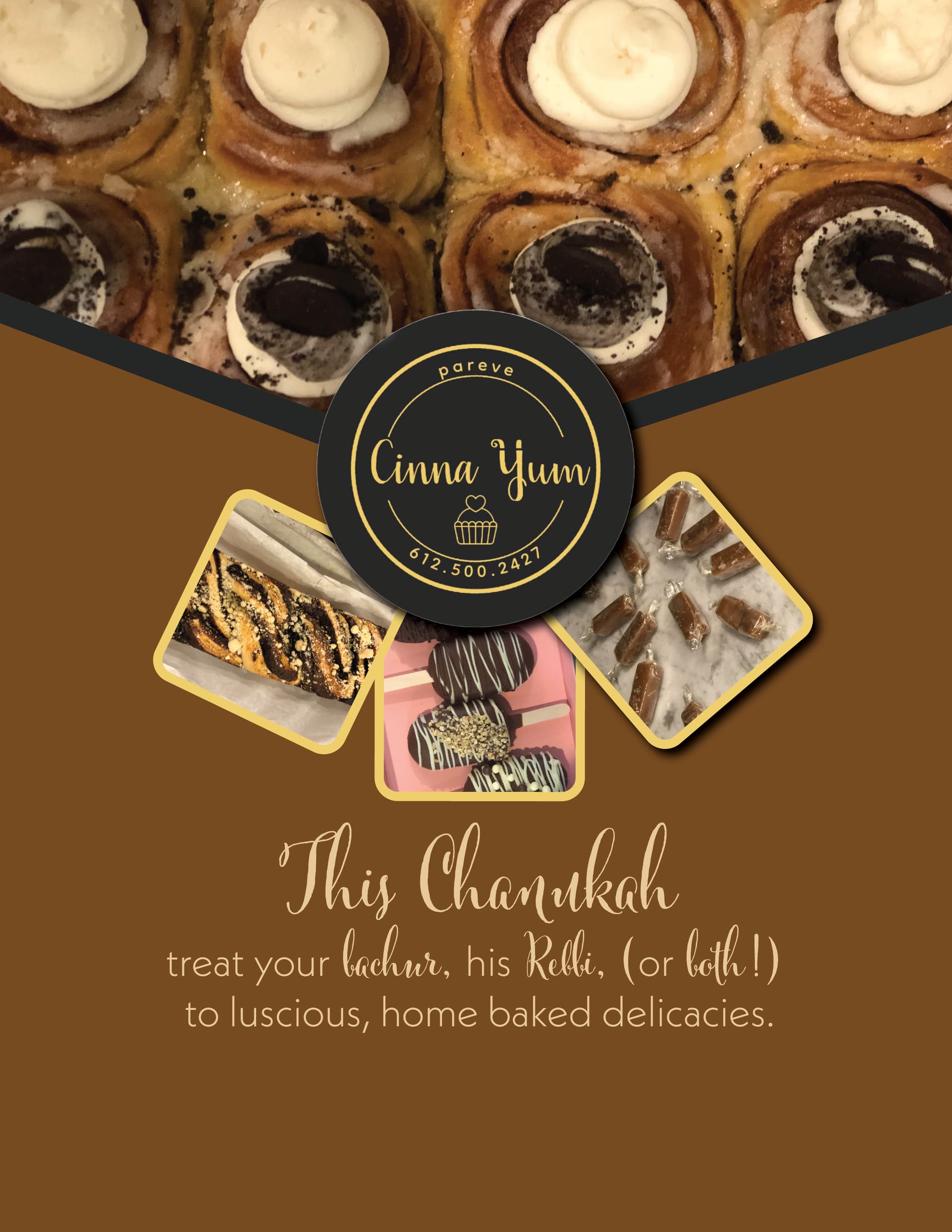
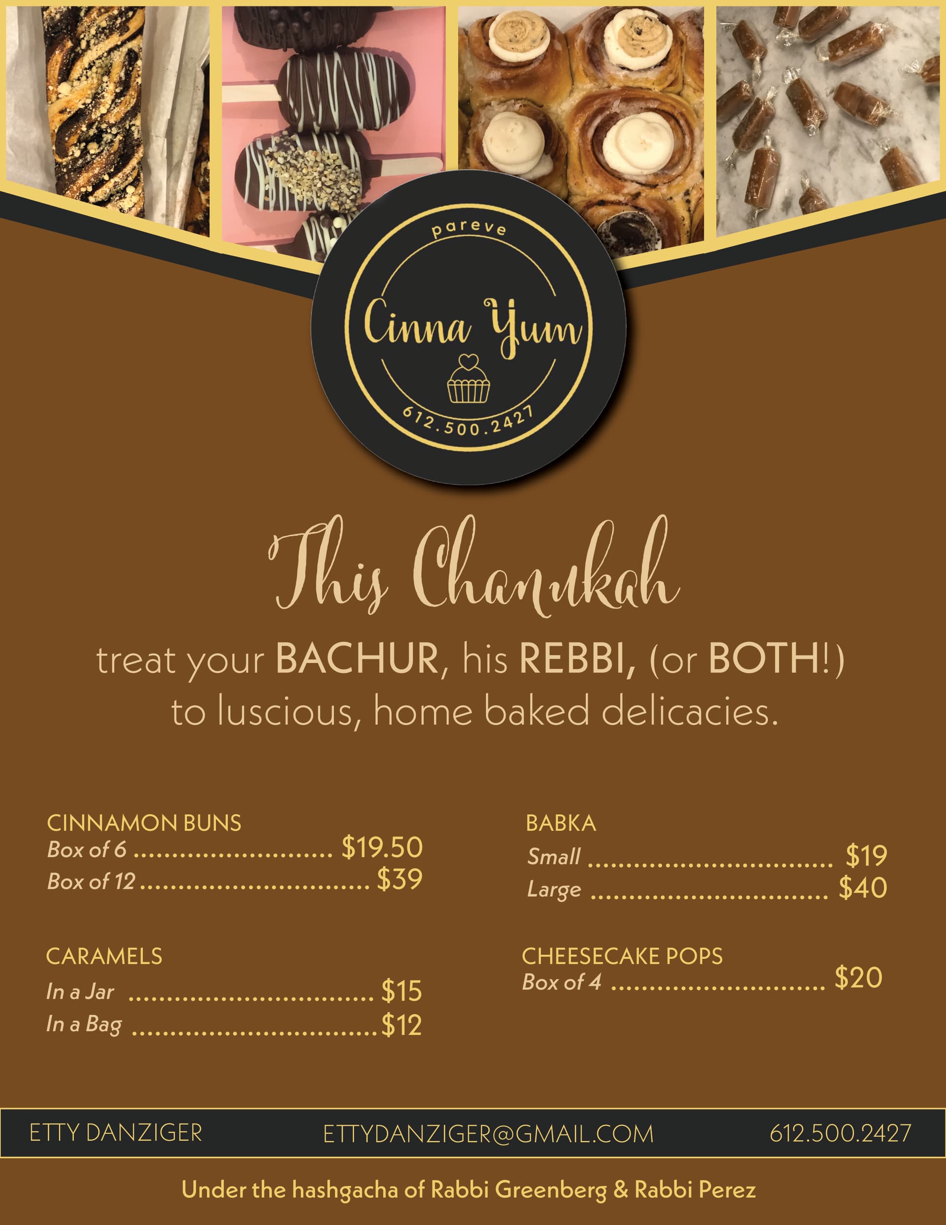
I am creating a Chanukah flyer for a client who sells baked goods. these are the ideas I have so far, my problem is I need to put pricing on also and contact information…anyone have any ideas where on the page I should put it or if I should rearrange anything differently?
I like the first one. maybe you could raise the top image with the logo so that you have some more space on the advert to add more info.
I like the first one better. I think you can use the top just for the pictures - make 4 geometric shapes in the black area and put the pics into the shapes…
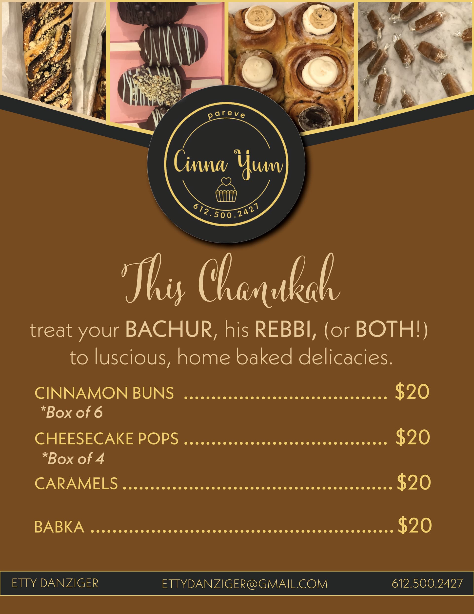
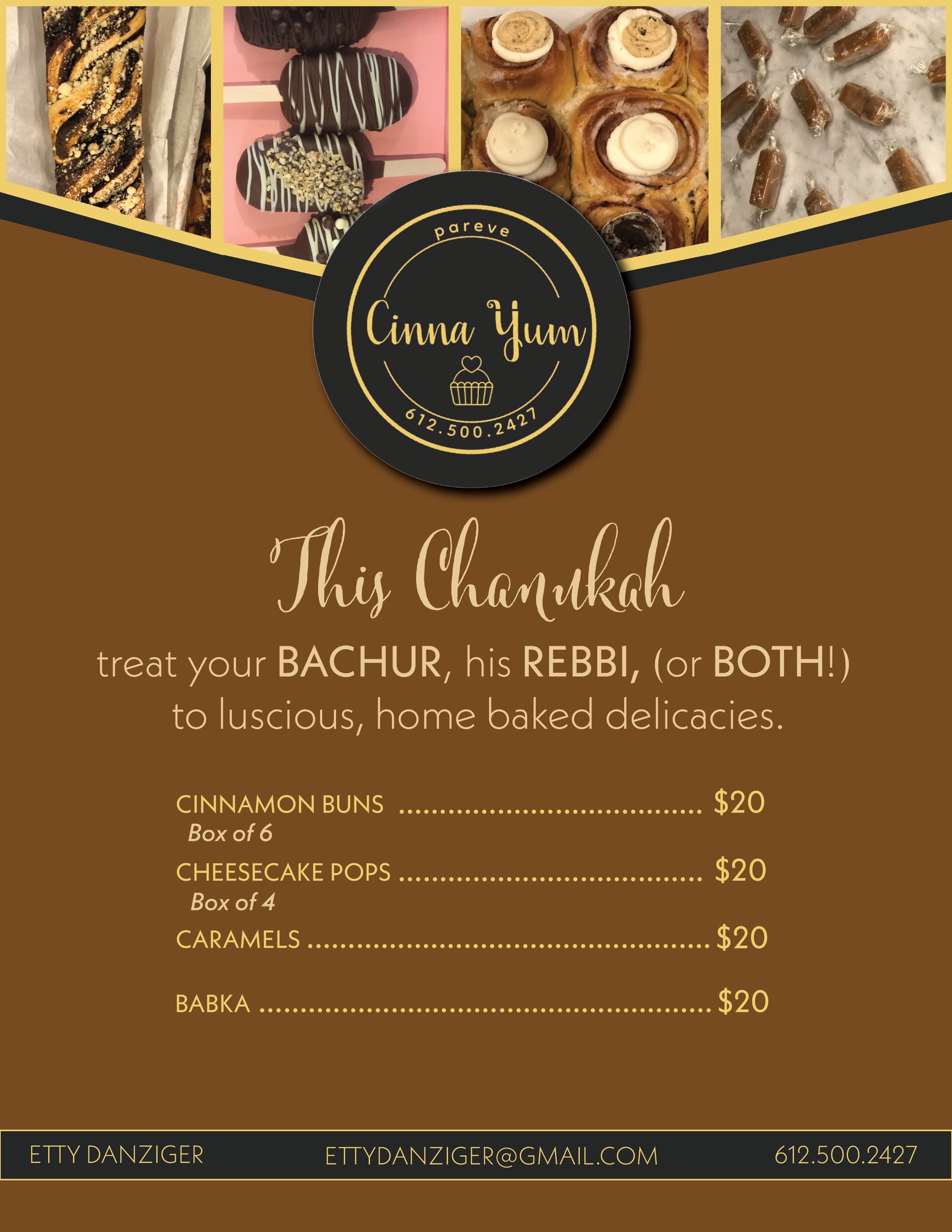
I think only the words “This Chanukah” should be in script - it’s hard to read the word bachur and Rebbi…
Very nice!
I would make a more obvious separation between the images so that it is clear that they are not one image.
Make sure that the logo is centered. It looks like it is a bit to the left.
I think that you can make the text a bit smaller so that the logo and “this chanukah” stand out more. Now the bachur, rebbi and both stand out as much as the chanukah.
I think that the list of baked goods should be smaller than the sentence “treat your…”.
Another thing, it could be I am wrong, but I feel like an * usually means that you should look somewhere else to get the rest of the info. Kind of like a footnote…
And maybe to help make the spacing look more even, place the “box of _” on the same line as the option.
I like how you added that bottom line there with the info. Just make sure that the text is not too close to the margin.
The whole ad makes me think chocolate  !
!
Great job! (the brown color is making me hungry for chocolate.)
One pointer-
Is this supposed to be an advert or more like a pricing guide?
The prices for the items are very focused on the ad if this an advertisement.
thanks @malkyh and @weiss4155 @al1 and @breindys! happy that the ad makes everyone think chocolate ![]() that means I did a good job lol! @MalkyH its meant to be both I guess…its being sent out in an email blast only…
that means I did a good job lol! @MalkyH its meant to be both I guess…its being sent out in an email blast only…
one more thing I thought of…is there too much empty space? I feel like there’s just a lot of solid brown…what if I made the background like a textured brown?
Gorgeous ad! I love it! A textured brown might look nice, but it will probably make the text on it hard to read…
really beautiful
I think it looks amazing! Nice job 
It looks really nice!
thanks everyone! client loved it bh!