Hi!
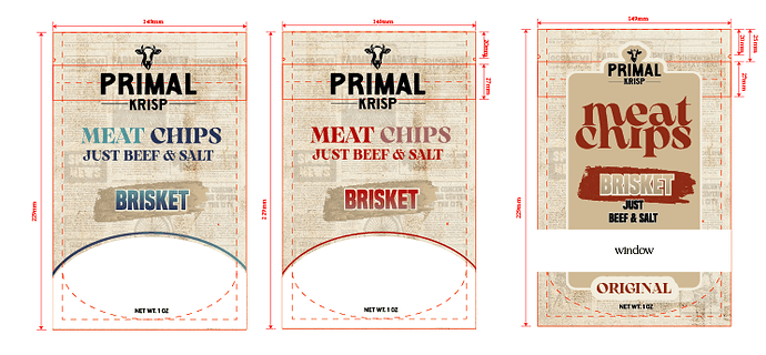
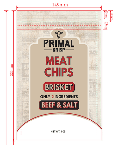
How would you pull the design together? He specifically wants this look but I’m not liking how all the info on the front of the bag is coming together.
Any good ideas on how to pull this all together?
Thanks!
Hi, if still relevant;
I would try shrinking some of the text on the front. Give it a bit more breathing space…
and maybe some of it could slot into each other if you know what I mean. Like the “Just beef& salt” or whichever part is relevant to all flavours, maybe you could shrink that under the chips and fit it all before the drop of the p…
& then maybe you have space for a bit of graphic on there- everyone likes pictures 
hope this is helpful!
Hatzlocho
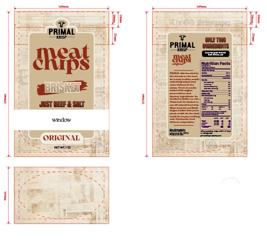
Thank you for replying. I was having such a hard time going back and forth with modern style and and less modern. In the end I came up with this design. Also where it says window thats going to be a window so youll see the chips…
I still need to work on one style thats not so modern, (they love it but want another option…)
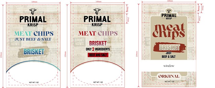
Personally I don’t find the middle one to add anything… It looks quite raw. I would work more with the 2 side options.
Your original option was really nice, you can just play around with the typography a bit to bring it up!
Also I feel like I would keep away from blues in a kosher meat product. Don’t most ppl associate blue with milchigs? lol just feels off!
Hatzlocho!
They didn’t decide on colors yet… but ya good point with blue being weird for meat product.
They like the left one the best and they want another option bolding the points like I did in the middle thats why I did an option like that, thought it looked raw as well.
Should I make any changes to the one on the left (besides color  )
)
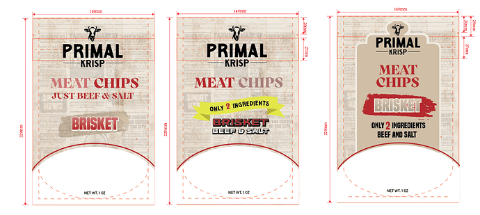
Im really stuck here, this is the latest design.
My client wants changes again- He cant make up his mind he keeps changing his mind…
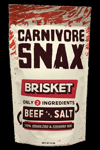
He said whats throwing him off is the “just two ingredients, beef and salt” set up. He likes it like carnivore snax bag. very clean and concise how its laid out. He wants me to change the layout but likes the designs.
see attached my design adn the bag design he likes.
I really can use ideas if anyone can help me out. Im stumped at this point.
Gosh I dont remember having such a complicating time designing something so simple. lol
looks like he wants a more modern vibe.
Maybe take your original design and challenge yourself to come up with like 10 variations of it in a short time and then you’ll be able to pull out the good parts…
or if you give him an entirely different design he might be able to tell you what parts he like so you can combine?
Hatzlocho!
I hear what your saying but the carnivore snax copy is not modern in my eyes and thats what he likes. Unless thats considered modern
Thanx Rivki for responding.
It’s clean look + typography based…
Just know when I get stuck in something, often helps to break out of looking at the same thing again and again
G’luck!
Can’t wait to see the final design 
The carnivore one is more modern cuz it has very clean layout, lots of neg space, and sans typography. The reason that you probably feel it is not so modern is cuz of the grunge textures everywhere.
Yours is more vintagey with the serif font and the newspaper print background.
I think that what’s throwing me off (and maybe your client) is that the only 2 ingredients is bigger than the beef and salt - it’s almost more of a focus than the important part - the beef and salt. Try making it smaller…
The bag he likes is not a modern style but it is in style. You see how that beef and salt and some of the other fonts look old fashion? That’s trending for a bit of a different look.
I think you did a rly great job in a more modern style!
I like that yellow ribbon but I would put beef and salt right after it.
I also liked the version where the meat chips were a little bigger - gives some hierarchy but then not sure where the brisket would fit. hmm.
 great job!
Nice and neat!

