Hi! I’m new to the field and would love if someone can give me some critique on this ad. It’s for a school parent event. Thanks in advance!
1 Like
I really like it. Great job!
The colouring of the photos looks a bit washed-out, is this a screenshot?
Thanks. It’s not a screenshot, it’s a jpeg, but I’m not sure why it uploaded like that. The real pdf isn’t washed out.
It looks really nice, but yes the whole thing looks washed out. Is it because its cmyk colors, I find when you save cmyk colors the pdf looks washed out.
Yes, I think it is CMYK. I assumed they are printing it, but how do I change it if they are emailing it out?
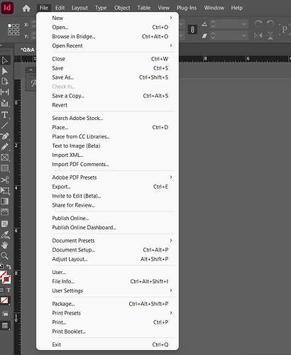
Go to file, document color mode and select RGB for emailing list.

