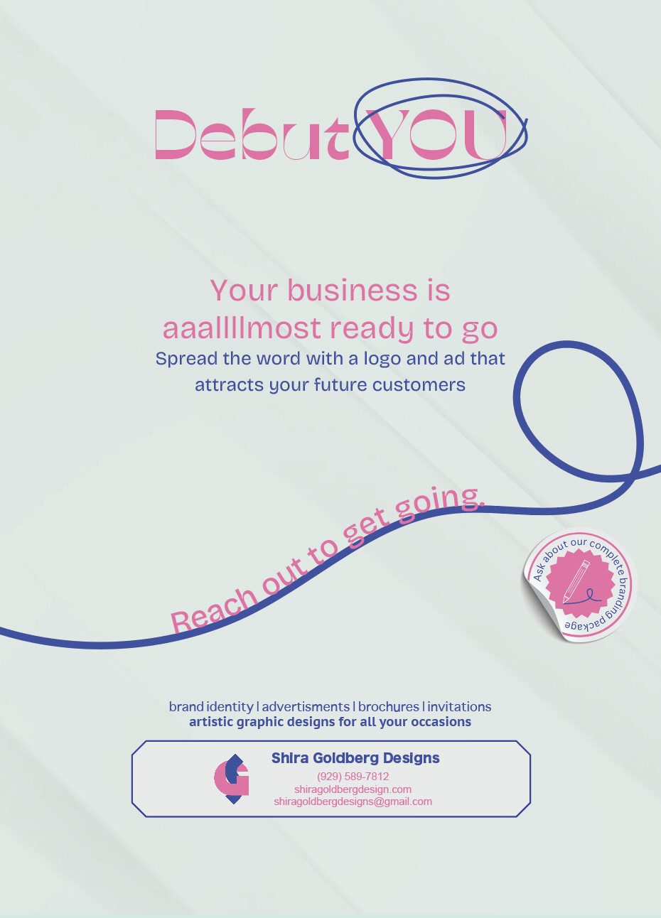
been working on this for to long and want advice to move on with it
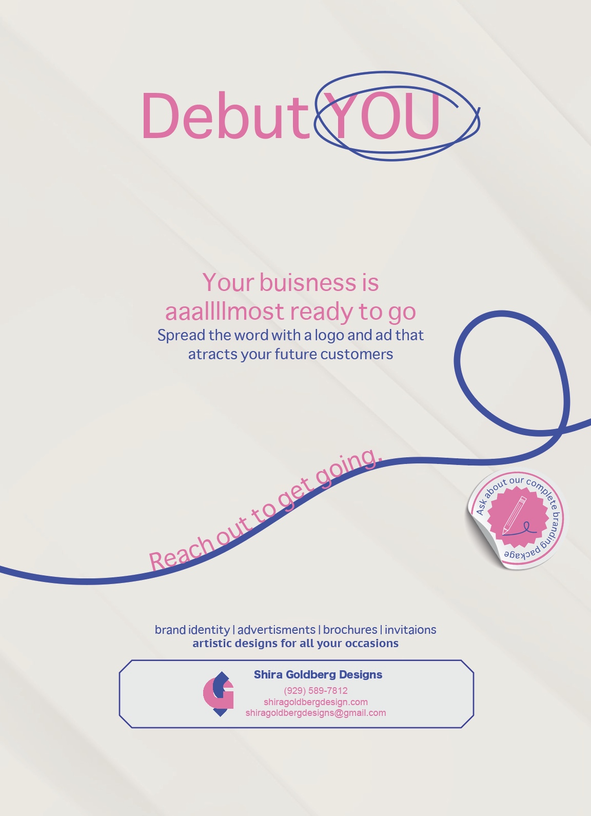
You have a typo:
buisness - business
Otherwise I like it. Just maybe use a sharper contrasting font for the heading to make it stand out. The text font is very simple.
thank you! would be a good font.ive been staring at it to much. needs fresh eyes
Very pretty! So neat and striking!
Maybe make the word YOU a little bolder.
You can fix the spelling of the word atracts - attracts, and invitations.
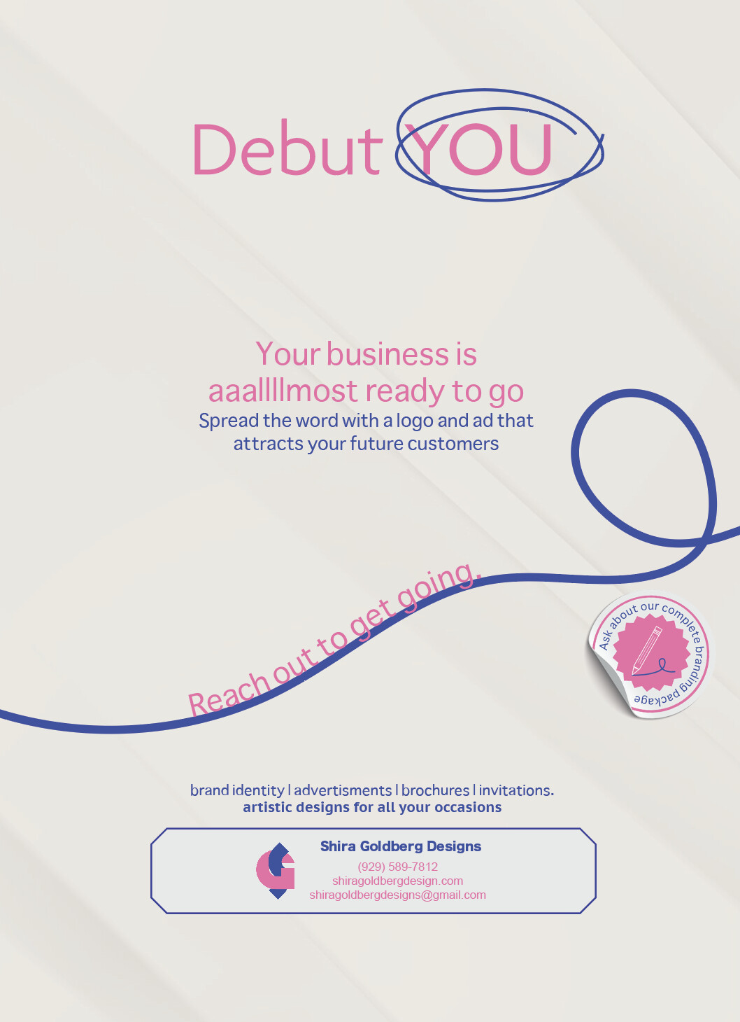
Take out the period after invitations.
Also the fonts look very basic
I wouldn’t suggest a serif font, rather a bolder and interesting sans in a heavier weight.
thank you I changed the font curious if this border is helping or totally not and is this new color nice with it?
its supposed to be a green but now it seems more grey
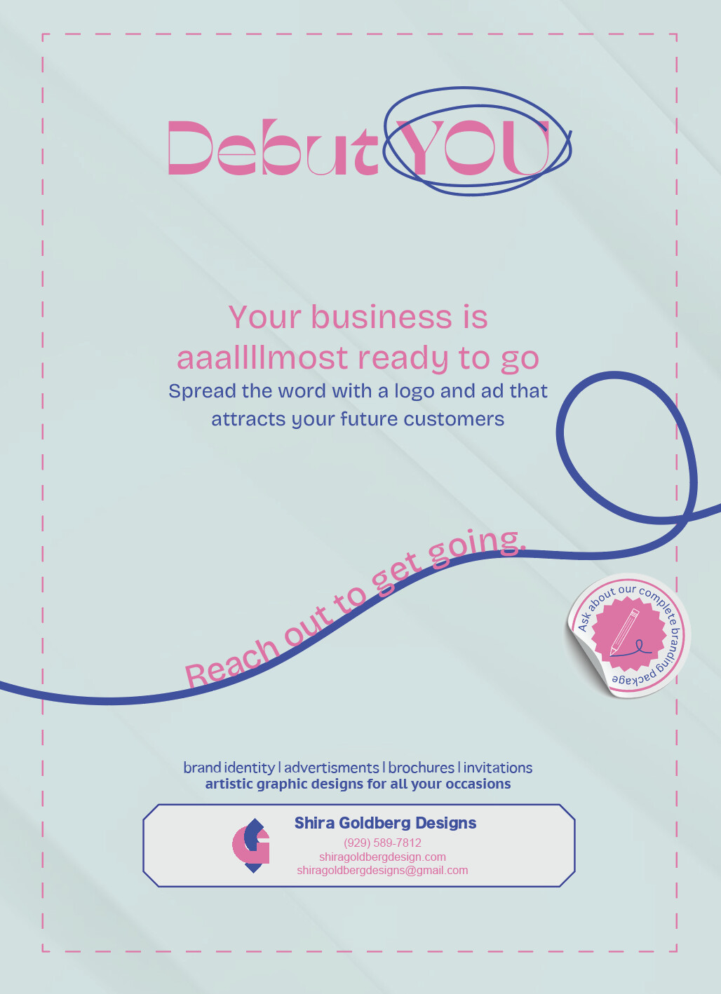
Yes i like the first one that you changed, it has a finished touch now.
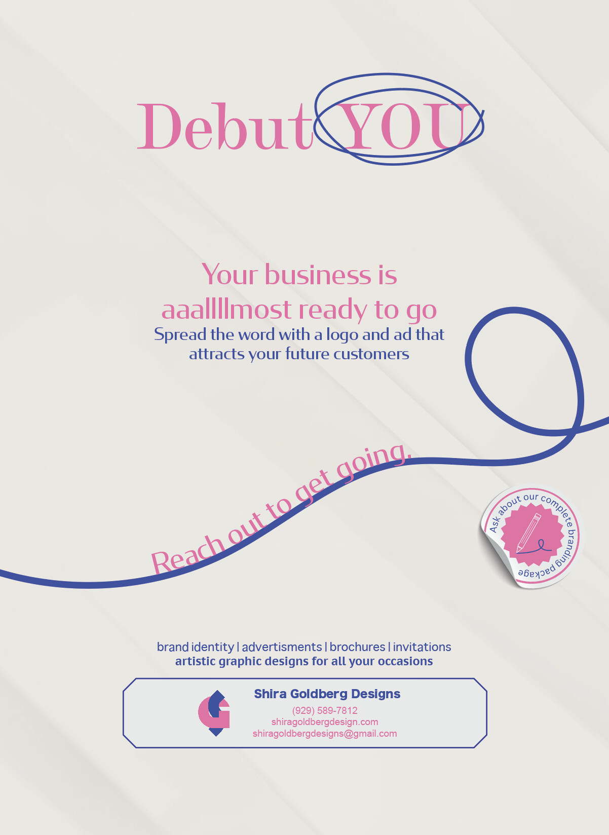
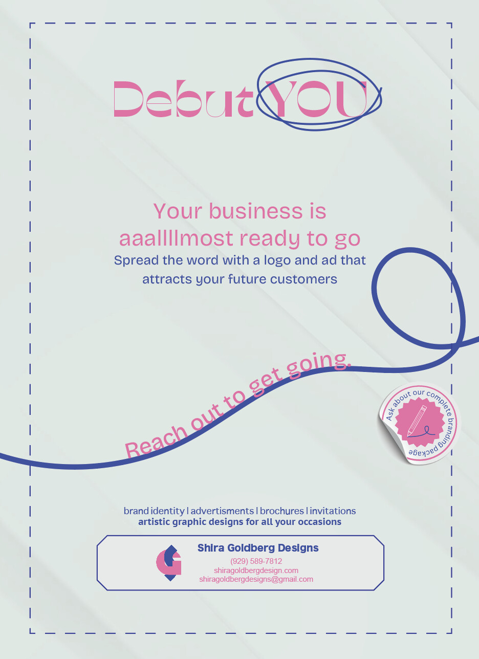
I think you should capitalize “artistic graphic designs…”
And your info is a little hard to read.
the best thing would be to make the title a lot bigger and the your business text a lot smaller think of the rule like this header - subtext- info text 90-30-10 percentage wise