
For a different font for the english words…any advice?
I like it, its very elegant! Just wondering if they wanted the rashi letters specifically?! I would probably not use that Hebrew style font.
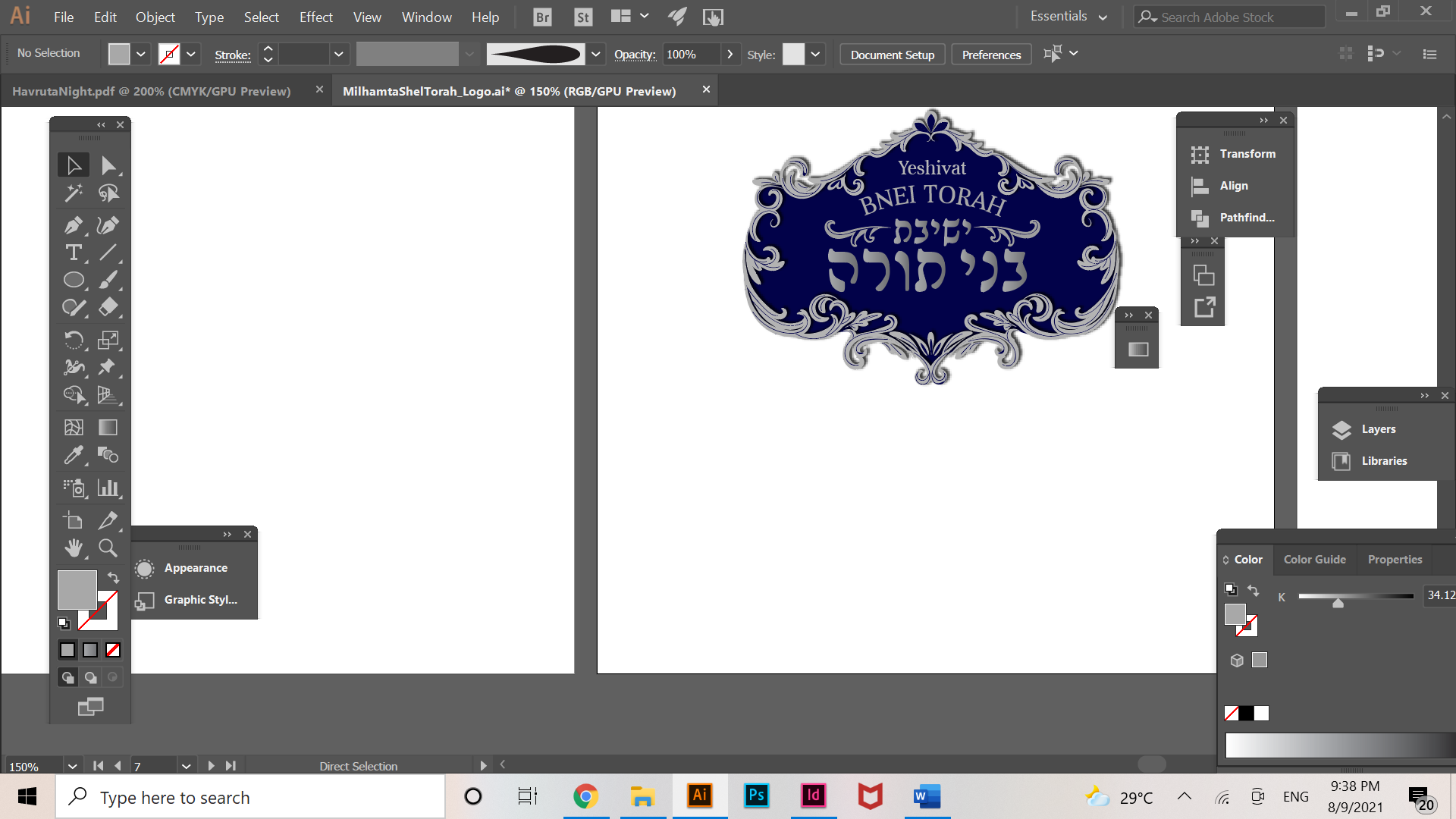
Yes, they wanted that. I am working on trying to convince them out of it. But working on the English font for now.
Ok, hopefully you’ll succeed in convincing them out of it;)
I also really like the whole elegant style! I’m not sure if it looks so good with the gradient on the letters. I would try a solid color, maybe white…
Yeah I’m also not fond of the gradient on the letters… I think solid would look best
i find that the outside frame is a bit overpowering the inside text. would consider giving the outside frame less emphasis buy making it simpler, thinner or not the identical shade and strength as the inside txt
Thanks everyone! Is the English font fine?
i think so
Looks nice! Would tone down the frame a little bit, maybe thinner, as it makes the whole design a little busy. Would also try varying the tint of the English vs Hebrew text so it doesn’t run together as much-ie. if you want the Hebrew text to be most prominent, perhaps it could be somewhat lighter than the English text.