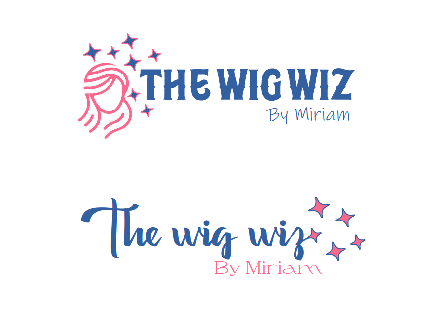
The client likes a magical touch!
Any comments?
Nice idea!
I don’t think you need an image, the stars, the circle and the busy font.
It’s too much.
Try to simplify it by choosing one element to work with.
The magical take is an awesome direction to go with!
So different from the typical wig logo’s.
I would drop the face image completely and focus on the stars.
An idea: have the stars glowing around the word ‘wig’. Drop everything else but the words.
I would also look for a different font in general.
This has so much potential and I can’t wait to see where you go with it ![]()
Same here - I love this idea, it’s very unique.
If you go with those sparkles, I wouldn’t leave the outline there - it won’t even be seen when the logo is smaller. Also, I don’t think it needs 3 colours.
(Just wondering, is wiz spelt correctly?)
My mistake, I just checked and they do write wiz in the US
I also think you should focus on the stars if she wants the whimsical feel.
I would not use 2 unique fonts - i.e. if The Wig Wiz is in a special font I would keep the By Miriam in a simple classy font or vice versa.
I do like the Wig Wiz font though, would love to see it alone with the stars and the by miriam simplified.
It has huge potential!