Hi,
I like the first one.
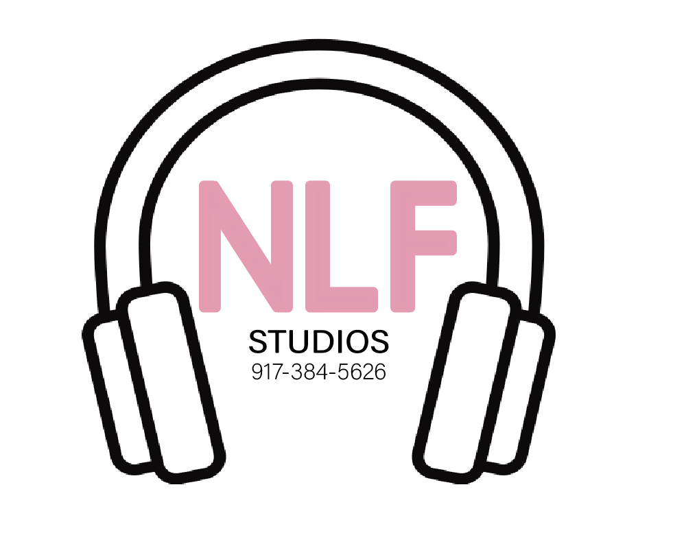
Maybe add a black connecting bubble border around NLF.
Or maybe change up the font of NLF to spruce it up- give it more life
Thanks I’ll try both. Just to clarify. They are two different ones for separate people.
maybe do something like a studio mike coming out of the L, with a bubble border around the whole thing.
I agree with @Itasilver the space inside the L would fit the mike nicely. And the word studio has to be bigger - the logo will be viewed at a much smaller size so that won’t be seen if it’s not bigger.
Also what type of file do I send it to her as at the end?
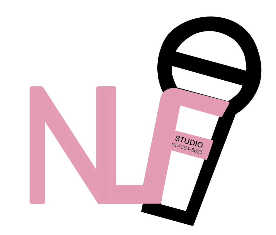
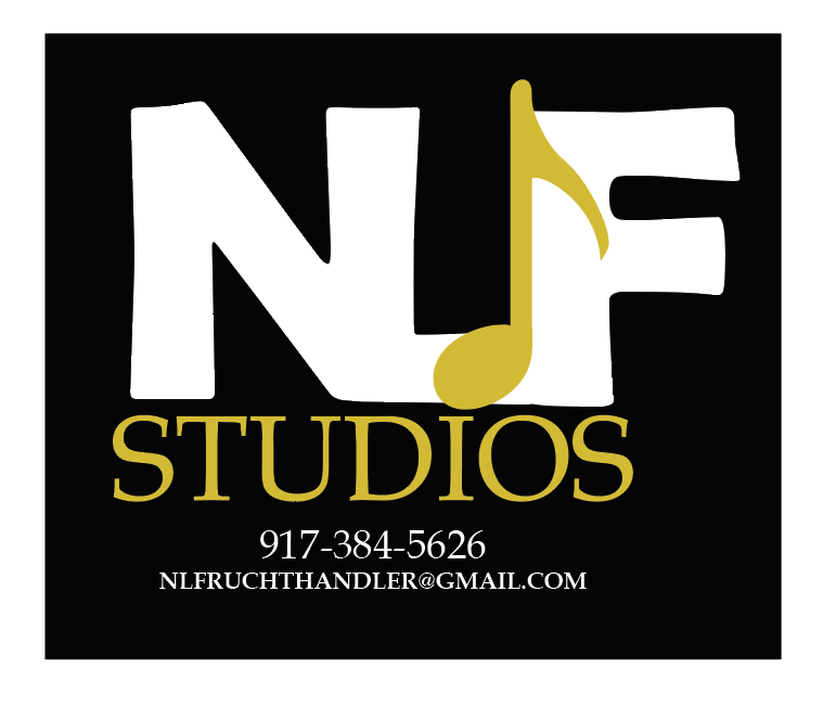
Much classier! Would it look better if the musical note was in the N?
Also, put a drop more space between the initials and studios
I tried it in the N and it didn’t look good. What about this?
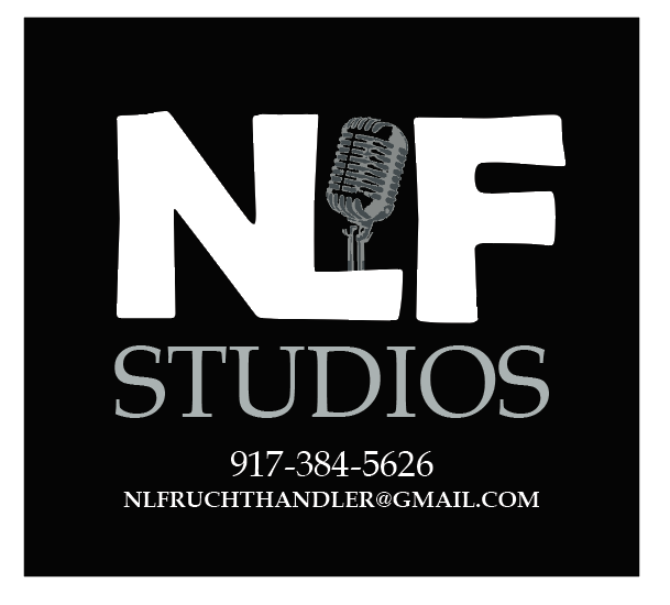
Also I’m not sure about the alignment of STUDIOS.
i like this. Justify studios to the N and F
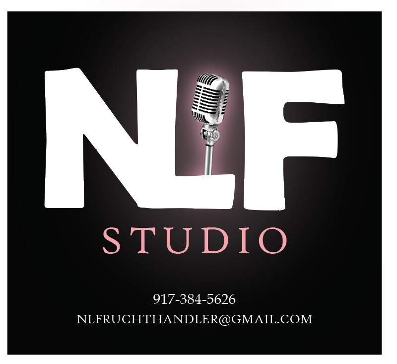
Oh wow! It looks amazing!
Is this a logo? I wouldn’t use a photo in a logo.
yes its a logo
so what should i use instead?
I think logos should be vector.
do you know where I can get something similar to this?
Maybe find something more contrasting then ‘image trace’ it. It’ll look more fake but will do the job