Hi,
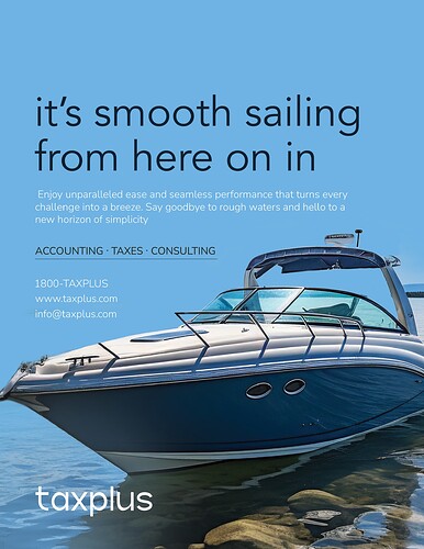
Working on this ad- anyone have any critique for me?
Thanks so much!
Love the ad
I would move all the text up a little and give some space between the text and the boat
I like what you did! I think you should move everything up a bit. maybe put the line “accounting…cunsulting” on top of the white text.
you can try to bring in a bit of the brown color from the stones on bottom…
Would you consider switching the white text to dark and dark text to white? I feel like it will pop more maybe. But I think you’ll have to try it
Try tightening the text a little. The headline text is very spread apart.
The subhead paragraph- can you shorten the lines so there are less words per line, and it’s more symmetrical? It will be easier to read if there are less words per line (even though it’s not technically so many).
Im wondering also if you can make the headline text a different, more “interesting” font. Maybe the one they use for their logo?
Oh also, can you stack up the services (accounting, consulting…) and then move the contact info to the bottom with the logo? That will give you more white space to work with and will help give over the confident feeling you want to present
maybe try capitalizing the title and decreasing the space between the letters
Love the sans serif font in you used for the body text. Do you mind sharing which one you used.
Thanks!
@miriam thank you!
It’s nunito sans!
Also thank you everyone for all the critique- going to get working on the changes and send the updated version iYH as soon as I get to it!

