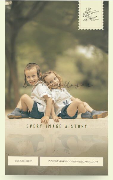
Hi! Any critics on this ad? besides for the logo cutting through the picture, that will get taken care of. Thanks!
2 Likes
Love it!!
Ok. This is one of the best photography ads I’ve seen in a while (The one I designed included ![]() )!
)!
One thing, make sure the contact info is centered inside the boxes.
Such a great ad! I love that pic!
How about making the headline bigger and using a more exciting font?
I would put it above the heads of the boys.
And would you try lowering the opacity of the boxes with her contact details? Maybe round off the corners too. Or put it in one box with both pieces of info stacked.
This is absolutely beautiful! The one thing I would change is the boxes on the bottom, as @chanamiriam suggested. I would combine them and add some visual interest - maybe the same thing you have around the logo on top. I’d also take out the border (not sure if that’s part of the ad, or just showing up here…)
Not sure why, but it seems to me that the screenshot is a bit washed out for some reason. Just make sure that’s not the case with the actual ad… Otherwise really nice!
Agree with @chanamiriam and @AVG comments.
this is so so beautiful!!! I like everything about it including the border! stunning!