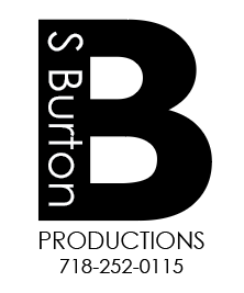
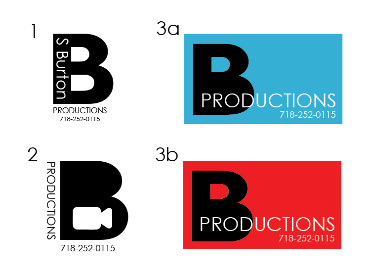
I feel like these are very plain, even though there is nothing technically wrong with any of them. I’d start by finding more interesting fonts, and also thinking how to better incorporate an icon into the logo.
did you look for inspiration of other logos in the industry?
2 is nice
What about a play button instead of full camera?