
its a sample raffle ticket for an organization’s raffle campaign
since theres so much info (that all needs to be on the front side) i feel like it looks a little too squishy…
any advice?
thanks so much!
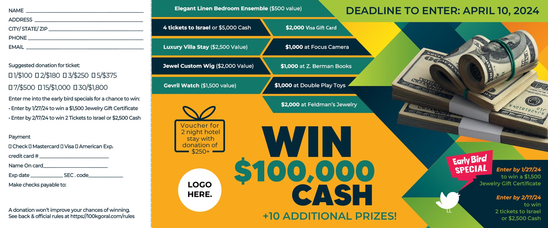
Nice job!! It’s hard when there’s a lot that needs to fit… but maybe try and use lighter shades in the areas that you want to be seen second or third to help with hierarchy