Two diff versions… which image works better?


I like the first image more
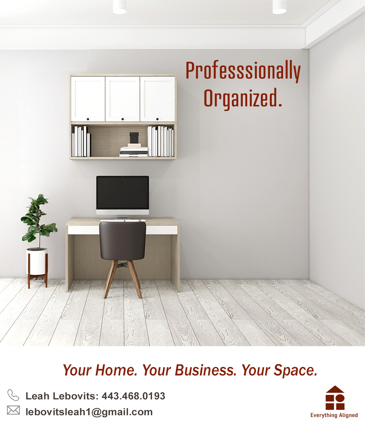
agread, also the bottom letters “Leah Lebovitz…” look a little shrunken-
Spelling is professionally. I like the first image because it is emptier and the second image because it looks like it actually got organized by someone…maybe you can find a picture that has shelving but not the window just a blank wall.
i like the second one.
i think the first one looks more like an advertisement for a computer/office job…
I like the second one