Album cover

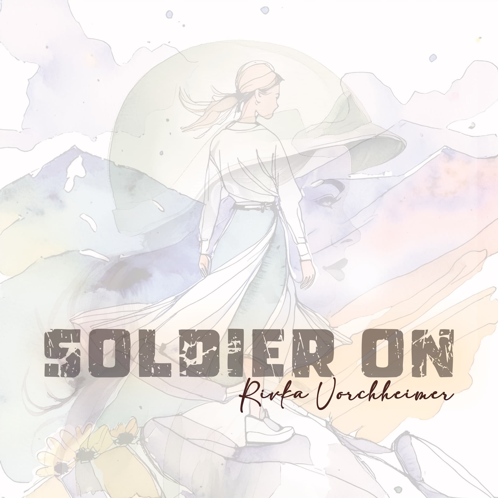
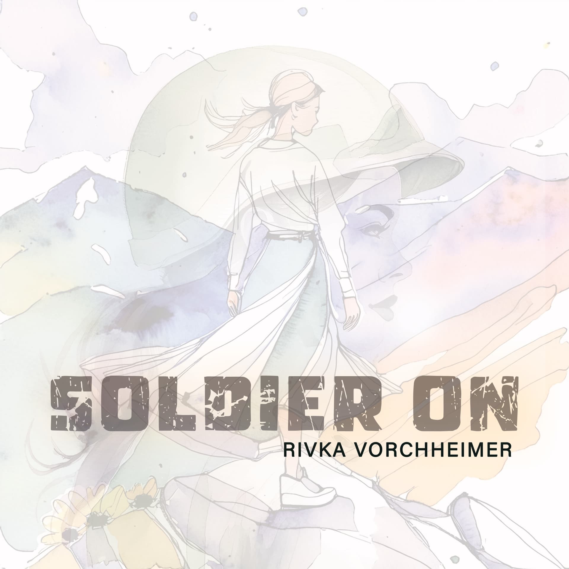
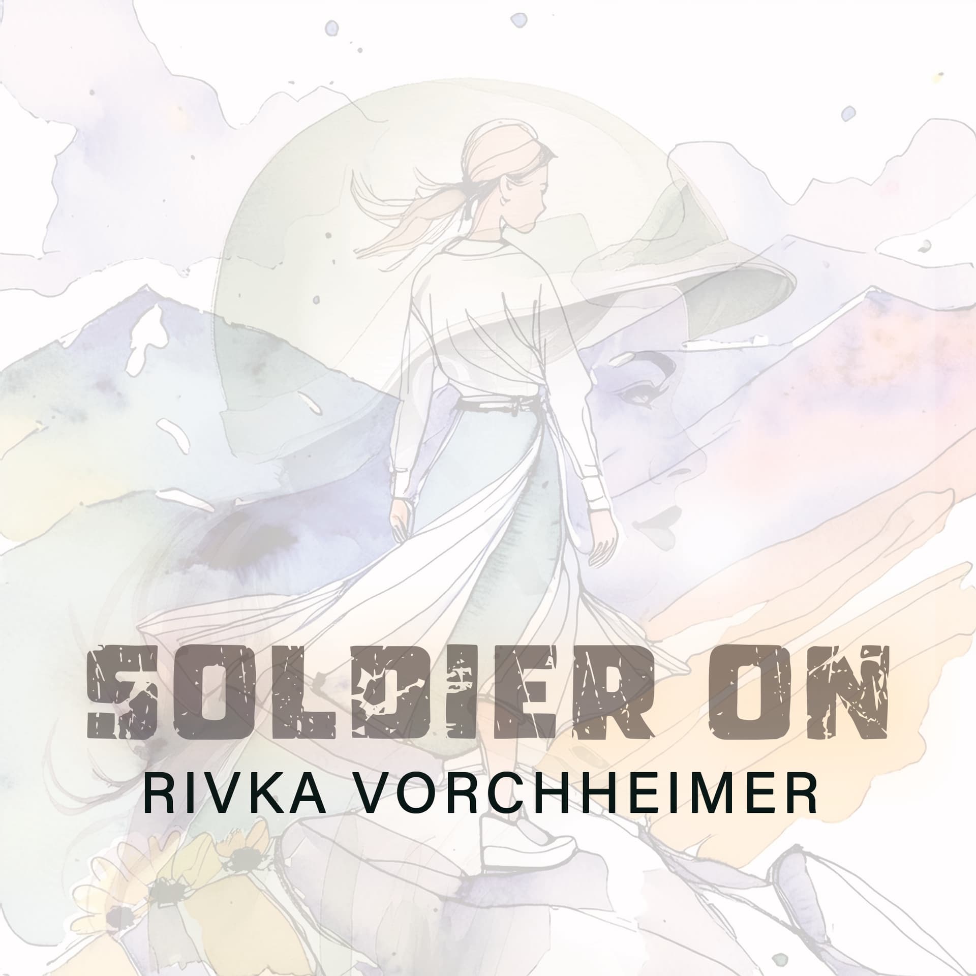
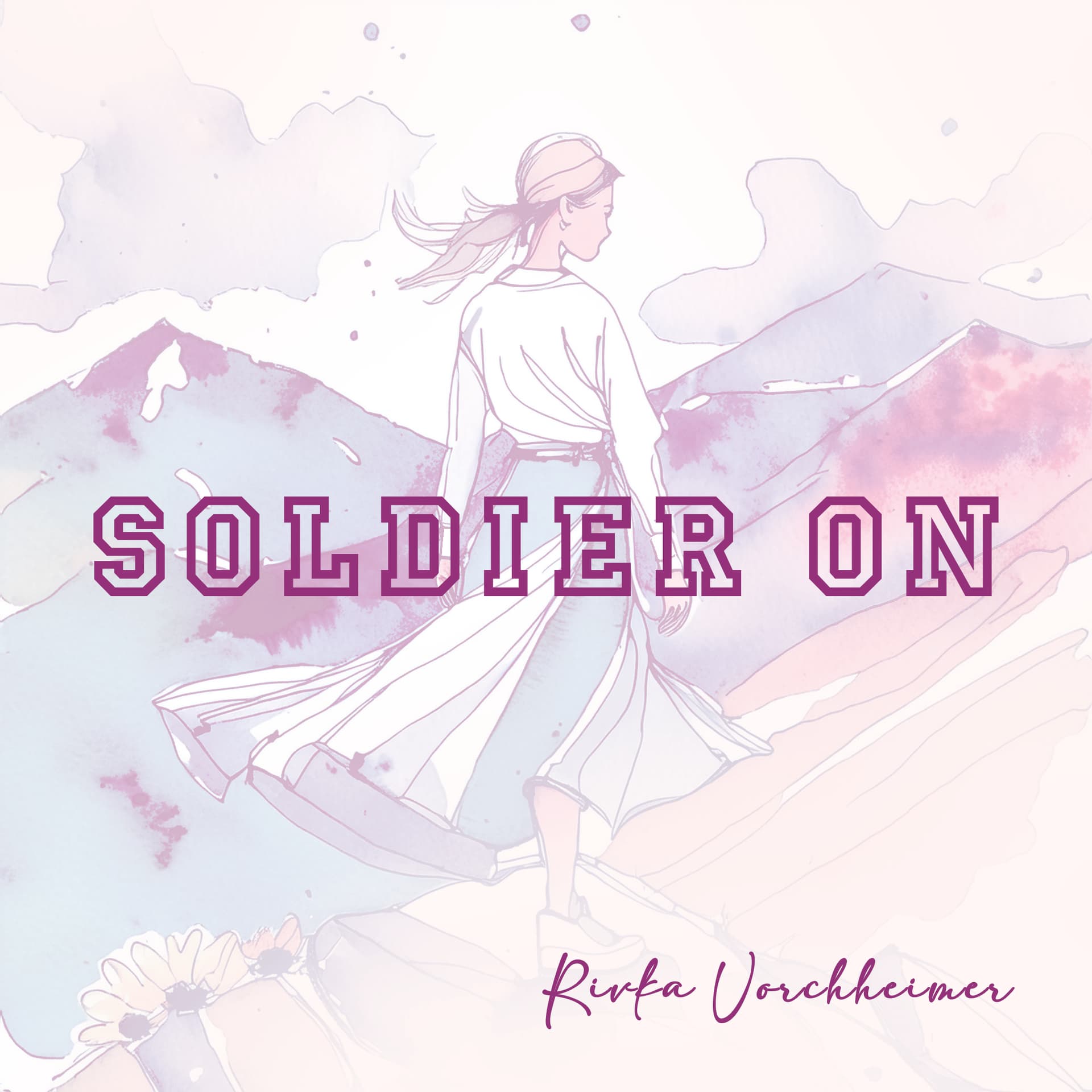
can you lmk what you think of this?
is it too abstract? and im not sure about the scripty font
also - does it look like she has 2 feet?? :slight_smile:

heres a few lines from the song, so you can get the concept - i want to make sure the style is right for the song…
The battle may be invisible
But your soul ranks invincible
From On high He’s watching
You silently fighting

Love the concept - the first one is my favorite. Can you make the soldier and girl more opaque, and the background faded? You can also have the script overlapping the grungy font a bit.

Thanks! good idea - yep will try that iyh.
also here’s another version - but not sure if it has that soldier kind of look enough…

btw in the end im going with this one
but thanks for your help! :slight_smile:

1 Like

like it

Beautiful!

now we wanna hear the song :wink:

thanks everyone!
lol if you want to hear you can message me privately! :wink: