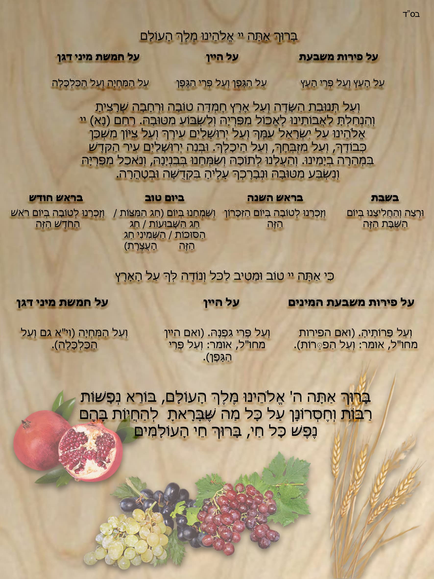
I’m designing this to be printed and hung on a wall.
I would love to get some feedback cuz I feel something isn’t right but can’t pinpoint exactly what.
Really nice!!
Can you bring all the words down? Looks a little top heavy and the images on the side maybe?
What do you mean by the images on the side?
Maybe put the images down the side, behind the text, and then you can move the text down
Beautiful!
-do you want to add a title on top? like “al hamichya”?will give it some context and balance the fruits on bottom
-I think the brown background with the black text is not giving enough contrast which minimizes readablilty of the text.You can lighten the background or even turn it white.
I would move the fruits off the text as well so that it can read better.
Otherwise great work!
I like the images on the bottom, is there a way to make them closer together and moved down more so you have more space for words. Or make them as part of the background. I understand why you did that background but its hard to see the words, I dont love the backdrop on the words, it makes it look very busy.
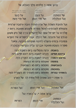
What about doing something like this layout for the extra yomtov words.
Cant wait to see the finished product!
Do you know where I can find such a layout to copy the text from?
I got the text online and reformatted the whole thing.
Look for layout ideas wherever they sell these type of things.
al hamichya | Eichlers (shopeichlers.com)
Also, I think the shadow behind the letters is making it hard to read.
This is so far what I’ve got.
(The black lines on the side are just from the screenshot.)
The fruit didn’t work on the side but I would appreciate any other critique.

Wow this is much better!!! I would lower all the text to make the same space on top and the bottom.
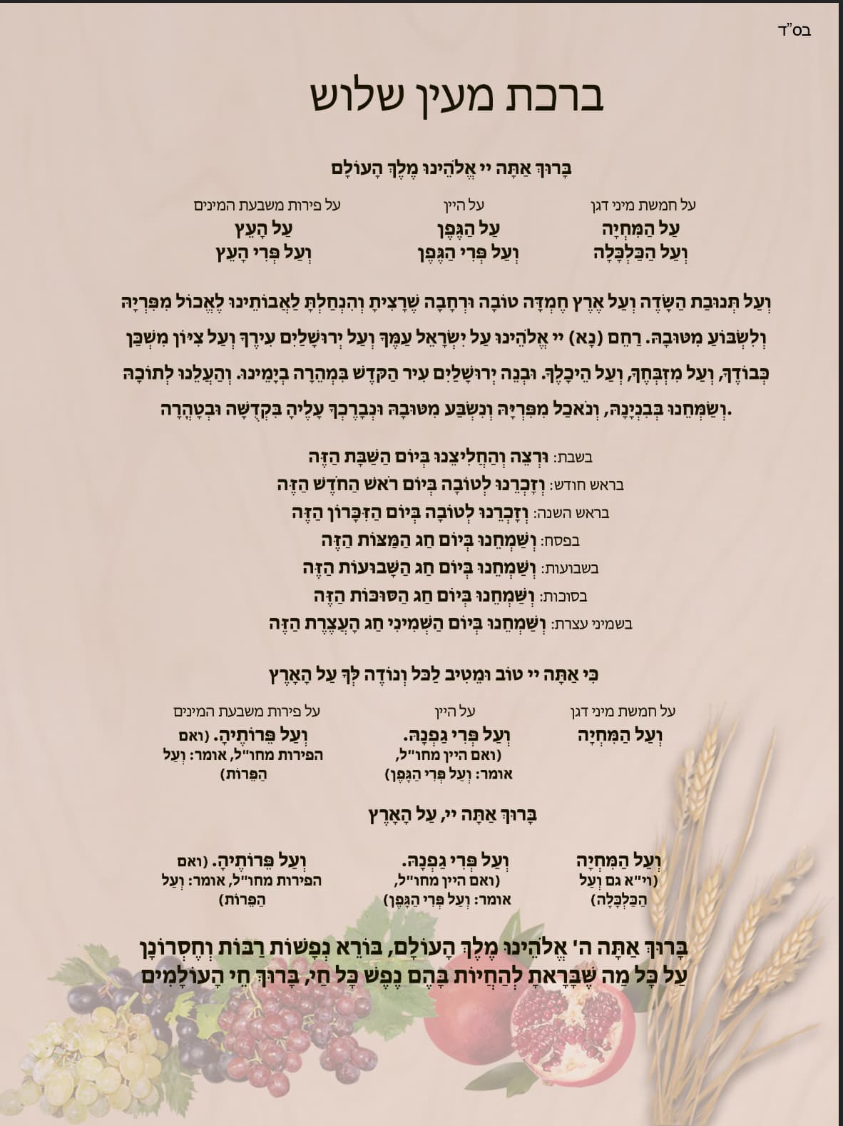
The layout is much nicer!
Is in centered (it may just be the screenshot)?
Do you want to add color to the tittle? Bring out a color from the picture?
I would make a separation of some sort between the al hamichya and the borei nefashos.
I am not sure if the main text needs so much leading.
I would adjust the spacing between the paragraphs. I am finding the flow to be a bit confusing. Maybe try having the “extra” text a different color? Or smaller…
These things can help make the text take up less space which will give you more room at the bottom.
Do you mean to change the colour of the stroke of the title?
Extra text meaning the add ins?
I meant to change the color of the tittle and make it more bold. Basically, give it a bit of life and make it stand out a tad.
Ya. The add ins. Like for shabbos ect. They shouldn’t be as dominant as the rest of the text.
I would center borei nefashos under the text val tenuvas hasadeh. Looks like it is too much to the left now.
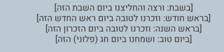
When I made an al hamichya sign I wrote the add ins in only 4 lines
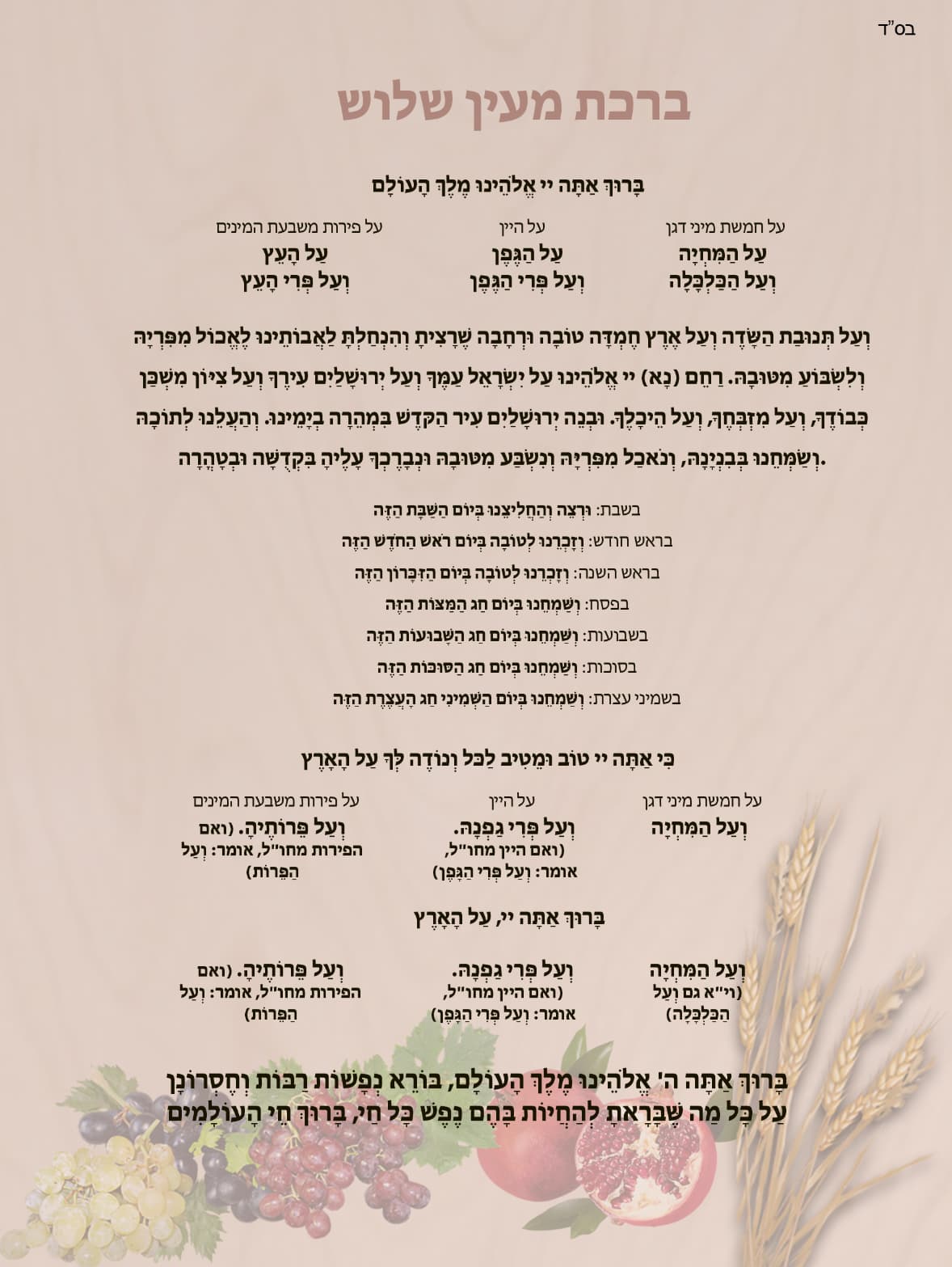
It looks really good to me, One small change, I think the heading is a drop to much to the right and needs to be centered more.
Thank you.
Going to send it off to print now:)