Hi,
I made this ad for an air mattress gemach. What do people think of it?
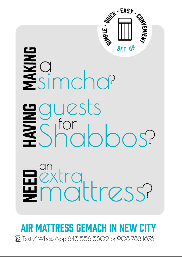
Creative work with the typography!
I like how the round badge breaks up the rectangle shape.
It might look straighter if you turn the words a bit clockwise.
Maybe try brighter contrasting colors to make it stand out more?
Though I do see why you chose these colors - seems to fit with air mattresses.
Also, is this a regular letter-size ad?
If the whole ad will be text-based, maybe go for a bolder font that has more weight?
Another idea:
You can add little illustrations/ icons as a visual cue for each question and position somewhere around text…
Might look better if “making” and “need” are exactly the height of the words horizontally (the way “having” fits exactly).
Hatzlacha!!
Do the icons add to it or it looked better without?
This is not a regular letter sized ad. It’s 5 by 7 - it’s not being printed…
Also, you suggested changing to brighter colors - what do you think will good?
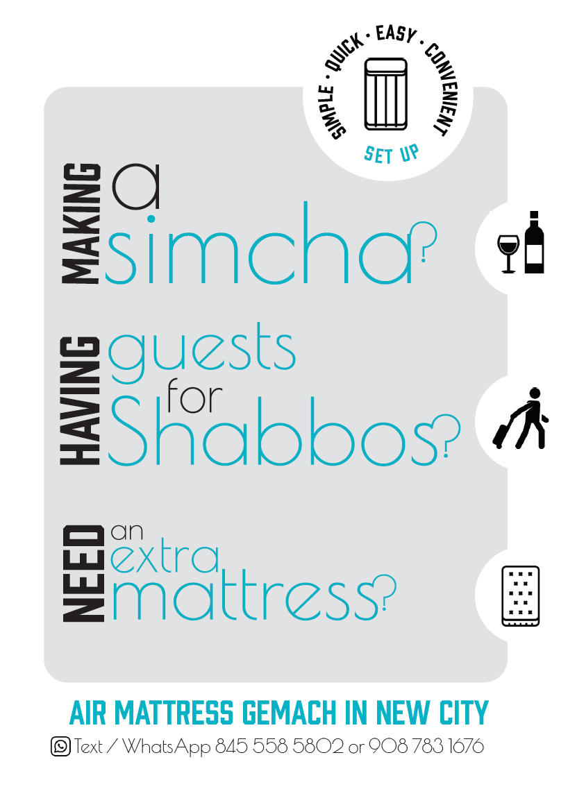
Looks great with the vertical words matched up exactly to the horizontal!
Since the design is so text-based, maybe have these icons interacting with the letters - sitting on them or something, without any circle around them.
Maybe try any 2 complementary colors?
Maybe this teal with magenta/ red?
Just another idea for the question marks - you can try making each as high as the entire question… possibly in black and partially behind the words…
Thanks so much @Chani_Wolpin for your help!
Are these changes better?
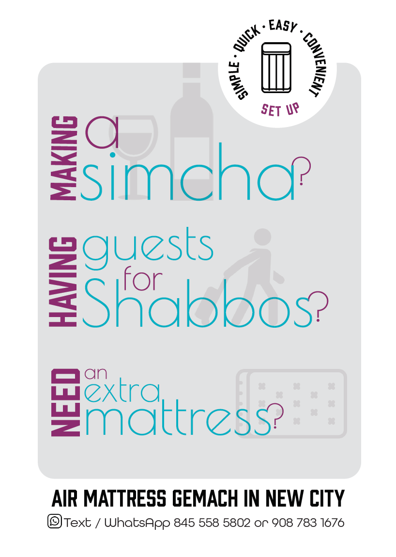
This looks so cute!
Love it!!
I like the pink additional color but im not sure if I like the first way you did the icons in the circles better then the way it is now…
maybe try making that one in this pink?
Really nice job, sharp and original-good work!
Looks really great! Big improvement from first
like this last one the best! Love the icons behind the text, it helps you visualize what you’re reading as you’re reading it, love the color contrast now.
is it just me or the words “set up” in the icon on top are not centered to the mattress in the circle? not sure if the mattress in that logo would look better in blue or not, but maybe have that blue color somewhere else on the page also just to give repitition? just an idea… not sure if you need to tho
over all great job!! 
Well done! I would just change the font of the blue.
really nice and original!
It somehow disturbs me that the wine icon is much taller than the question while the 2 other ones are the height of the question…
Also, the mattress icon seems a diff type of icon, which bothers me a little. Can you try find another icon that seems more the same type?
I was thinking - if you could get real 3d wine/mattress etc, and make it look like its actually sitting on top of the letters (eg with the persons legs coming off) like chani w suggested - that would probably look really cool
But dunno if would work out
I would also make the wine icon smaller, and agree about incorporating the teal blue somewhere else - instead of some of the black text at top/ bottom.
Really nice looking!
Thanks so much everyone for your help!
The client was very happy!! 
Can we see the final version?
It’s basically what I last posted, just made the wine icon a drop smaller…